## Load and install the packages that we'll be using today
if (!require("pacman")) install.packages("pacman")
pacman::p_load(sf, tidyverse, data.table, lwgeom, rnaturalearth, maps, mapdata, spData, tigris, tidycensus, leaflet, mapview, tmap, tmaptools)
## My preferred ggplot2 plotting theme (optional)
# theme_set(hrbrthemes::theme_ipsum())ECON 4370 / 6370 Computing for Economics
Lecture 7: Taming the Data Zoo: Spatial Data
Note
Part of this lecture is derived from Grant McDermott’s lecture notes.
Note: This lecture will focus only on vector-based spatial analysis. We will not cover raster-based spatial analysis, although this is an equally important subject. I’ll provide some links to further resources at the bottom of this document for those of you who want to explore further on your own.
Requirements
External libraries (requirements vary by OS)
We’re going to be doing all our spatial analysis and plotting today in R. Behind the scenes, R provides bindings to powerful open-source GIS libraries. These include the Geospatial Data Abstraction Library (GDAL) and Interface to Geometry Engine Open Source (GEOS) API suite, as well as access to projection and transformation operations from the PROJ library. You needn’t worry about all this, but for the fact that you may need to install some of these external libraries first. The requirements vary by OS:
- Linux: Requirements vary by distribution. See here.
- Mac: You should be fine to proceed directly to the R packages installation below. An unlikely exception is if you’ve configured R to install packages from source; in which case see here.
- Windows: Same as Mac, you should be good to go unless you’re installing from source. In which case, see here.
R packages
- New: sf, lwgeom, maps, mapdata, spData, tigris, tidycensus, leaflet, mapview, tmap, tmaptools
- Already used: tidyverse
Truth be told, you only need a handful of the above libraries to do 95% of the spatial work that you’re likely to encounter. But R’s spatial ecosystem and support is extremely rich, so I’ll try to walk through a number of specific use-cases in this lecture. Run the following code chunk to install (if necessary) and load everything.
Census API key
Finally, we’ll be accessing some data from the US Census Bureau through the tidycensus package. This will require a Census API key, which you can request here. Once that’s done, you can set it using the tidycensus::census_api_key() function. I recommend using the “install = TRUE” option to save your key for future usage. See the function’s help file for more information.
tidycensus::census_api_key("PLACE_YOUR_API_KEY_HERE", install = TRUE)Introduction: CRS and map projections
If you’re reading this after the fact, I recommend these two helpful resources. The very short version is that spatial data, like all coordinate-based systems, only make sense relative to some fixed point. That fixed point is what the Coordinate Reference Systems, or CRS, is trying to set. In R, we can define the CRS in one of two ways:
EPSG code (e.g.
3857), orPROJ string (e.g.
"+proj=merc").
We’ll see examples of both implementations in in this lecture. For the moment, however, just know that they are equally valid ways of specifying CRS in R (albeit with different strengths and weaknesses). You can search for many different CRS definitions here.
Aside: There are some important updates happening in the world of CRS and geospatial software, which will percolate through to the R spatial ecosystem. Thanks to the hard work of various R package developers, these behind-the-scenes changes are unlikely to affect the way that you interact with spatial data in R. But they are worth understanding if you plan to make geospatial work a core component of your work. More here.
Similarly, whenever we try to plot (some part of) the earth on a map, we’re effectively trying to project a 3-D object onto a 2-D surface. This will necessarily create some kind of distortion. Different types of map projections limit distortions for some parts of the world at the expense of others. For example, consider how badly the standard (but infamous) Mercator projection distorts the high latitudes in a global map (source):
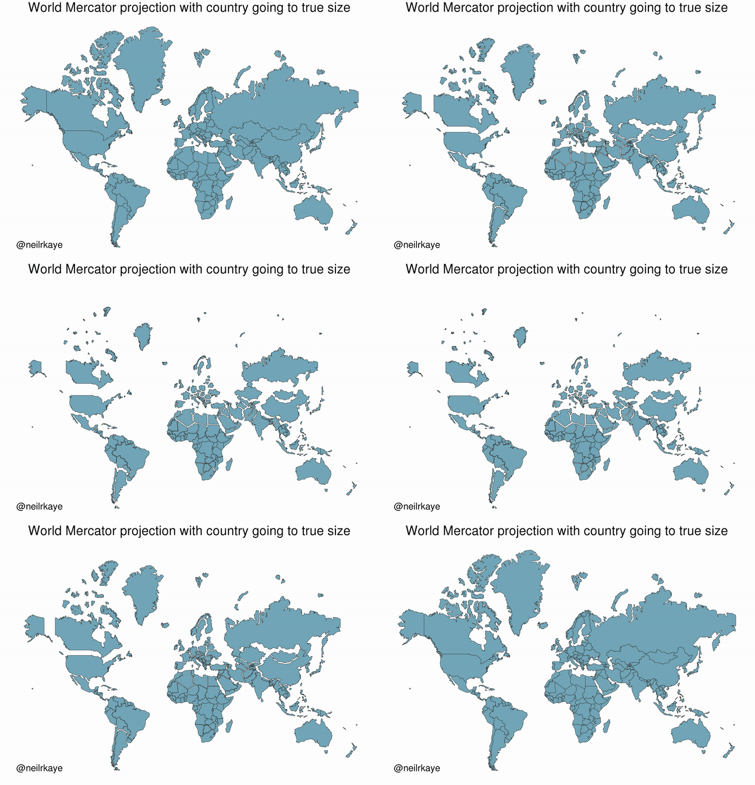
Bottom line: You should always aim to choose a projection that best represents your specific area of study. I’ll also show you how you can “re-orient” your projection to a specific latitude and longitude using the PROJ syntax. But first I’m obliged to share this XKCD summary. (Do yourself a favour and click on the link.)
Simple Features and the sf package
R has long provided excellent support for spatial analysis and plotting (primarily through the sp, rgdal, rgeos, and raster packages). However, until recently, the complex structure of spatial data necessitated a set of equally complex spatial objects in R. I won’t go into details, but a spatial object (say, a SpatialPolygonsDataFrame) was typically comprised of several “layers” — much like a list — with each layer containing a variety of “slots”. While this approach did (and still does) work perfectly well, the convoluted structure provided some barriers to entry for newcomers. It also made it very difficult to incorporate spatial data into the tidyverse ecosystem that we’re familiar with. Luckily, all this has changed thanks to the advent of the sf package (link).
The “sf” stands for simple features, which is a simple (ahem) standard for representing the spatial geometries of real-world objects on a computer.1 These objects — i.e. “features” — could include a tree, a building, a country’s border, or the entire globe. The point is that they are characterised by a common set of rules, defining everything from how they are stored on our computer to which geometrical operations can be applied them. Of greater importance for our purposes, however, is the fact that sf represents these features in R as data frames. This means that all of our data wrangling skills from previous lectures can be applied to spatial data; say nothing of the specialized spatial functions that we’ll cover next.
Reading in spatial data
Somewhat confusingly, most of the functions in the sf package start with the prefix st_. This stands for spatial and temporal and a basic command of this package is easy enough once you remember that you’re probably looking for st_SOMETHING().2
Let’s demonstrate by reading in the North Carolina counties shapefile that comes bundled with sf. As you might have guessed, we’re going to use the st_read() command and sf package will handle all the heavy lifting behind the scenes.
# library(sf) ## Already loaded

## Location of our shapefile (here: bundled together with the sf package)
file_loc = system.file("shape/nc.shp", package="sf")

## Read the shapefile into R
nc = st_read(file_loc, quiet = TRUE)
Simple Features as data frames
Let’s print out the nc object that we just created and take a look at its structure.
ncSimple feature collection with 100 features and 14 fields
Geometry type: MULTIPOLYGON
Dimension: XY
Bounding box: xmin: -84.32385 ymin: 33.88199 xmax: -75.45698 ymax: 36.58965
Geodetic CRS: NAD27
First 10 features:
AREA PERIMETER CNTY_ CNTY_ID NAME FIPS FIPSNO CRESS_ID BIR74 SID74
1 0.114 1.442 1825 1825 Ashe 37009 37009 5 1091 1
2 0.061 1.231 1827 1827 Alleghany 37005 37005 3 487 0
3 0.143 1.630 1828 1828 Surry 37171 37171 86 3188 5
4 0.070 2.968 1831 1831 Currituck 37053 37053 27 508 1
5 0.153 2.206 1832 1832 Northampton 37131 37131 66 1421 9
6 0.097 1.670 1833 1833 Hertford 37091 37091 46 1452 7
7 0.062 1.547 1834 1834 Camden 37029 37029 15 286 0
8 0.091 1.284 1835 1835 Gates 37073 37073 37 420 0
9 0.118 1.421 1836 1836 Warren 37185 37185 93 968 4
10 0.124 1.428 1837 1837 Stokes 37169 37169 85 1612 1
NWBIR74 BIR79 SID79 NWBIR79 geometry
1 10 1364 0 19 MULTIPOLYGON (((-81.47276 3...
2 10 542 3 12 MULTIPOLYGON (((-81.23989 3...
3 208 3616 6 260 MULTIPOLYGON (((-80.45634 3...
4 123 830 2 145 MULTIPOLYGON (((-76.00897 3...
5 1066 1606 3 1197 MULTIPOLYGON (((-77.21767 3...
6 954 1838 5 1237 MULTIPOLYGON (((-76.74506 3...
7 115 350 2 139 MULTIPOLYGON (((-76.00897 3...
8 254 594 2 371 MULTIPOLYGON (((-76.56251 3...
9 748 1190 2 844 MULTIPOLYGON (((-78.30876 3...
10 160 2038 5 176 MULTIPOLYGON (((-80.02567 3...Now we can see the explicit data frame structure that was I talking about earlier. The object has the familiar tibble-style output that we’re used to (e.g. it only prints the first 10 rows of the data). However, it also has some additional information in the header, like a description of the geometry type (“MULTIPOLYGON”) and CRS (e.g. EPSG ID 4267). One thing I want to note in particular is the geometry column right at the end of the data frame. This geometry column is how sf package achieves much of its magic: It stores the geometries of each row element in its own list column.3 Since all we really care about are the key feature attributes — county name, FIPS code, population size, etc. — we can focus on those instead of getting bogged down by hundreds (or thousands or even millions) of coordinate points. In turn, this all means that our favourite tidyverse operations and syntax (including the pipe operator %>%) can be applied to spatial data. Let’s review some examples, starting with plotting.
Plotting and projection with ggplot2
Plotting sf objects is incredibly easy thanks to the package’s integration with both base R plot() and ggplot2. I’m going to focus on the latter here, but feel free to experiment.4 The key geom to remember is geom_sf(). For example:
# library(tidyverse) ## Already loaded

nc_plot =
  ggplot(nc) +
  geom_sf(aes(fill = AREA), alpha=0.8, col="white") +
  scale_fill_viridis_c(name = "Area") +
  ggtitle("Counties of North Carolina")

nc_plot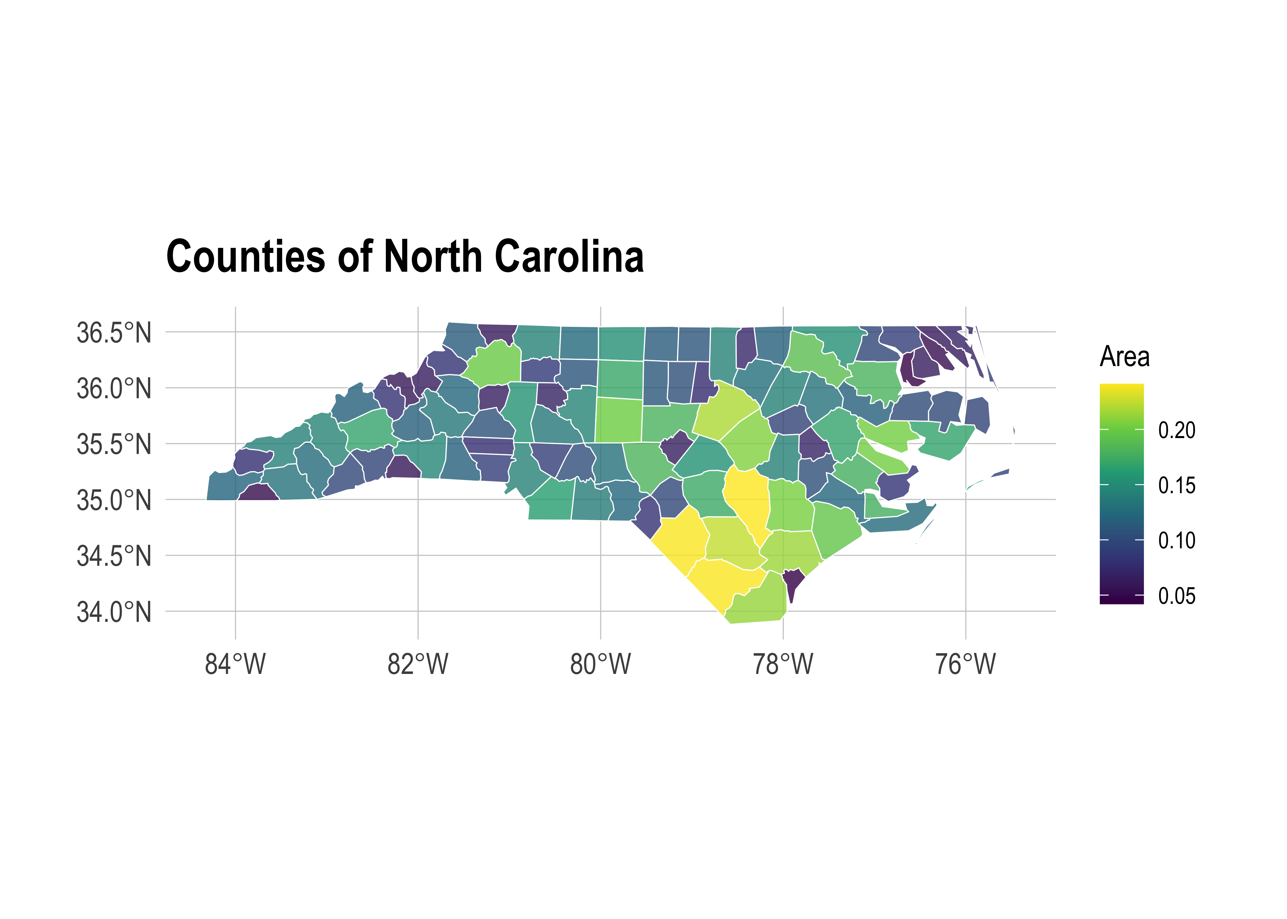
To reproject an sf object to a different CRS, we can use sf::st_transform().
nc %>%
  st_transform(crs = "+proj=moll") %>% ## Reprojecting to a Mollweide CRS
  head(2) ## Saving vertical space
Simple feature collection with 2 features and 14 fields
Geometry type: MULTIPOLYGON
Dimension: XY
Bounding box: xmin: -7160488 ymin: 4364312 xmax: -7077217 ymax: 4404766
Projected CRS: +proj=moll
AREA PERIMETER CNTY_ CNTY_ID NAME FIPS FIPSNO CRESS_ID BIR74 SID74
1 0.114 1.442 1825 1825 Ashe 37009 37009 5 1091 1
2 0.061 1.231 1827 1827 Alleghany 37005 37005 3 487 0
NWBIR74 BIR79 SID79 NWBIR79 geometry
1 10 1364 0 19 MULTIPOLYGON (((-7145982 43...
2 10 542 3 12 MULTIPOLYGON (((-7118092 43...Or, we can specify a common projection directly in the ggplot call using coord_sf(). This is often the most convenient approach when you are combining multiple sf data frames in the same plot.
nc_plot +
  coord_sf(crs = "+proj=moll") +
labs(subtitle = "Mollweide projection") 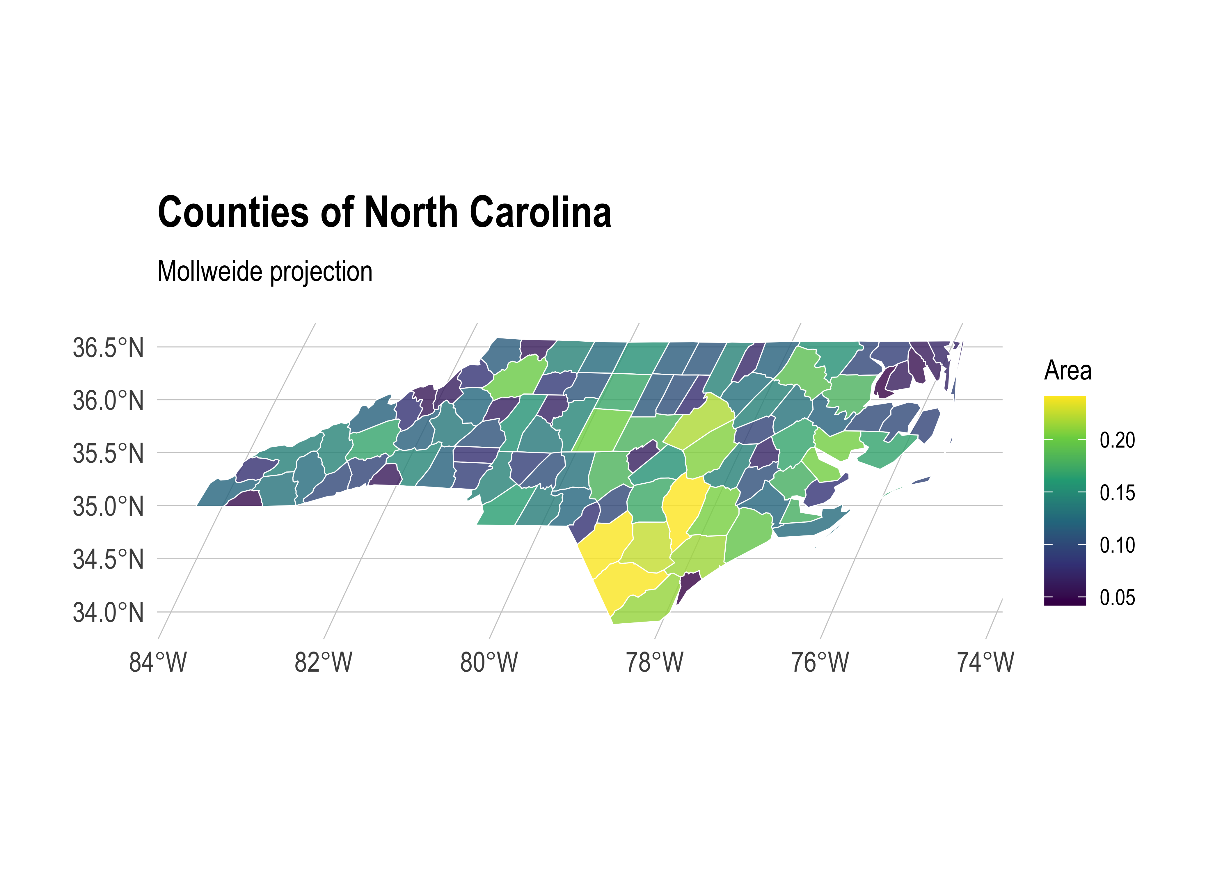
Note that we used a PROJ string to define the CRS reprojection above. But we could easily use an EPSG code instead. For example, here’s the NC state plane projection.
nc_plot +
  coord_sf(crs = 32119) +
labs(subtitle = "NC state plane") 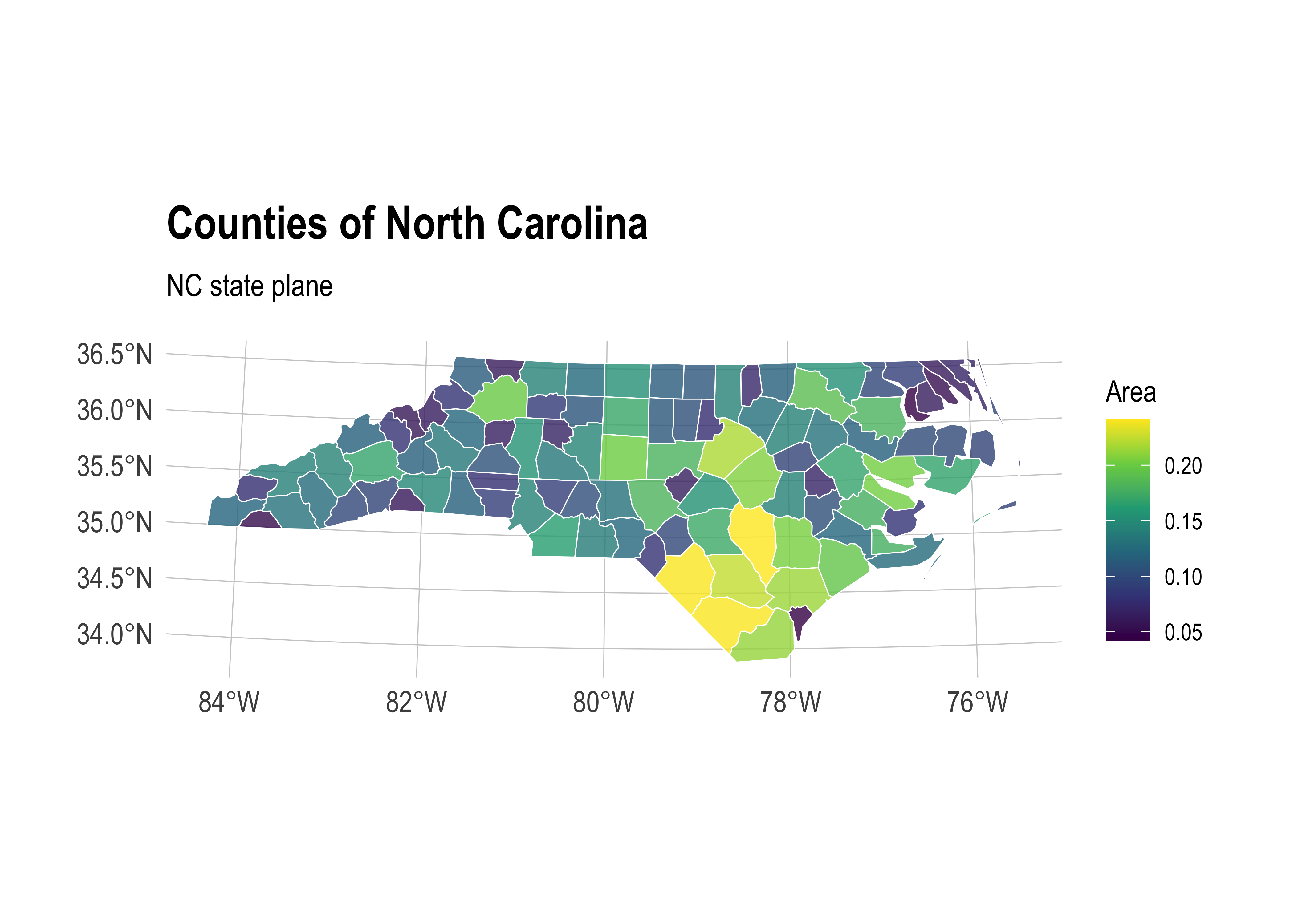
Data wrangling with dplyr and tidyr
As I keep saying, the tidyverse approach to data wrangling carries over very smoothly to sf objects. For example, the standard dplyr verbs like filter(), mutate() and select() all work:
nc %>%
  filter(NAME %in% c("Camden", "Durham", "Northampton")) %>%
  mutate(AREA_1000 = AREA*1000) %>%
  select(NAME, contains("AREA"), everything())
Simple feature collection with 3 features and 15 fields
Geometry type: MULTIPOLYGON
Dimension: XY
Bounding box: xmin: -79.01814 ymin: 35.85786 xmax: -75.95718 ymax: 36.55629
Geodetic CRS: NAD27
NAME AREA AREA_1000 PERIMETER CNTY_ CNTY_ID FIPS FIPSNO CRESS_ID
1 Northampton 0.153 153 2.206 1832 1832 37131 37131 66
2 Camden 0.062 62 1.547 1834 1834 37029 37029 15
3 Durham 0.077 77 1.271 1908 1908 37063 37063 32
BIR74 SID74 NWBIR74 BIR79 SID79 NWBIR79 geometry
1 1421 9 1066 1606 3 1197 MULTIPOLYGON (((-77.21767 3...
2 286 0 115 350 2 139 MULTIPOLYGON (((-76.00897 3...
3 7970 16 3732 10432 22 4948 MULTIPOLYGON (((-79.01814 3...You can also perform group_by() and summarise() operations as per normal (see here for a nice example). Furthermore, the dplyr family of join functions also work, which can be especially handy when combining different datasets by (say) FIPS code or some other attribute. However, this presumes that only one of the objects has a specialized geometry column. In other words, it works when you are joining an sf object with a normal data frame. In cases where you want to join two sf objects based on their geometries, there’s a specialized st_join() function. I provide an example of this latter operation in the section on geometric operations below.
And, just to show that we’ve got the bases covered, you can also implement your favourite tidyr verbs. For example, we can tidyr::gather() the data to long format, which is useful for facetted plotting.5 Here I demonstrate using the “BIR74” and “BIR79” columns (i.e. the number of births in each county in 1974 and 1979, respectively).
nc %>%
  select(county = NAME, BIR74, BIR79, -geometry) %>%
  gather(year, births, BIR74, BIR79) %>%
  mutate(year = gsub("BIR", "19", year)) %>%
  ggplot() +
  geom_sf(aes(fill = births), alpha=0.8, col="white") +
  scale_fill_viridis_c(name = "Births", labels = scales::comma) +
  facet_wrap(~year, ncol = 1) +
labs(title = "Births by North Carolina county") 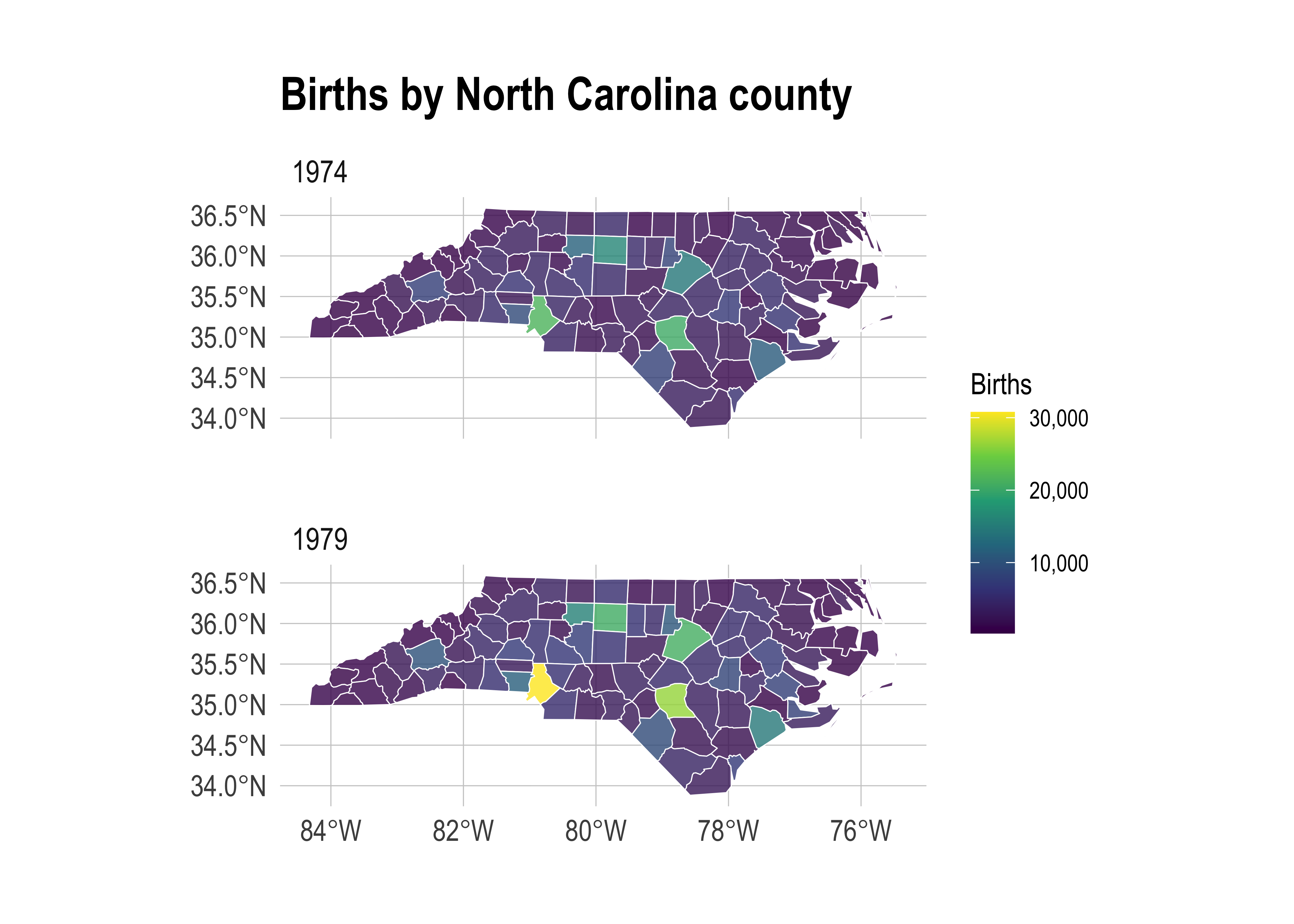
Specialized geometric operations
Alongside all the tidyverse functionality, the sf package comes with a full suite of geometrical operations. You should take a look at at the third sf vignette or the Geocomputation with R book to get a complete overview. However, here are a few examples to get you started:
Unary operations
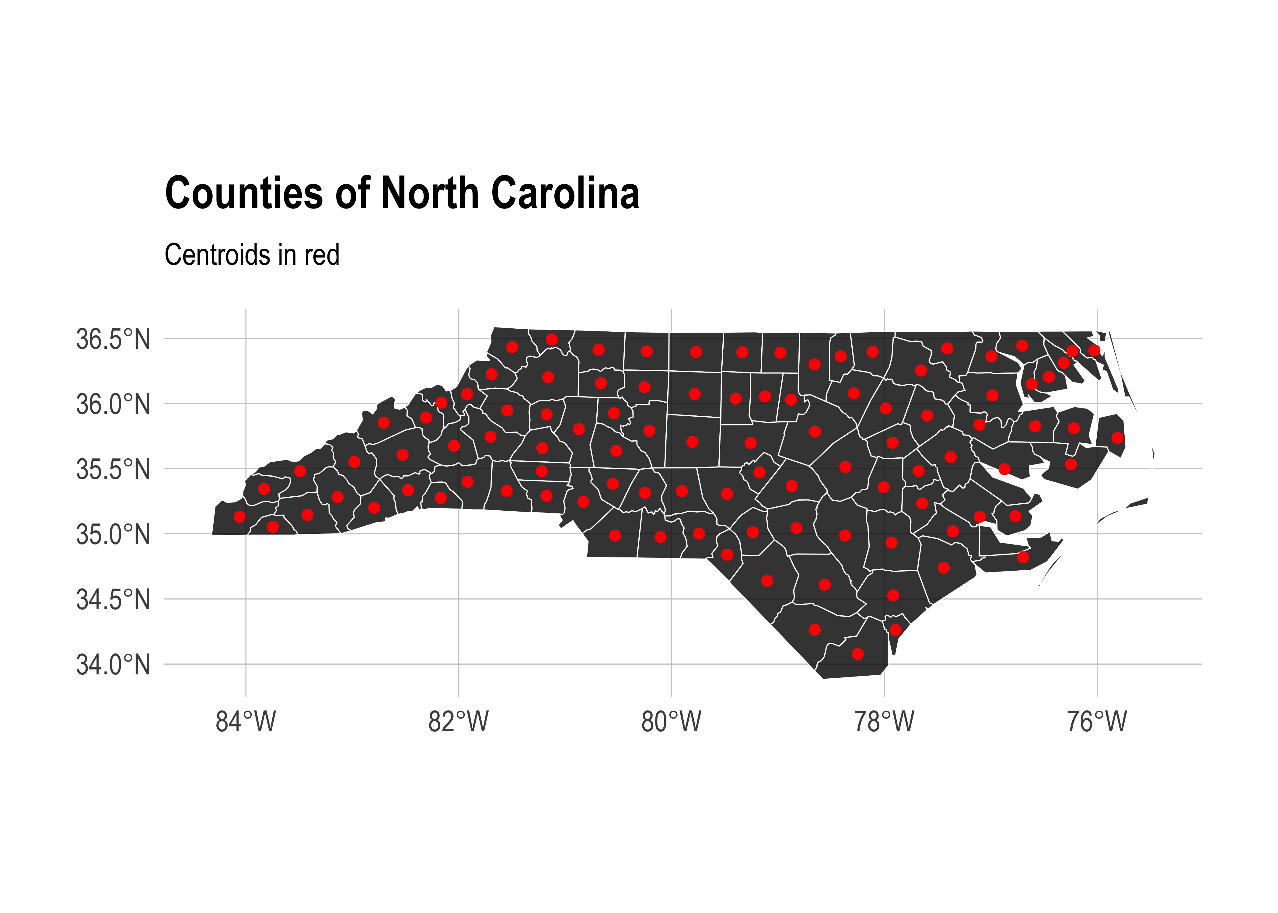
So-called unary operations are applied to a single object. For instance, you can get the st_area(), st_centroid(), st_boundary(), st_buffer(), etc. of an object using the appropriate command. For example:
nc %>% st_area() %>% head(5) ## Only show the area of the first five counties to save space.Units: [m^2]
[1] 1137107793 610916077 1423145355 694378925 1520366979And:
nc_centroid = st_centroid(nc)

ggplot(nc) +
  geom_sf(fill = "black", alpha = 0.8, col = "white") +
  geom_sf(data = nc_centroid, col = "red") + ## Notice how easy it is to combine different sf objects
  labs(
    title = "Counties of North Carolina",
    subtitle = "Centroids in red"
    )
Or you can “melt” sub-elements of an sf object (e.g. counties) into larger elements (e.g. states) using sf::st_union():
nc %>%
  st_union() %>%
  ggplot() +
  geom_sf(fill=NA, col="black") +
labs(title = "Outline of North Carolina") 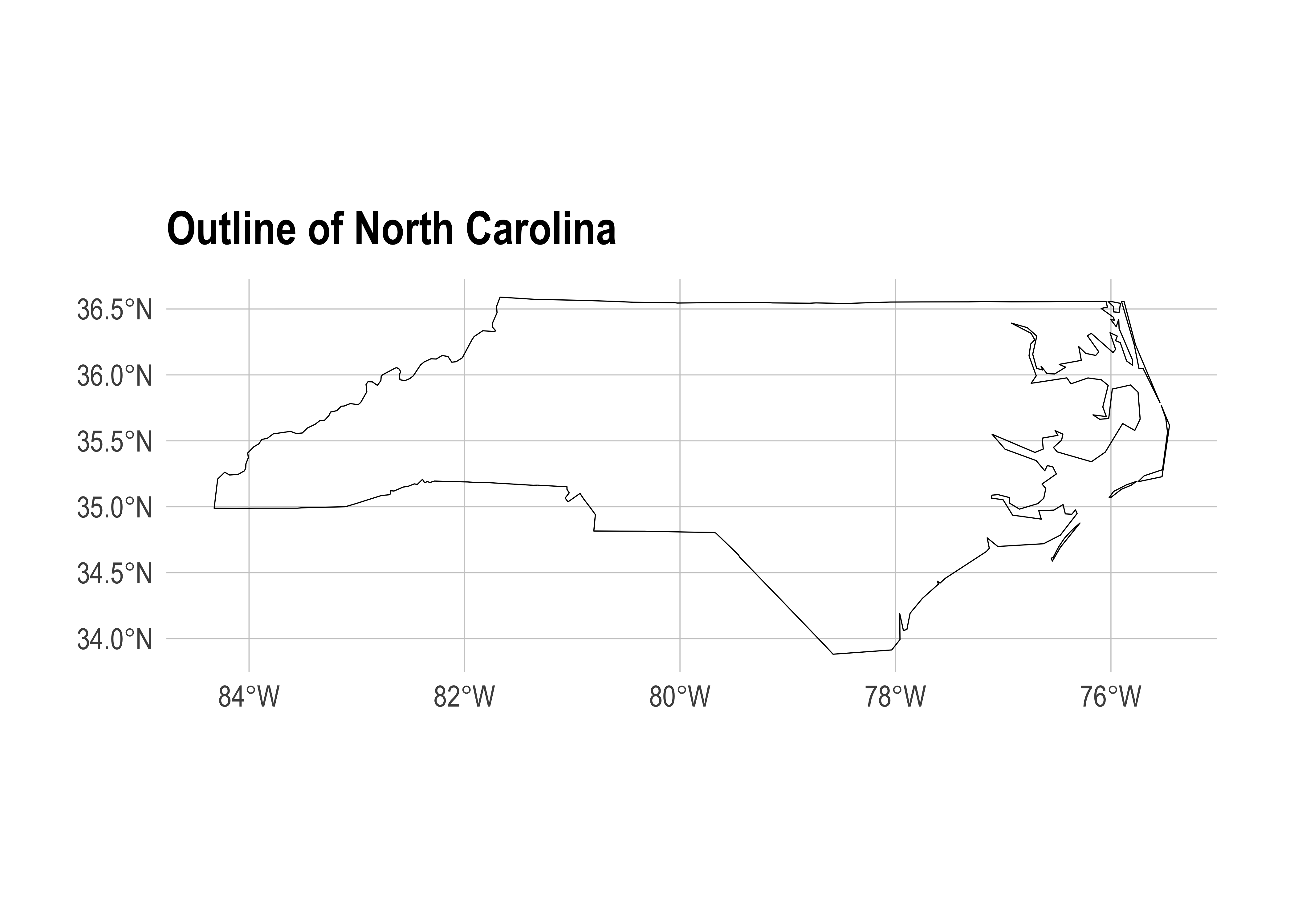
Binary operations
Another set of so-called binary operations can be applied to multiple objects. So, we can get things like the distance between two spatial objects using sf::st_distance(). In the below example, I’m going to get the distance from Ashe county to Brunswich county, as well as itself. The latter is just a silly addition to show that we can easily make multiple pairwise comparisons, even when the distance from one element to another is zero.
ashe_brunswick = nc %>% filter(NAME %in% c("Ashe", "Brunswick"))
brunswick = nc %>% filter(NAME %in% c("Brunswick"))

## Use "by_element = TRUE" to give a vector instead of the default pairwise matrix
## Note: ashe_brunswick has 2 counties, brunswick has 1, so we need to match lengths
ashe = nc %>% filter(NAME == "Ashe")
ab_dist = st_distance(ashe, brunswick, by_element = TRUE)
# Units: [m]
# [1] 347930.7

## We can use the `units` package (already installed as sf dependency) to convert to kilometres
ab_dist = ab_dist %>% units::set_units(km) %>% round()
# Units: [km]
# [1] 348

ggplot(nc) +
  geom_sf(fill = "black", alpha = 0.8, col = "white") +
  geom_sf(data = nc %>% filter(NAME %in% c("Ashe", "Brunswick")), aes(fill = NAME), col = "white") +
  labs(
    title = "Calculating distances",
    subtitle = paste0("The distance between Ashe and Brunswick is ", ab_dist, " km")
    ) +
  theme(legend.title = element_blank())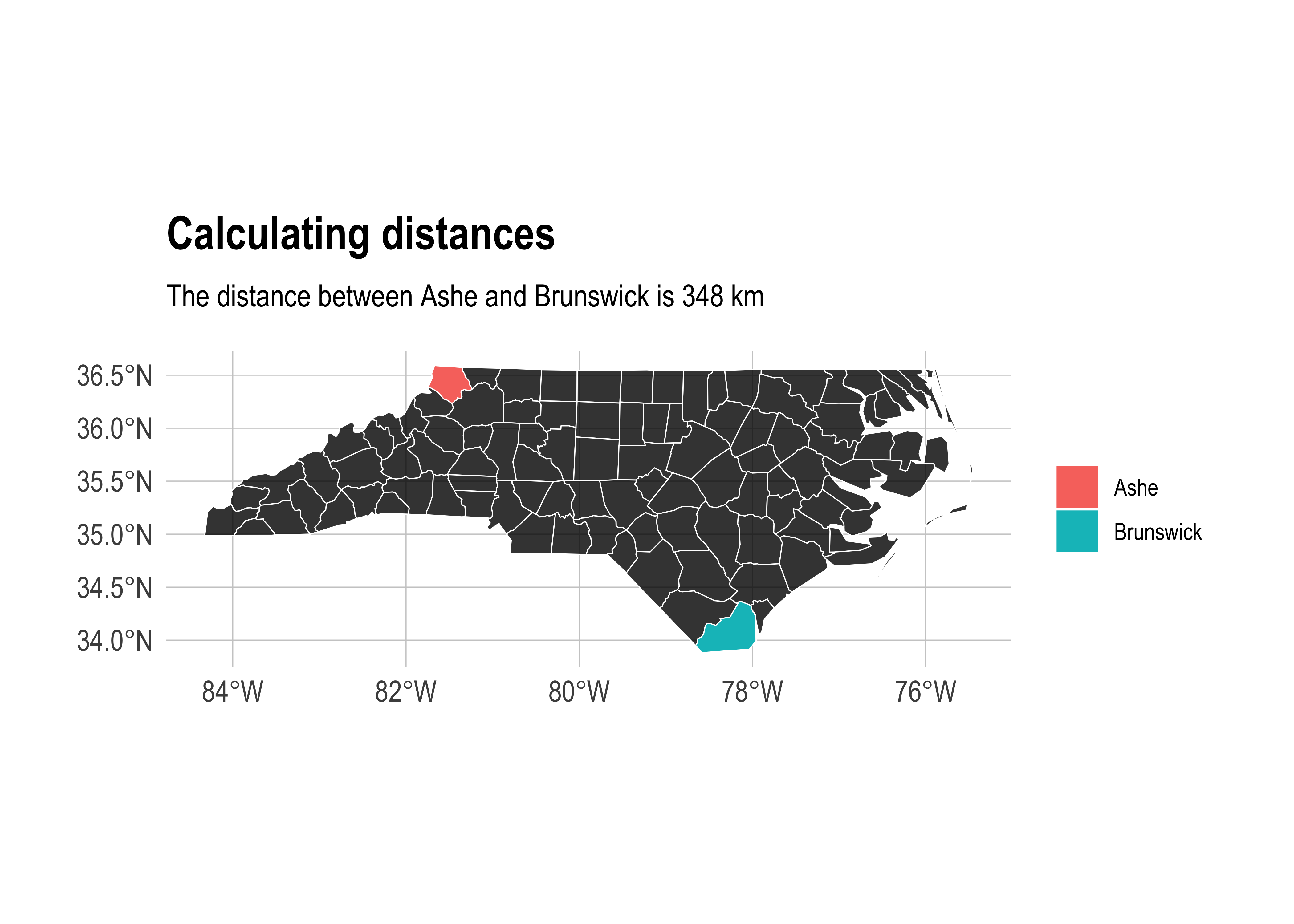
Binary logical operations
A sub-genre of binary geometric operations falls into the category of logic rules — typically characterising the way that geometries relate in space. (Do they overlap, etc.)
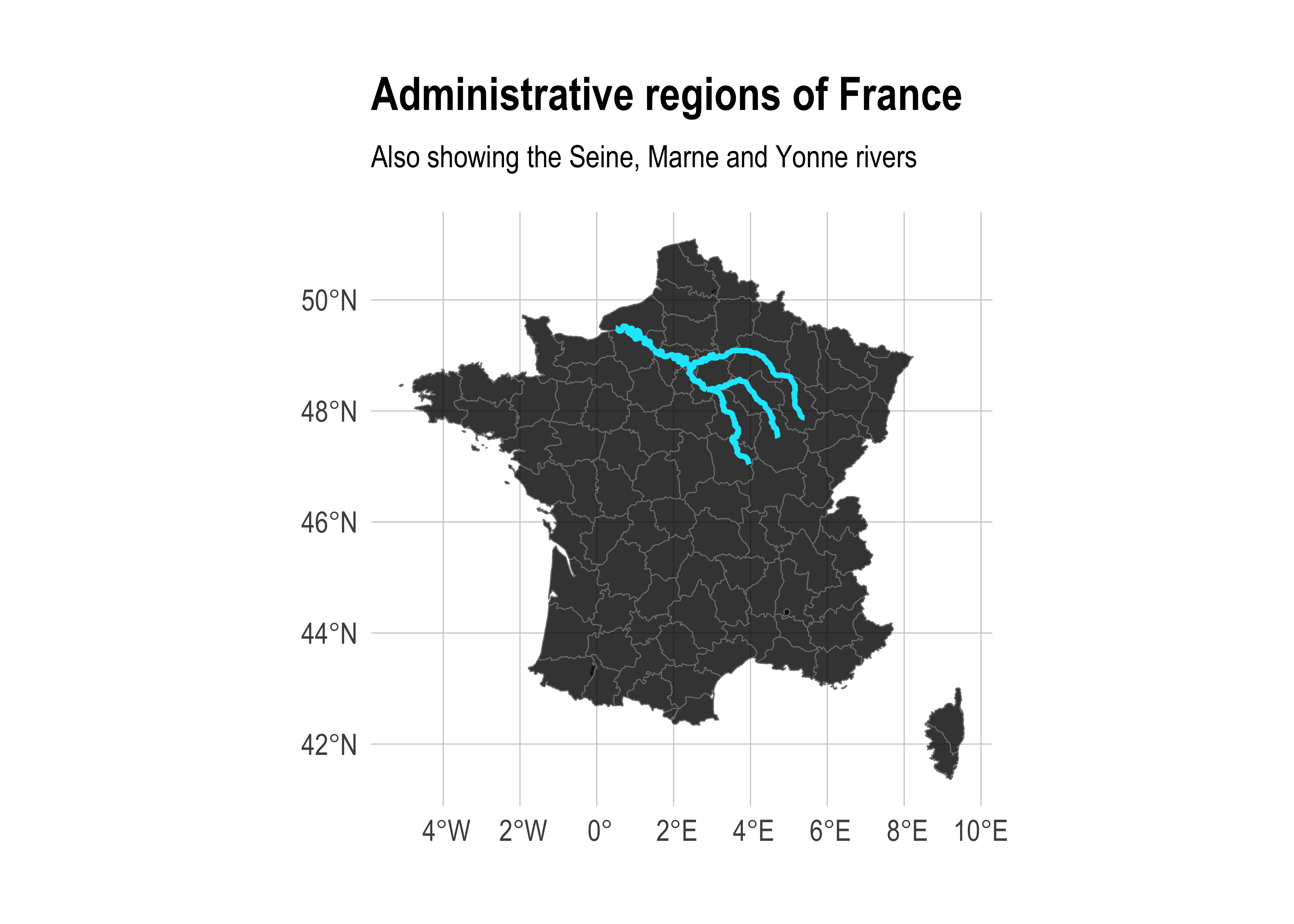
For example, we can calculate the intersection of different spatial objects using sf::st_intersection(). For this next example, I’m going to use two new spatial objects: 1) A regional map of France from the maps package and 2) part of the Seine river network (including its Marne and Yonne tributaries) from the spData package. Don’t worry too much about the process used for loading these datasets; I’ll cover that in more depth shortly. For the moment, just focus on the idea that we want to see which adminstrative regions are intersected by the river network. Start by plotting all of the data to get a visual sense of the overlap:
## Get the data
france = st_as_sf(map('france', plot = FALSE, fill = TRUE))
data("seine", package = "spData")

## Make sure they have the same projection
seine = st_transform(seine, crs = st_crs(france))

ggplot() +
  geom_sf(data = france, alpha = 0.8, fill = "black", col = "gray50") +
  geom_sf(data = seine, col = "#05E9FF", lwd = 1) +
  labs(
    title = "Administrative regions of France",
    subtitle = "Also showing the Seine, Marne and Yonne rivers"
    )
Now let’s limit it to the intersected regions:
seine = st_transform(seine, crs = st_crs(france))

# Fix any geometry issues before intersection
france = st_make_valid(france)
seine = st_make_valid(seine)

# Use GEOS engine instead of S2 to avoid geometry validation issues
sf_use_s2(FALSE)
france_intersected = st_intersection(france, seine)
sf_use_s2(TRUE)  # Re-enable S2 for other operations

france_intersected
Simple feature collection with 22 features and 2 fields
Geometry type: GEOMETRY
Dimension: XY
Bounding box: xmin: 0.4931747 ymin: 47.04007 xmax: 5.407726 ymax: 49.52717
Geodetic CRS: +proj=longlat +ellps=clrk66 +no_defs +type=crs
First 10 features:
ID name geom
Aisne Aisne Marne LINESTRING (3.608053 49.089...
Marne Marne Marne LINESTRING (4.872966 48.637...
Seine-et-Marne Seine-et-Marne Marne LINESTRING (3.254238 48.977...
Seine-Saint-Denis Seine-Saint-Denis Marne LINESTRING (2.595133 48.876...
Val-de-Marne Val-de-Marne Marne LINESTRING (2.53346 48.8581...
Haute-Marne Haute-Marne Marne LINESTRING (5.407725 47.877...
Seine-Maritime Seine-Maritime Seine LINESTRING (1.071621 49.309...
Eure Eure Seine LINESTRING (1.514229 49.077...
Marne.1 Marne Seine LINESTRING (3.868337 48.522...
Val-Doise Val-Doise Seine LINESTRING (2.286567 48.954...Note: The sf package uses a geometry engine called S2 by default for spatial operations. S2 is a modern, spherical geometry library developed by Google that is fast and accurate for most spatial tasks, especially those involving global or large-scale data. However, S2 can sometimes struggle with certain complex or invalid geometries, such as those found in some administrative boundaries. In these cases, you can temporarily switch to the older GEOS engine by calling sf_use_s2(FALSE), which may handle problematic geometries more gracefully. After performing the necessary operation, it’s good practice to turn S2 back on with sf_use_s2(TRUE) for subsequent work.
Note that st_intersection() only preserves exact points of overlap. As in, this is the exact path that the rivers follow within these regions. We can see this more explicitly in map form:
france_intersected %>%
  ggplot() +
  geom_sf(alpha = 0.8, aes(fill = ID, col = ID)) +
  labs(
    title = "Seine, Marne and Yonne rivers",
    caption = "Colours depict French administrative regions"
    ) +
  theme(legend.title = element_blank())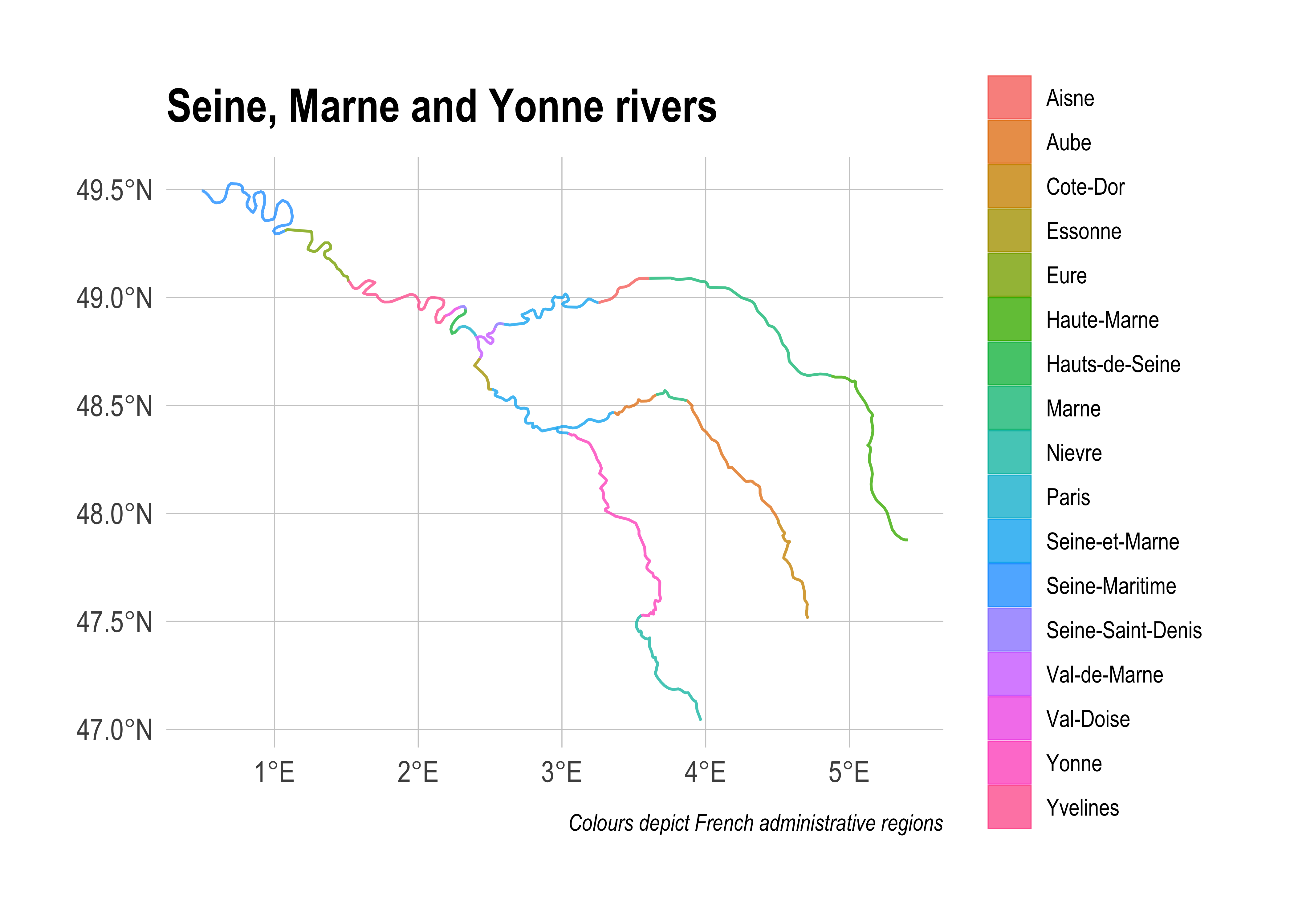
If we instead wanted to plot the subsample of intersected provinces (i.e. keeping their full geometries), we have a couple options. We could filter the france object by matching its region IDs with the france_intersected object. However, a more direct option is to use the sf::st_join() function which matches objects based on overlapping (i.e. intersecting) geometries:
# Use GEOS engine for spatial join to avoid geometry validation issues
sf_use_s2(FALSE)
france_join_result = st_join(france, seine) %>%
  filter(!is.na(name)) %>% ## Get rid of regions with no overlap
  distinct(ID, .keep_all = T) ## Some regions are duplicated b/c two branches of the river network flow through them
sf_use_s2(TRUE)  # Re-enable S2 for other operations

france_join_result %>%
  ggplot() +
  geom_sf(alpha = 0.8, fill = "black", col = "gray50") +
  geom_sf(data = seine, col = "#05E9FF", lwd = 1) +
labs(title = "Intersected regions only") 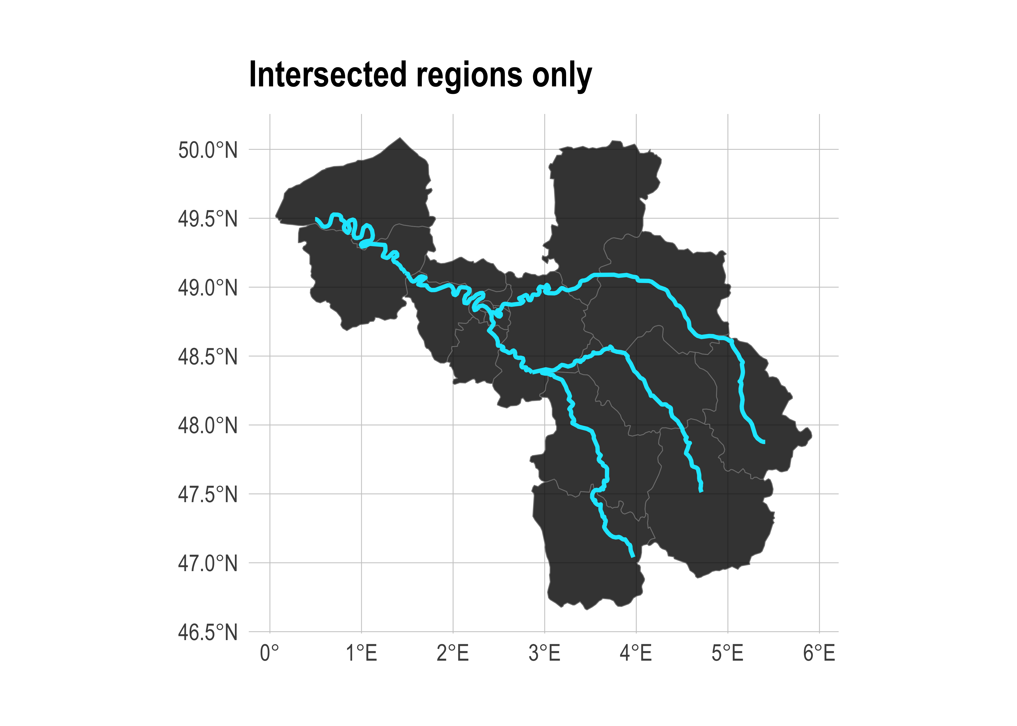
That’s about as much sf functionality as I can show you for today. The remaining part of this lecture will cover some additional mapping considerations and some bonus spatial R “swag”. However, I’ll try to slip in a few more sf-specific operations along the way.
Where to get map data
As our first North Carolina examples demonstrate, you can easily import external shapefiles, KML files, etc., into R. Just use the generic sf::st_read() function on any of these formats and the sf package will take care of the rest. However, we’ve also seen with the France example that you might not even need an external shapefile. Indeed, R provides access to a large number of base maps — e.g. countries of the world, US states and counties, etc. — through the maps, (higher resolution) mapdata and spData packages, as well as a whole ecosystem of more specialized GIS libraries.6 To convert these maps into “sf-friendly” data frame format, we can use the sf::st_as_sf() function as per the below examples.
Example 1: The World
# library(maps) ## Already loaded

world = st_as_sf(map("world", plot = FALSE, fill = TRUE))

world_map =
  ggplot(world) +
  geom_sf(fill = "grey80", col = "grey40", lwd = 0.3) +
  labs(
    title = "The world",
    subtitle = paste("EPSG:", st_crs(world)$epsg)
    )
world_map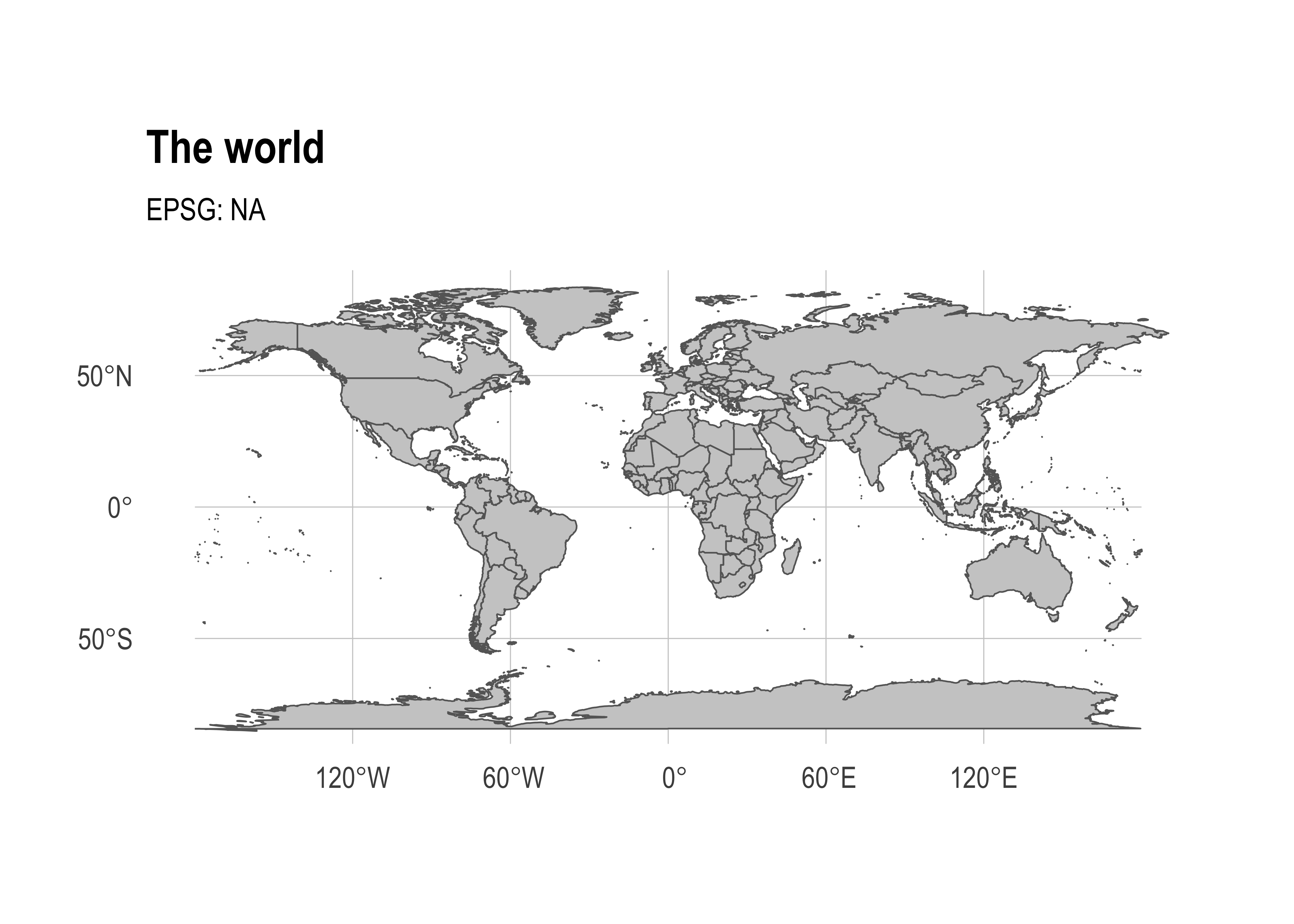
All of the usual sf functions and transformations can then be applied. For example, we can reproject the above world map onto the Lambert Azimuthal Equal Area projection (and further orientate it at the South Pole) as follows.
world_map +
  coord_sf(crs = "+proj=laea +y_0=0 +lon_0=155 +lat_0=-90") +
  labs(subtitle = "Lambert Azimuthal Equal Area projection")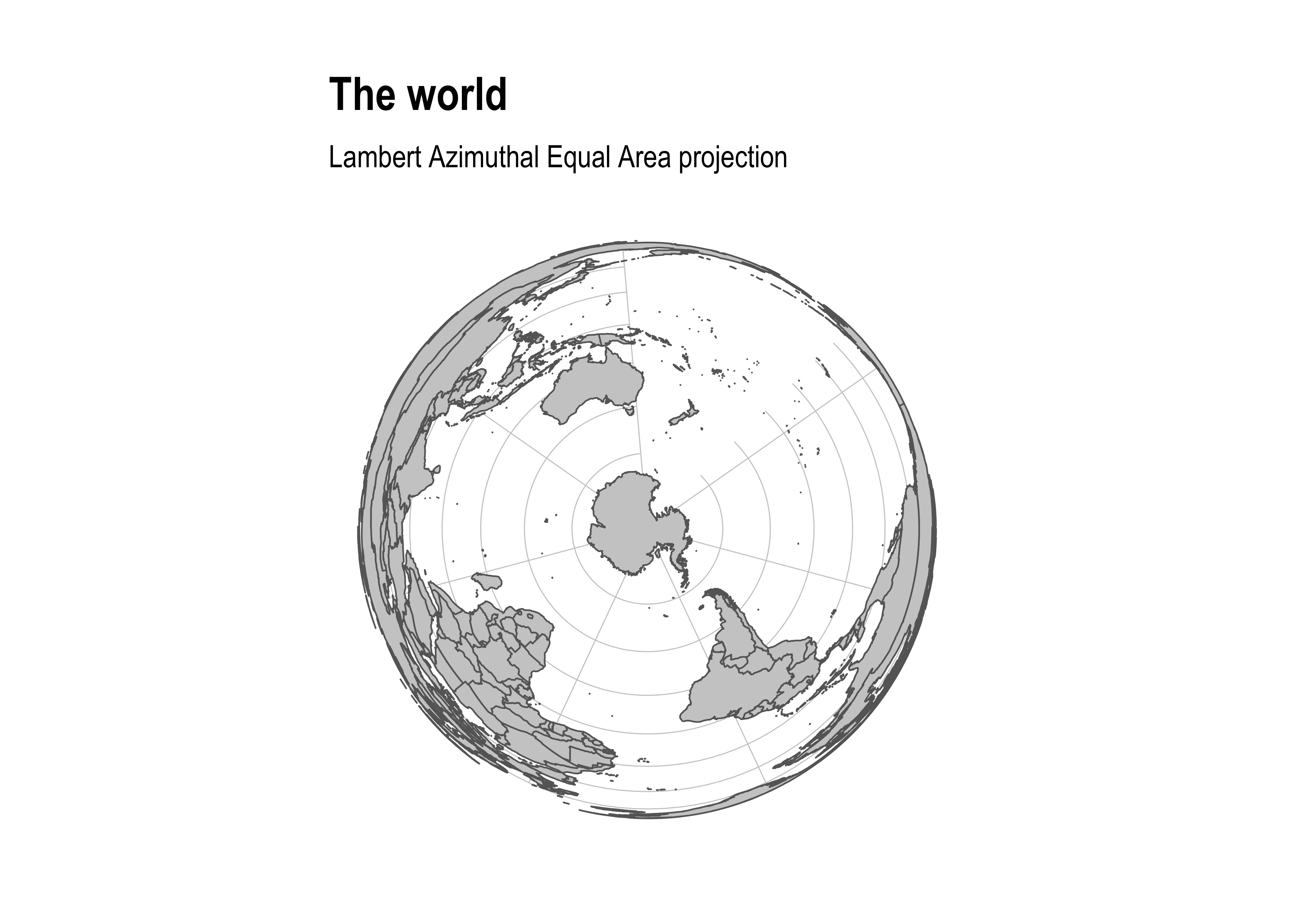
Several digressions on projection considerations
Winkel tripel projection
As we’ve already seen, most map projections work great “out of the box” with sf. One niggling and notable exception is the Winkel tripel projection. This is the preferred global map projection of National Geographic and requires a bit more work to get it to play nicely with sf and ggplot2 (as detailed in this thread). Here’s a quick example of how to do it:
# library(lwgeom) ## Already loaded

wintr_proj = "+proj=wintri +datum=WGS84 +no_defs +over"

world_wintri = lwgeom::st_transform_proj(world, crs = wintr_proj)

## Don't necessarily need a graticule, but if you do then define it manually:
gr =
  st_graticule(lat = c(-89.9,seq(-80,80,20),89.9)) %>%
  lwgeom::st_transform_proj(crs = wintr_proj)

ggplot(world_wintri) +
  geom_sf(data = gr, color = "#cccccc", size = 0.15) + ## Manual graticule
  geom_sf(fill = "grey80", col = "grey40", lwd = 0.3) +
  coord_sf(datum = NA) +
  theme_ipsum(grid = F) +
  labs(title = "The world", subtitle = "Winkel tripel projection")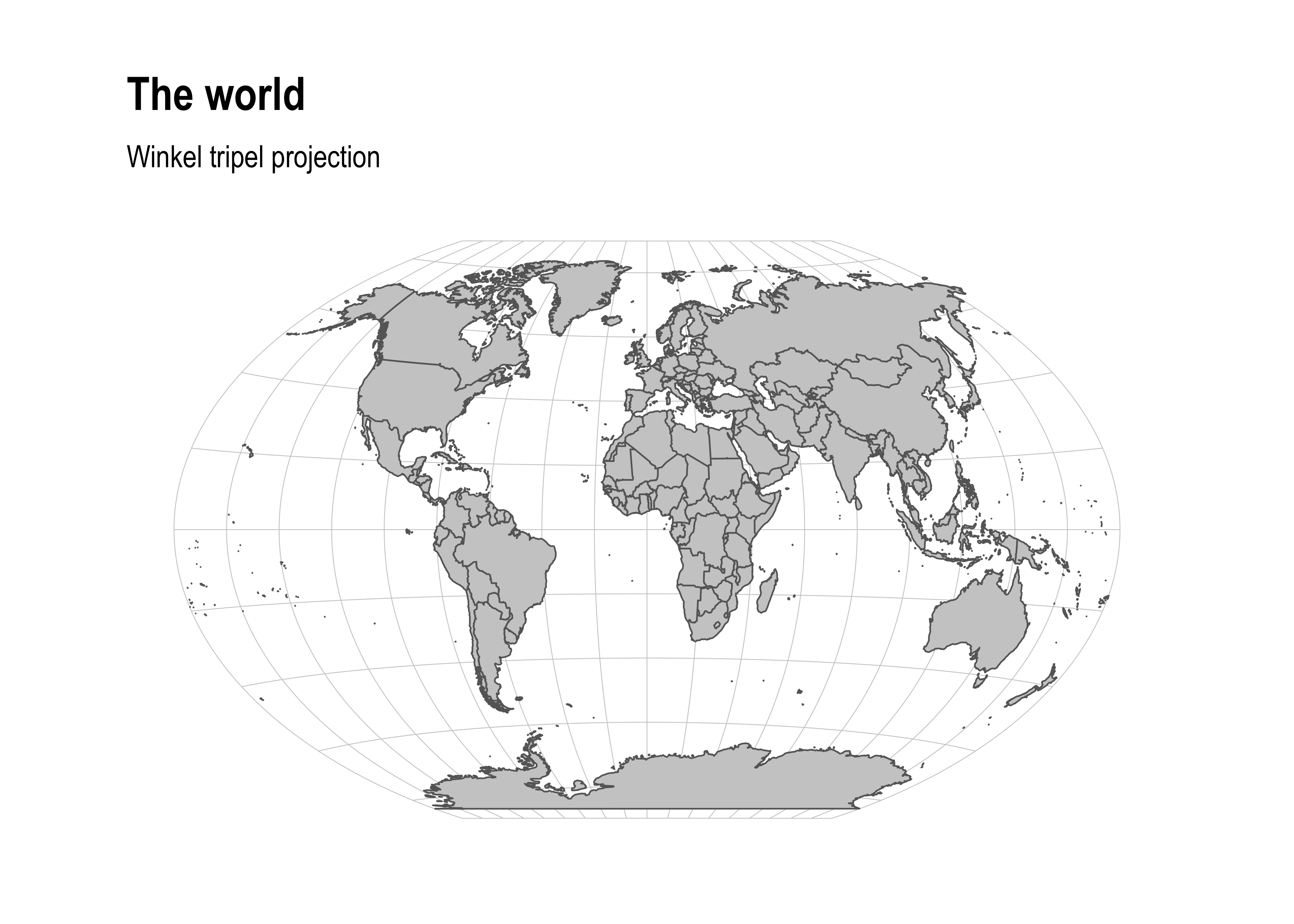
Equal Earth projection
The latest and greatest projection, however, is the “Equal Earth” projection. This does work well out of the box, in part due to the ne_countries dataset that comes bundled with the rnaturalearth package (link). I’ll explain that second part of the previous sentence in moment. But first let’s see the Equal Earth projection in action.
# library(rnaturalearth) ## Already loaded

countries =
  ne_countries(returnclass = "sf") %>%
  st_transform(8857) ## Transform to equal earth projection
  # st_transform("+proj=eqearth +wktext") ## PROJ string alternative

ggplot(countries) +
  geom_sf(fill = "grey80", col = "grey40", lwd = 0.3) +
  labs(title = "The world", subtitle = "Equal Earth projection")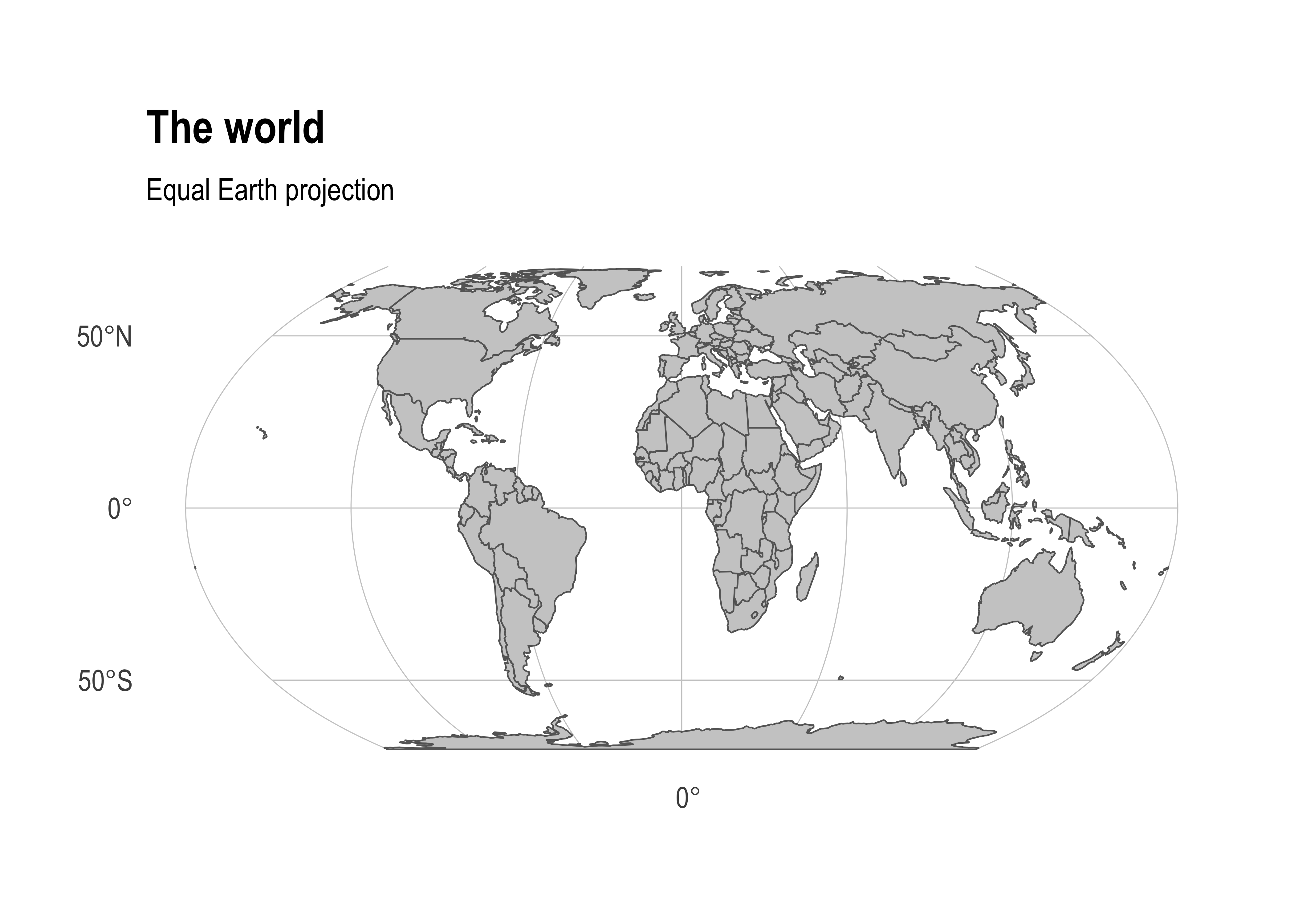
As noted, the rnaturalearth::ne_countries spatial data frame is important for correctly displaying the Equal Earth projection. On the face of it, this looks pretty similar to our maps::world spatial data frame from earlier. They both contain polygons of all the countries in the world and appear to have similar default projections. However, some underlying nuances in how those polygons are constructed allows us avoid some undesirable visual artefacts that arise when reprojecting to the Equal Earth projection. Consider:
world %>%
  st_transform(8857) %>% ## Transform to equal earth projection
  ggplot() +
  geom_sf(fill = "grey80", col = "grey40", lwd = 0.3) +
  labs(title = "The... uh, world", subtitle = "Projection fail")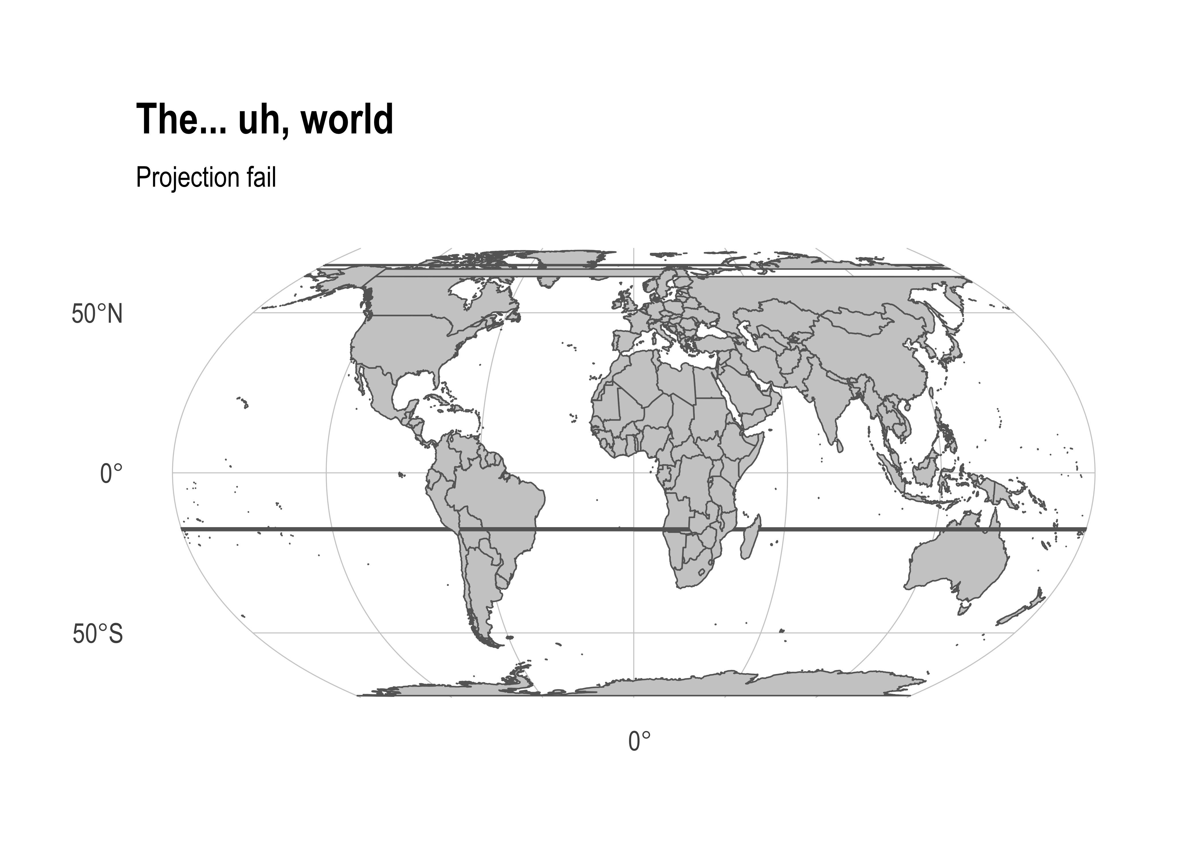
These types of visual artefacts are particularly common for Pacific-centered maps and, in that case, arise from polygons extending over the Greenwich prime meridian. It’s a suprisingly finicky problem to solve. Even the rnaturalearth doesn’t do a good job. Luckily, Nate Miller has you covered with an excellent guide to set you on the right track.
Example 2: A single country (i.e. Norway)
The maps and mapdata packages have detailed county- and province-level data for several individual nations. We’ve already seen this with France, but it includes the USA, New Zealand and several other nations. However, we can still use it to extract a specific country’s border using some intuitive syntax. For example, we could plot a base map of Norway as follows.
norway = st_as_sf(map("world", "norway", plot = FALSE, fill = TRUE))

## For a hi-resolution map (if you *really* want to see all the fjords):
# norway = st_as_sf(map("worldHires", "norway", plot = FALSE, fill = TRUE))

norway %>%
  ggplot() +
  geom_sf(fill="black", col=NA)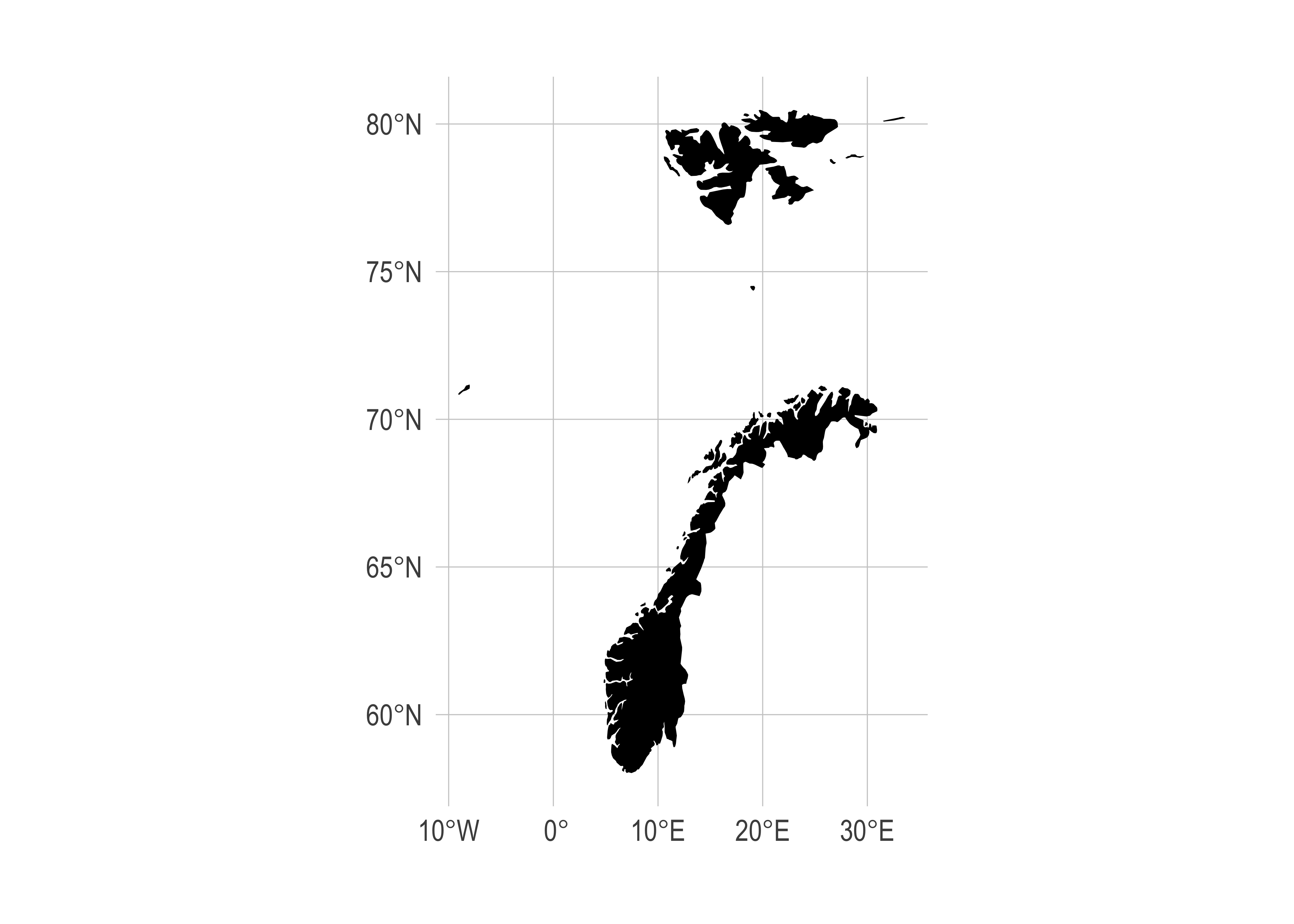
Hmmm. Looks okay, but I don’t really want to include non-mainland territories like Svalbaard (to the north) and the Faroe Islands (to the east). This gives me the chance to show off another handy function, sf::st_crop(), which I’ll use to crop our sf object to a specific extent (i.e. rectangle). While I am at, we could also improve the projection. The Norwegian Mapping Authority recommends the ETRS89 / UTM projection, for which we can easily obtain the equivalent EPSG code (i.e. 25832) from this website.
norway %>%
  st_crop(c(xmin=0, xmax=35, ymin=0, ymax=72)) %>%
  st_transform(crs = 25832) %>%
  ggplot() +
  geom_sf(fill="black", col=NA)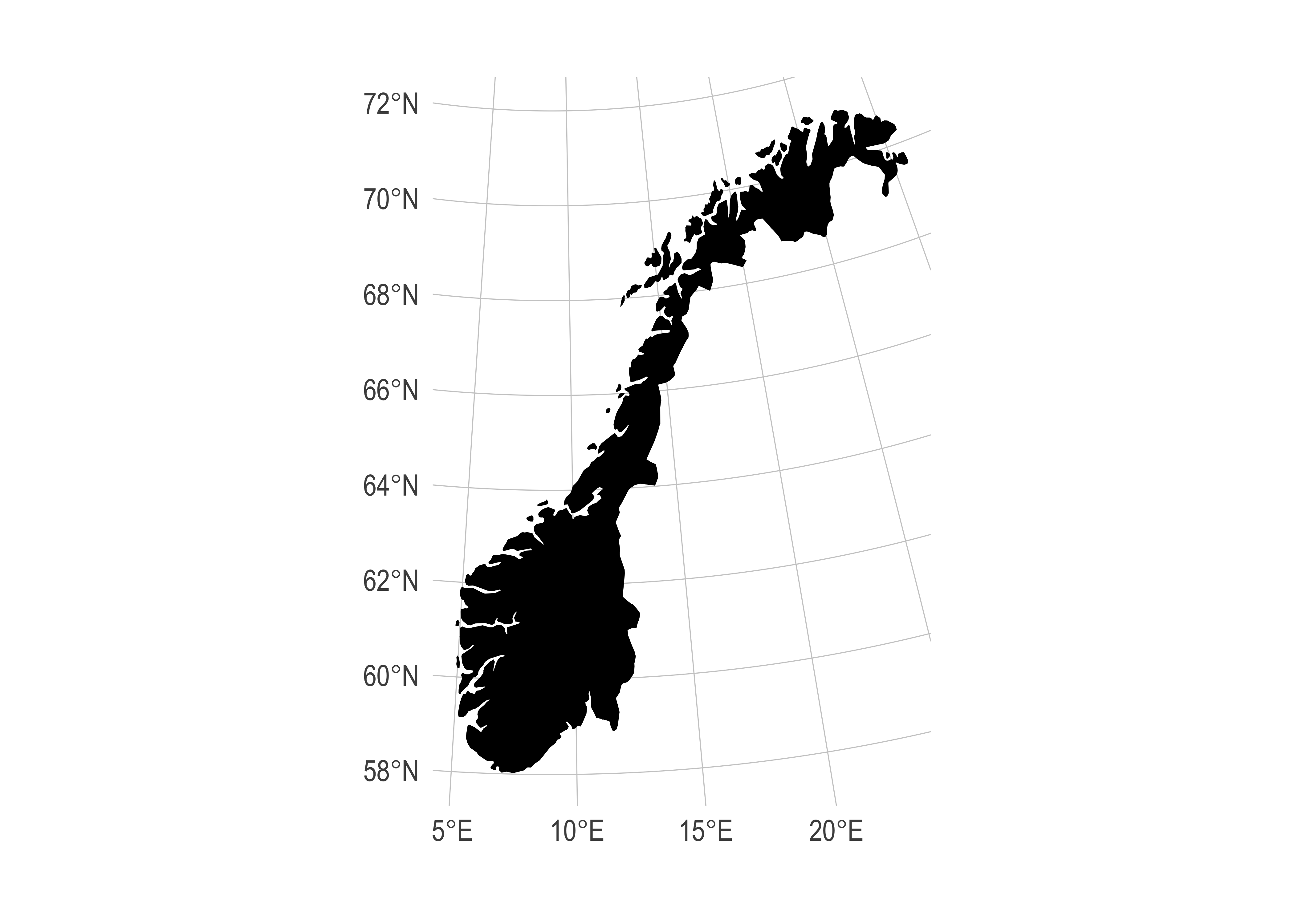
There you go. A nice-looking map of Norway. Fairly appropriate that it resembles a gnarly black metal guitar.
Aside: I recommend detaching the maps package once you’re finished using it, since it avoids potential namespace conflicts with
purrr::map.
detach(package:maps) ## To avoid potential purrr::map() conflictsFurther Examples
US Census data with tidycensus and tigris
Note: Before continuing with this section, you will first need to request an API key from the Census.
Working with Census data has traditionally quite a pain. You need to register on the website, then download data from various years or geographies separately, merge these individual files, etc. Thankfully, this too has recently become much easier thanks to the Census API and — for R at least — the tidycensus (link) and tigris (link) packages from Kyle Walker. This next section will closely follow a tutorial on his website.
We start by loading the packages and setting our Census API key. Note that I’m not actually running the below chunk, since I expect you to fill in your own Census key. You only have to run this function once.
# library(tidycensus) ## Already loaded
# library(tigris) ## Already loaded

## Replace the below with your own census API key. We'll use the "install = TRUE"
## option to save the key for future use, so we only ever have to run this once.
census_api_key("YOUR_CENSUS_API_KEY_HERE", install = TRUE)

## Also tell the tigris package to automatically cache its results to save on
## repeated downloading. I recommend adding this line to your ~/.Rprofile file
## so that caching is automatically enabled for future sessions. A quick way to
## do that is with the `usethis::edit_r_profile()` function.
options(tigris_use_cache=TRUE)
Let’s say that our goal is to provide a snapshot of Census rental estimates across different cities in the Pacific Northwest. To do this, we use the tidycensus::get_acs() function, which allows us to easily access data from the American Community Survey (ACS) directly from R. The get_acs() function lets you specify the type of geography you want (such as census tracts, counties, or states), the variables of interest (using their Census variable IDs), the states to include, and whether to return spatial geometry for mapping. In our case, we download tract-level rental data for Oregon and Washington by specifying geography = "tract", the variable ID for median gross rent ("DP04_0134"), and setting geometry = TRUE to get spatial features. Note that you’ll need to look up the correct variable ID for your topic of interest—in this case, “DP04_0134” for median rent.
rent =
  tidycensus::get_acs(
    geography = "tract", variables = "DP04_0134",
    state = c("WA", "OR"), geometry = TRUE
    )
rent
Simple feature collection with 2785 features and 5 fields (with 19 geometries empty)
Geometry type: MULTIPOLYGON
Dimension: XY
Bounding box: xmin: -124.7631 ymin: 41.99179 xmax: -116.4635 ymax: 49.00249
Geodetic CRS: NAD83
# A tibble: 2,785 × 6
GEOID NAME variable estimate moe geometry
<chr> <chr> <chr> <dbl> <dbl> <MULTIPOLYGON [°]>
1 53011042500 Census Tract 4… DP04_01… 1483 106 (((-122.6716 45.62722, -…
2 53011041206 Census Tract 4… DP04_01… 1431 396 (((-122.5804 45.63943, -…
3 53011041800 Census Tract 4… DP04_01… 1334 105 (((-122.6617 45.64505, -…
4 53011040904 Census Tract 4… DP04_01… 1451 71 (((-122.6877 45.7134, -1…
5 53003960500 Census Tract 9… DP04_01… 874 95 (((-117.0594 46.40209, -…
6 53021980100 Census Tract 9… DP04_01… NA NA (((-119.1375 46.25852, -…
7 53025010600 Census Tract 1… DP04_01… 1142 154 (((-119.8751 47.2331, -1…
8 53071920500 Census Tract 9… DP04_01… 1224 149 (((-118.3763 46.07184, -…
9 53075001000 Census Tract 1… DP04_01… 675 240 (((-118.2491 46.73414, -…
10 53075000700 Census Tract 7… DP04_01… 1005 115 (((-117.4653 47.01376, -…
# ℹ 2,775 more rowsThis returns an sf object, which we can plot directly.
rent %>%
  ggplot() +
  geom_sf(aes(fill = estimate, color = estimate)) +
  coord_sf(crs = 26910) +
  scale_fill_viridis_c(name = "Rent ($)", labels = scales::comma) +
  scale_color_viridis_c(name = "Rent ($)", labels = scales::comma) +
  labs(
    title = "Rental rates across Oregon and Washington",
    caption = "Data: US Census Bureau"
) 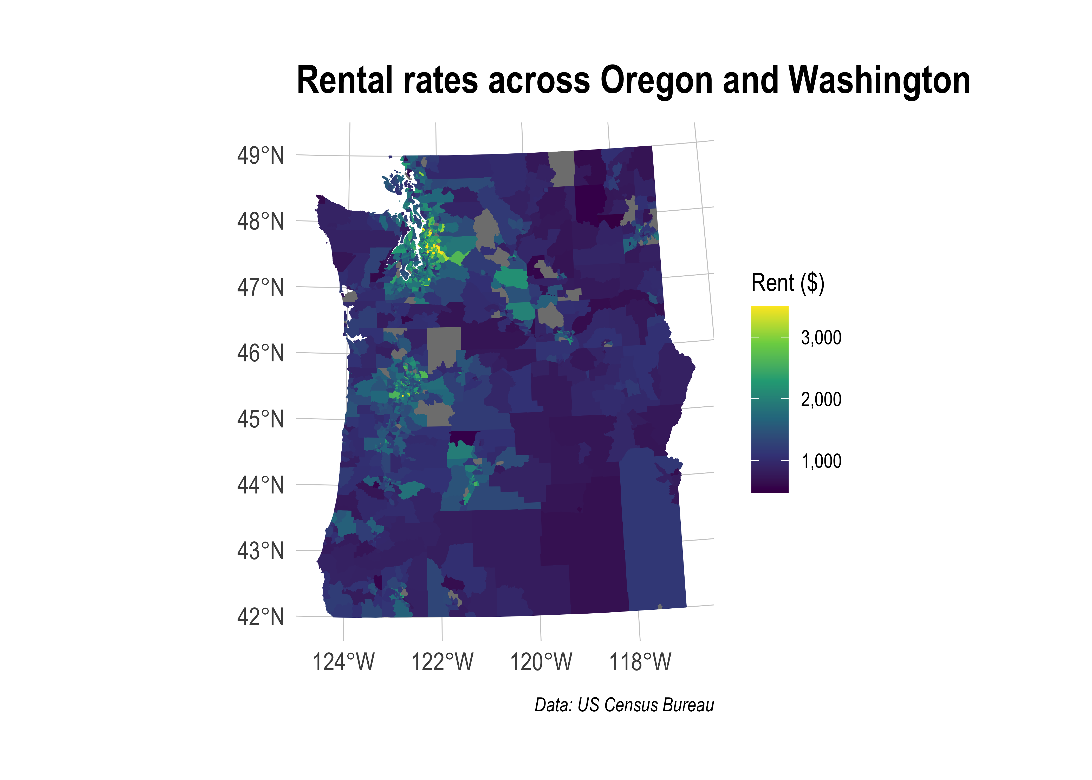
Hmmm, looks like you want to avoid renting in Seattle if possible…
The above map provides rental information for pretty much all of the Pacific Northwest. Perhaps we’re not interested in such a broad swatch of geography. What if we’d rather get a sense of rents within some smaller and well-defined metropolitan areas? Well, we’d need some detailed geographic data for starters, say from the TIGER/Line shapefiles collection. The good news is that the tigris package has you covered here. For example, let’s say we want to narrow down our focus and compare rents across three Oregon metros: Portland (and surrounds), Corvallis, and Eugene.
or_metros =
  tigris::core_based_statistical_areas(cb = TRUE) %>%
  # filter(GEOID %in% c("21660", "18700", "38900")) %>% ## Could use GEOIDs directly if you know them
  filter(grepl("Portland|Corvallis|Eugene", NAME)) %>%
  filter(grepl("OR", NAME)) %>% ## Filter out Portland in Maine
  select(metro_name = NAME)
Now we do a spatial join on our two data sets using the sf::st_join() function.
# Use GEOS engine for spatial join to avoid geometry validation issues
sf_use_s2(FALSE)
or_rent =
  st_join(
    rent,
    or_metros,
    # join = st_within: only keep features from 'rent' that are completely within 'or_metros'
    # left = FALSE: perform an inner join, keeping only matches (i.e., tracts within the selected metros)
    join = st_within, left = FALSE
    )
sf_use_s2(TRUE)  # Re-enable S2 for other operations
or_rent
Simple feature collection with 666 features and 6 fields
Geometry type: MULTIPOLYGON
Dimension: XY
Bounding box: xmin: -124.1587 ymin: 43.44001 xmax: -121.7681 ymax: 46.18897
Geodetic CRS: NAD83
# A tibble: 666 × 7
GEOID NAME variable estimate moe geometry metro_name
* <chr> <chr> <chr> <dbl> <dbl> <MULTIPOLYGON [°]> <chr>
1 530110425… Cens… DP04_01… 1483 106 (((-122.6716 45.62722, -… Portland-…
2 530110412… Cens… DP04_01… 1431 396 (((-122.5804 45.63943, -… Portland-…
3 530110418… Cens… DP04_01… 1334 105 (((-122.6617 45.64505, -… Portland-…
4 530110409… Cens… DP04_01… 1451 71 (((-122.6877 45.7134, -1… Portland-…
5 530110404… Cens… DP04_01… 1465 122 (((-122.6002 45.78026, -… Portland-…
6 530110404… Cens… DP04_01… 1368 175 (((-122.5485 45.79886, -… Portland-…
7 530110426… Cens… DP04_01… 1321 126 (((-122.668 45.62629, -1… Portland-…
8 530110405… Cens… DP04_01… 2385 536 (((-122.3322 45.5835, -1… Portland-…
9 530110423… Cens… DP04_01… 1148 85 (((-122.6871 45.64037, -… Portland-…
10 530110429… Cens… DP04_01… 1230 227 (((-122.6143 45.63259, -… Portland-…
# ℹ 656 more rowsOne useful way to summarize this data and compare across metros is with a histogram. Note that “regular” ggplot2 geoms and functions play perfectly nicely with sf objects (i.e. we aren’t limited to geom_sf()).
or_rent %>%
  ggplot(aes(x = estimate)) +
  geom_histogram() +
facet_wrap(~metro_name) 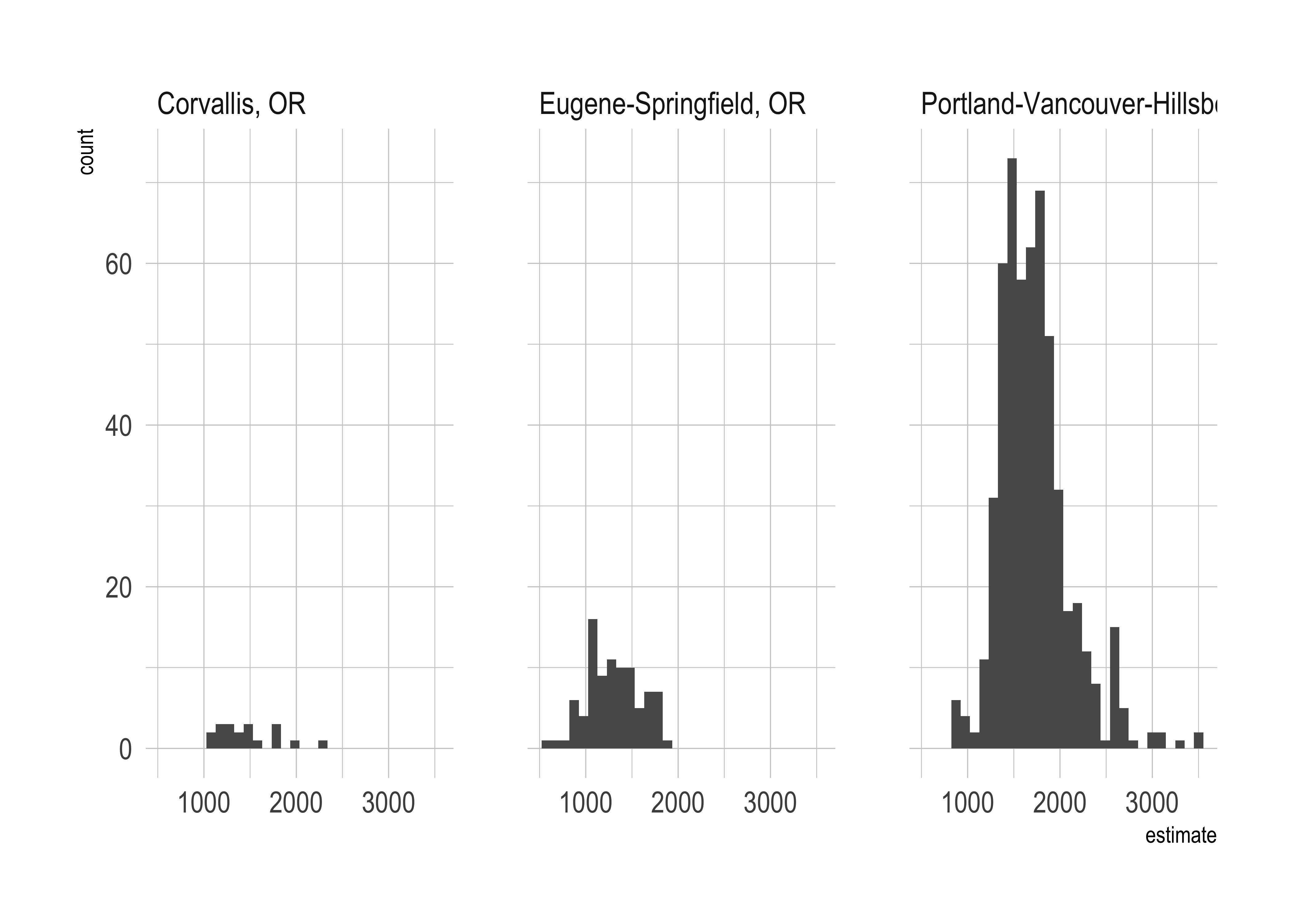
That’s a quick taste of working with tidycensus (and tigris). In truth, the package can do a lot more than I’ve shown you here. For example, you can also use it to download a variety of other Census microdata such as PUMS, which is much more detailed. See the tidycensus website for more information.
Rural-to-urban migration in China
Suppose we study how agricultural productivity affects rural-to-urban migration in a Chinese context, and we apply an algorithm that clusters villages based on the validity of intrumental variables. We want to visualize the spatial distribution of the clusters with the rural-to-urban migration rate.
load("./data/china_map_dt.Rdata")
print(dt_plot)
# A tibble: 79 × 5
id longitude latitude migrant_worker_ratio group
<dbl> <dbl> <dbl> <dbl> <fct>
1 2106 125. 41.9 0.0204 SPI only
2 2109 123. 40.8 0.0609 SPI only
3 2110 121. 42.4 0.0152 No Valid IV
4 2205 125. 43.0 0.231 SPI only
5 2206 126. 41.0 0.224 SPI only
6 2207 129. 42.8 0.603 No Valid IV
7 3104 121. 31.7 0 SPI only
8 3105 121. 30.8 0.163 SPI and Fertilizer
9 3201 119. 33.9 0.481 SPI only
10 3202 119. 33.9 0.486 SPI only
# ℹ 69 more rowsNow the position of each village in described by its longitude and latitude. We can plot the map of China and the villages with the rural-to-urban migration rate.
library(ggplot2)
library(rnaturalearth)
library(rnaturalearthdata)
library(sf)


# Load the map of China using rnaturalearth
china_map <- ne_countries(country = "China", continent = "Asia", type = "countries", returnclass = "sf")

# Load province boundaries for China
china_provinces <- ne_states(country = "China", returnclass = "sf")

# Plot the map with ggplot2
ggplot() +
  geom_sf(data = china_map, fill = "#f9f9f9", color = "black") +
  geom_sf(data = china_provinces, fill = NA, color = "darkgrey") +
  geom_point(data = dt_plot, aes(x = longitude, y = latitude, size = migrant_worker_ratio, color = group), alpha = 0.6) +
  scale_size_continuous(range = c(1, 3), name = "Migration Rate") +
  scale_color_manual(values = c("No Valid IV" = "#d55e00", "SPI and Fertilizer" = "#0072b2", "SPI only" = "#009E73"), name = "Group") +
  guides(color = guide_legend(override.aes = list(size = 5))) + # Making the circles in the color legend larger
  theme_minimal() +
  theme(
    panel.grid = element_blank(),
    axis.title = element_blank(),
    axis.text = element_blank(),
    axis.ticks = element_blank(),
    legend.position = c(0.925, 0.35), # Positioning the legend near Shanghai
    legend.text = element_text(size = 12) # Making the font size in the legend a little larger
  ) +
  coord_sf()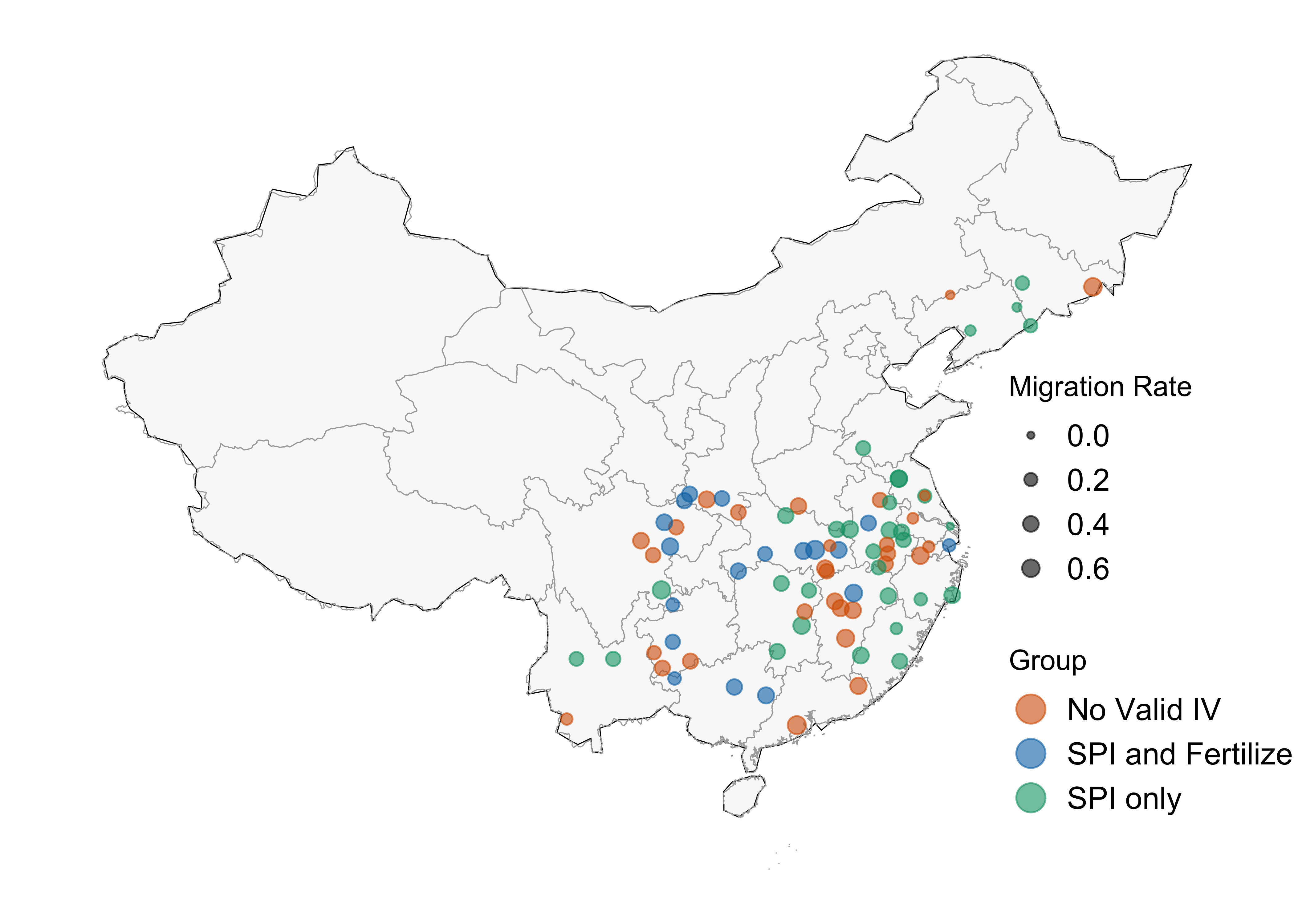
Covid Lockdown in US Counties
load("./data/counties_treated.Rdata")
print(counties_treated)
# A tibble: 1,927 × 5
county_name state lock_fips first_treated_date first_treated_date_int
<chr> <chr> <int> <date> <dbl>
1 abbeville south caroli… 45001 2020-02-01 32
2 acadia louisiana 22001 2020-02-01 32
3 accomack virginia 51001 2020-02-01 32
4 ada idaho 16001 2020-02-01 32
5 adair iowa 19001 2020-02-01 32
6 adair missouri 29001 2020-02-01 32
7 adair oklahoma 40001 2020-02-01 32
8 adams illinois 17001 2020-02-01 32
9 adams indiana 18001 2020-02-01 32
10 adams mississippi 28001 2020-02-01 32
# ℹ 1,917 more rowsThis processed data contains information on the date of lockdown for each county. We can plot the map of the US and the counties with the date of lockdown.
library(viridis)
library(sf)
# Install and load tigris package for county map data
if (!requireNamespace("tigris", quietly = TRUE)) {
  install.packages("tigris")
}
library(tigris)
library(ggrepel) # For better label placement if needed
options(tigris_use_cache = TRUE)

# Get US counties shapefile
counties_sf <- counties(cb = TRUE)
Retrieving data for the year 2024# Format FIPS codes for joining
counties_sf <- counties_sf %>%
mutate(lock_fips = as.integer(GEOID))
# Filter out Alaska (02), Hawaii (15), and territories if desired
# This focuses on the continental US (lower 48 states)
counties_sf_continental <- counties_sf %>%
filter(!substr(STATEFP, 1, 2) %in% c("02", "15", "60", "66", "69", "72", "78"))
# Join the data
counties_map_data <- counties_sf_continental %>%
left_join(counties_treated, by = "lock_fips")
# Ensure first_treated_date is Date type for plotting
counties_map_data <- counties_map_data %>%
mutate(first_treated_date = as.Date(first_treated_date))
# Create the map with improved sizing focused on continental US
p_map_date <- ggplot() +
# Base layer with all continental US counties
geom_sf(data = counties_sf_continental,
fill = "lightgray",
color = "white",
size = 0.1) +
# Treated counties layer
geom_sf(data = counties_map_data %>% filter(!is.na(first_treated_date)),
aes(fill = first_treated_date),
color = "white",
size = 0.1) +
# Use a proper projection for US maps
coord_sf(crs = 5070) + # Albers equal-area projection for US
# Color scale: use scale_fill_viridis_d for discrete, or scale_fill_viridis_c for continuous
scale_fill_viridis_c(
name = "Treatment Date",
option = "plasma",
direction = 1,
guide = guide_colorbar(
title.position = "top",
barwidth = 15,
barheight = 0.3,
title.hjust = 0.5
),
# Show date labels on the colorbar
labels = function(x) format(as.Date(x, origin = "2020-01-31"), "%Y-%m-%d")
) +
# Labels and theme
# labs(
# title = "US Counties by First Treatment Date",
# subtitle = "Counties colored by order of treatment (lighter = earlier)"
# ) +
theme_minimal() +
theme(
plot.title = element_text(size = 12, face = "bold"),
plot.subtitle = element_text(size = 10),
legend.position = "bottom",
legend.title = element_text(size = 9),
legend.text = element_text(size = 8),
legend.key.width = unit(1.5, "cm"),
legend.key.height = unit(0.3, "cm"),
legend.box.margin = margin(t = 0, r = 0, b = 0, l = 0),
axis.text = element_blank(),
axis.ticks = element_blank(),
panel.grid = element_blank(),
plot.margin = margin(t = 5, r = 5, b = 5, l = 5)
)
print(p_map_date)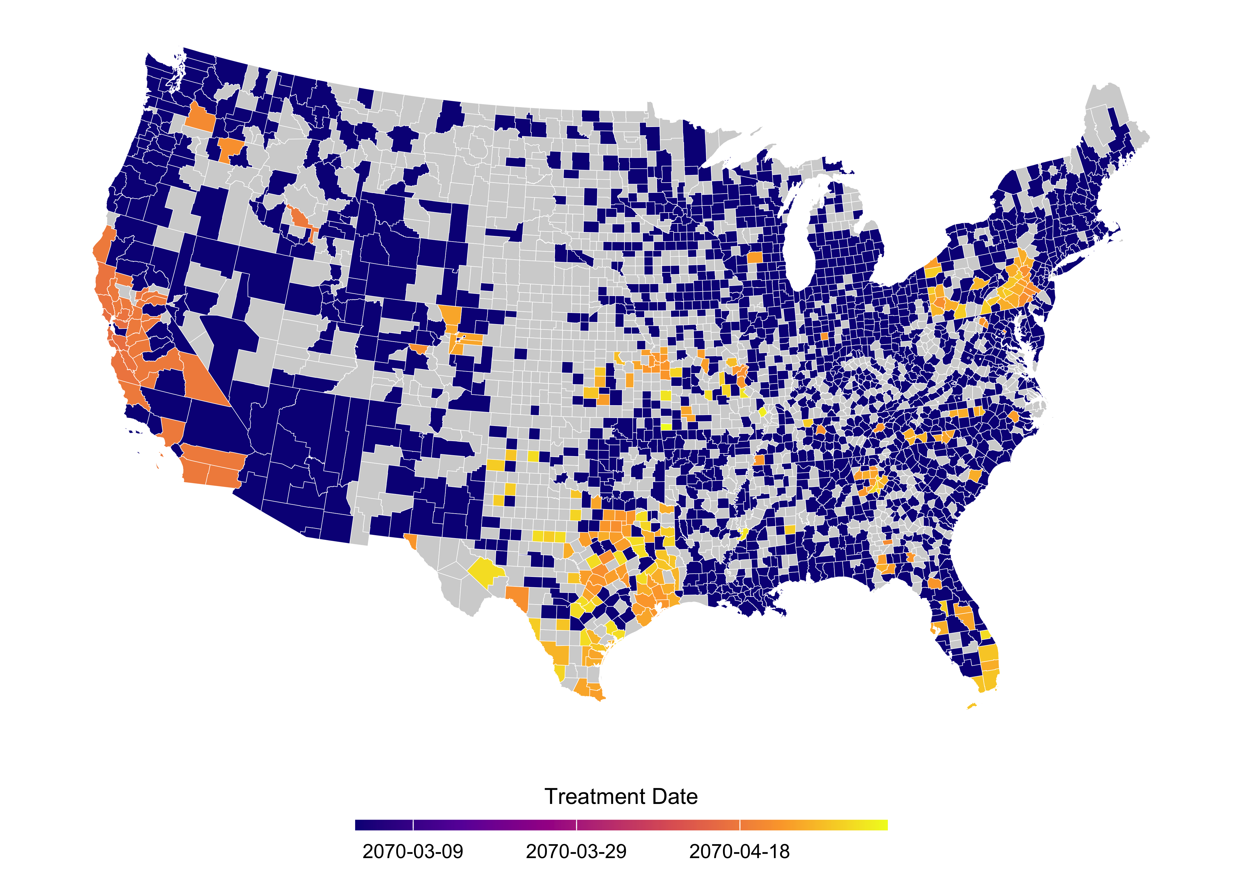
Further reading
You could easily spend a whole semester (or degree!) on spatial analysis and, more broadly, geocomputation. I’ve simply tried to give you as much useful information as can reasonably be contained in one lecture. Here are some resources for further reading and study:
- The package websites that I’ve linked to throughout this tutorial are an obvious next port of call for delving deeper into their functionality: sf, etc.
- The best overall resource right now may be Geocomputation with R, a superb new text by Robin Lovelace, Jakub Nowosad, and Jannes Muenchow. This is a “living”, open-source document, which is constantly updated by its authors and features a very modern approach to working with geographic data. Highly recommended.
- For interactive map plotting, I recommend the leaflet package, which is a wrapper for the JavaScript library leaflet.js. You can find a tutorial here, and some examples here.
- Similarly, the rockstar team behind sf, Edzer Pebesma and Roger Bivand, are busy writing their own book, Spatial Data Science. This project is currently less developed, but I expect it to become the key reference point in years to come. Imporantly, both of the above books cover raster-based spatial data.
- On the subject of raster data… If you’re in the market for shorter guides, Jamie Afflerbach has a great introduction to rasters here. At a slightly more advanced level, UO’s very own Ed Rubin has typically excellent tutorial here. Finally, the sf team is busy developing a new package called stars, which will provide equivalent functionality (among other things) for raster data. UPDATE: I ended up caving and wrote up a short set of bonus notes on rasters here.
- If you want more advice on drawing maps, including a bunch that we didn’t cover today (choropleths, state-bins, etc.), Kieran Healy’s Data Vizualisation book has you covered.
- Something else we didn’t really cover at all today was spatial statistics. This too could be subject to a degree-length treatment. However, for now I’ll simply point you to Spatio-Temporal Statistics with R, by Christopher Wikle and coauthors. (Another free book!) Finally, since it is likely the most interesting thing for economists working with spatial data, I’ll also add that Darin Christensen and Thiemo Fetzer have written a very fast R-implementation (via C++) of Conley standard errors. The GitHub repo is here. See their original blog post (and update) for more details.
Footnotes
See the first of the excellent sf vignettes for more details.↩︎
I rather wish they’d gone with a
sf_prefix myself — or at least created aliases for it — but the package developers are apparently following standard naming conventions from PostGIS.↩︎For example, we could print out the coordinates needed to plot the first element in our data frame, Ashe county, by typing
nc$geometry[[1]]. In contrast, I invite you to see how complicated the structure of a traditional spatial object is by running, say,str(as(nc, "Spatial")).↩︎Plotting sf objects with the base
plotfunction is generally faster. However, I feel that you give up a lot of control and intuition by moving away from the layered, “graphics of grammar” approach of ggplot2.↩︎In case you’re wondering: the newer
tidyr::pivot_*functions do not yet work with sf objects.↩︎The list of specialised maps packages is far too long for me to cover here. You can get marine regions, protected areas, nightlights, …, etc., etc.↩︎