set.seed(0)ECON 4370 / 6370 Computing for Economics
Lecture 9: Bootstrap and Resampling Methods
- We’ll review some concepts from sampling theory:
- Population vs. sample
- law of large numbers
- central limit theorem
- estimates and confidence intervals (CIs)
- We’ll also introduce the bootstrap
- resampling technique which we’ll use to form CIs
- helps to introduce other resampling techniques, such as cross-validation, which we’ll see later
Population vs. Sample
One of the most fundamental concepts of statistics is the distinction between population and sample.
A population is a large pool of units (say individuals, counties, states, etc.) we wish to learn something about.
- E.g. proportion of US citizens that support a particular presidential candidate.
Due to resource constraints, the econometrician only has access to a random subsample of units. She hopes to use the sample to learn about the population.
- E.g. survey of potential voters and the candidates they support. Estimate the proportion above using the fraction of supporters from the survey.
We model the population as a probability distribution, and our sample as drawing from this distribution.
Why do we bother with the abstract concept of a population? It allows us to use the language of probability theory to …
… compare procedures (e.g. LASSO vs CART)
… assess uncertainty about predictions.
Sometimes, the “population” isn’t a literal population of individuals (what is the population when we draw a time series of US GDP?).
- Conceptual questions about what we mean by a population can be important, but we won’t worry about them for the purpose of this class.
Every object we encounter in class is either a population or sample object. It is critical to understand which.
Sample objects are stuff we see directly in the data, e.g. average, proportion, histogram, model estimate.
Population objects are stuff we never see but about which we may wish to learn, e.g. expectation, probability, density or mass function, model parameter.
Sampling Illustration in R
- We’ll be using pseudo-random number generators. For reproducibility, we first set the seed:
- Consider the amount of money an Amazon customer spends each time they begin filling their shopping basket. Suppose spending in the population of Amazon customers follows an exponential distribution. That distribution, or precisely its probability density function, looks like this:
x <- seq(0, 10, length.out = 1000)
df <- data.frame(x = x, y = dexp(x))
ggplot(df, aes(x = x, y = y)) +
  geom_line() +
  labs(title = "Exponential Distribution Density Function",
       x = "Value (in tens of dollars)",
       y = "Density") +
  theme_minimal()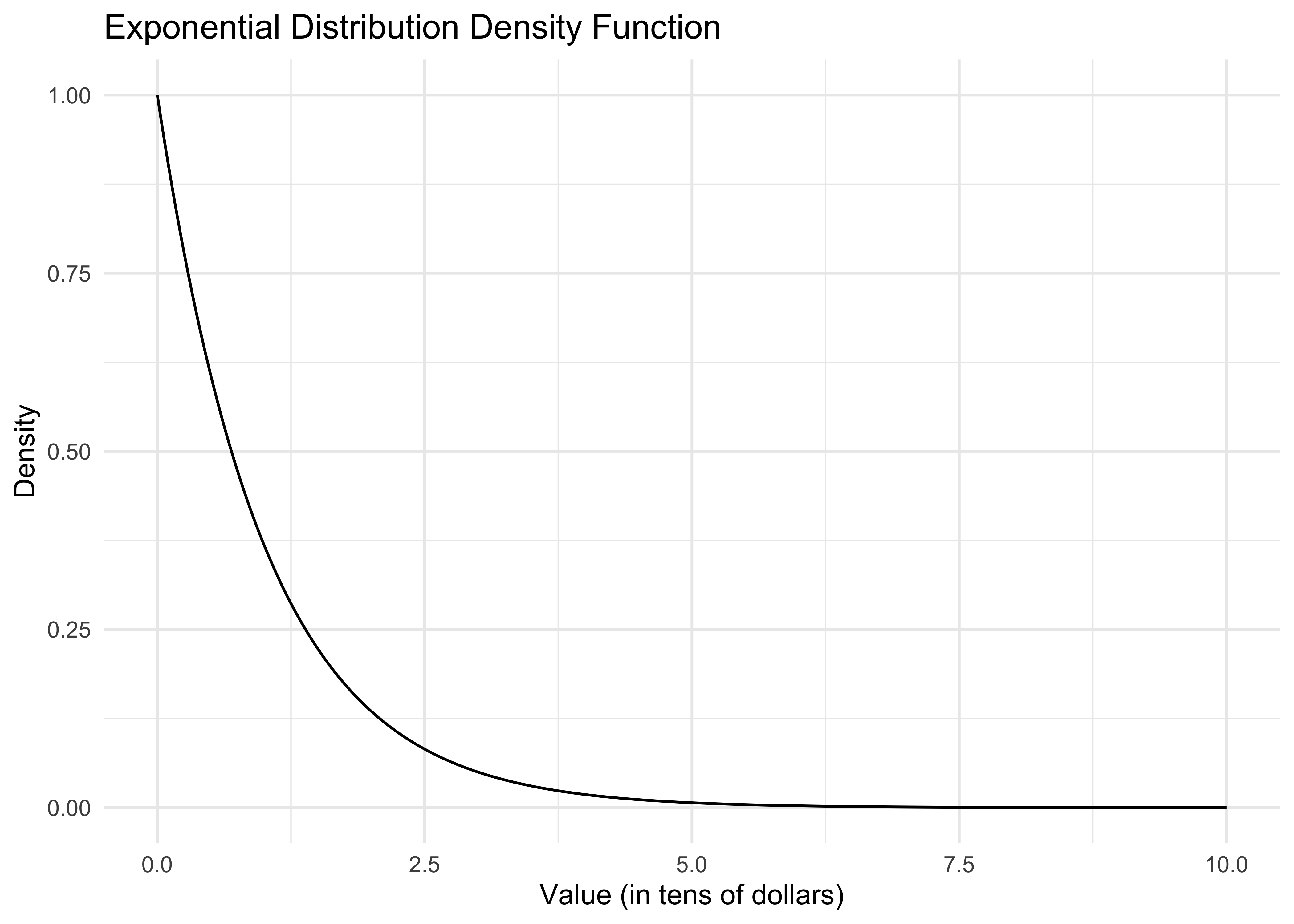
dexp()is the exponential density function. The curve() command plots this function from 0 to 10.Let’s say the x-axis is in tens of dollars. What is the economic meaning of this curve? That most people spend very little. The area under the curve from 0 to 1 can be interpreted either as the population proportion of people who spend at most $10 or the probability that a random Amazon customer spends at most $10.
How do we actually compute this area? It’s easiest to use the cumulative distribution function pexp(). In particular, pexp(x) gives the probability that a customer spends at most x*10 dollars (remember the x-axis is in tens of dollars). So then our desired probability is
pexp(1) - pexp(0)[1] 0.6321206Again, in economic terms, what does this number mean? Is it a population or sample quantity?
As the econometrician, we don’t get to know this distribution. Now, in reality, Amazon might have a very good idea about what this distribution is, depending on how much transaction data they store, but usually we can only hope to get a random sample from this distribution. Here’s how we can do this on the computer:
n <- 20
sample <- rexp(n)
sample
[1] 0.1840366 0.1457067 0.1397953 0.4360686 2.8949685 1.2295621 0.5396828
[8] 0.9565675 0.1470460 1.3907351 0.7620299 1.2376036 4.4239342 1.0545432
[15] 1.0352439 1.8760352 0.6547466 0.3369335 0.5884797 2.3645153This draws a random sample of 20 customers from our fictitious population.
As an aside, all of these commands have been specific to the exponential distribution, but you can look up many other distributions available in R. For example, corresponding functions for the normal distribution are dnorm(), pnorm(), and rnorm().
Let’s look at the sample distribution of spending.
df_hist <- data.frame(sample = sample)
ggplot(df_hist, aes(x = sample)) +
  geom_histogram(aes(y = ..density..), bins = 20, alpha = 0.7, fill = "lightblue", color = "black") +
  xlim(0, 10) + ylim(0, 1) +
  labs(title = "Sample Distribution of Spending",
       x = "Spending (in tens of dollars)",
       y = "Density") +
  theme_minimal()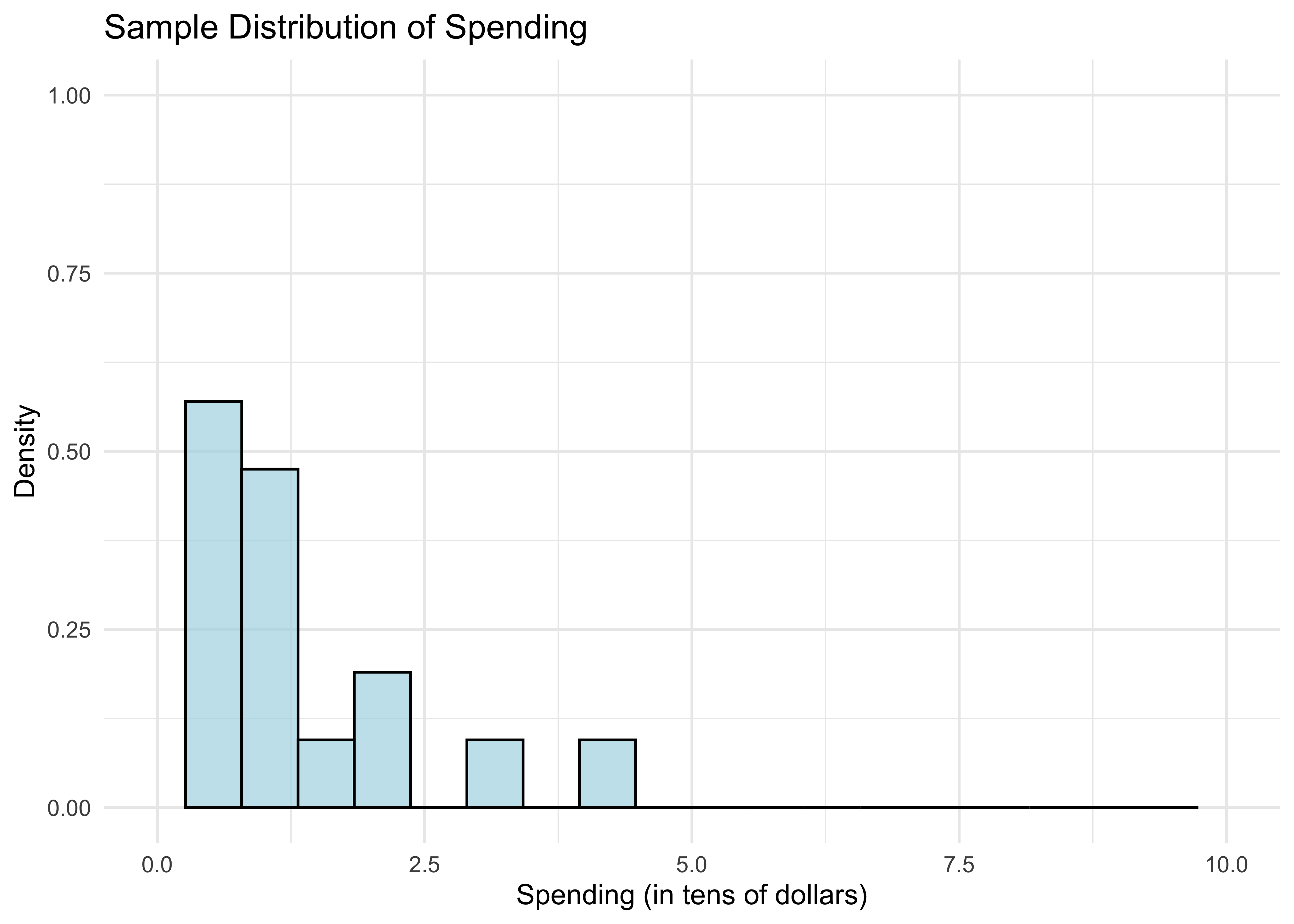
- What do the bars between 0 and 1 tell us? The area under the bars is just the fraction of customers who spend less than $10. We can compute this as follows.
mean(sample <= 1)[1] 0.55Is this a surprising number? It’s a little bit far from the population proportion calculated previously.
Of course, if we simply want the mean of the sample, we just use
mean(sample)[1] 1.119912If you remember back from your intro to probability course, the expectation of the standard exponential distribution is 1. This happens not to be too far off, unlike the fraction above.
Let’s overlay the population distribution (density function).
xgrid <- seq(0,10,length=1000)
df_hist <- data.frame(sample = sample)
df_curve <- data.frame(x = xgrid, y = dexp(xgrid))

ggplot(df_hist, aes(x = sample)) +
  geom_histogram(aes(y = ..density..), bins = 20, alpha = 0.7, fill = "lightblue", color = "black") +
  geom_line(data = df_curve, aes(x = x, y = y), color = "red", size = 1) +
  xlim(0, 10) + ylim(0, 1) +
  labs(title = "Sample Distribution vs Population Distribution",
       x = "Spending (in tens of dollars)",
       y = "Density") +
  theme_minimal()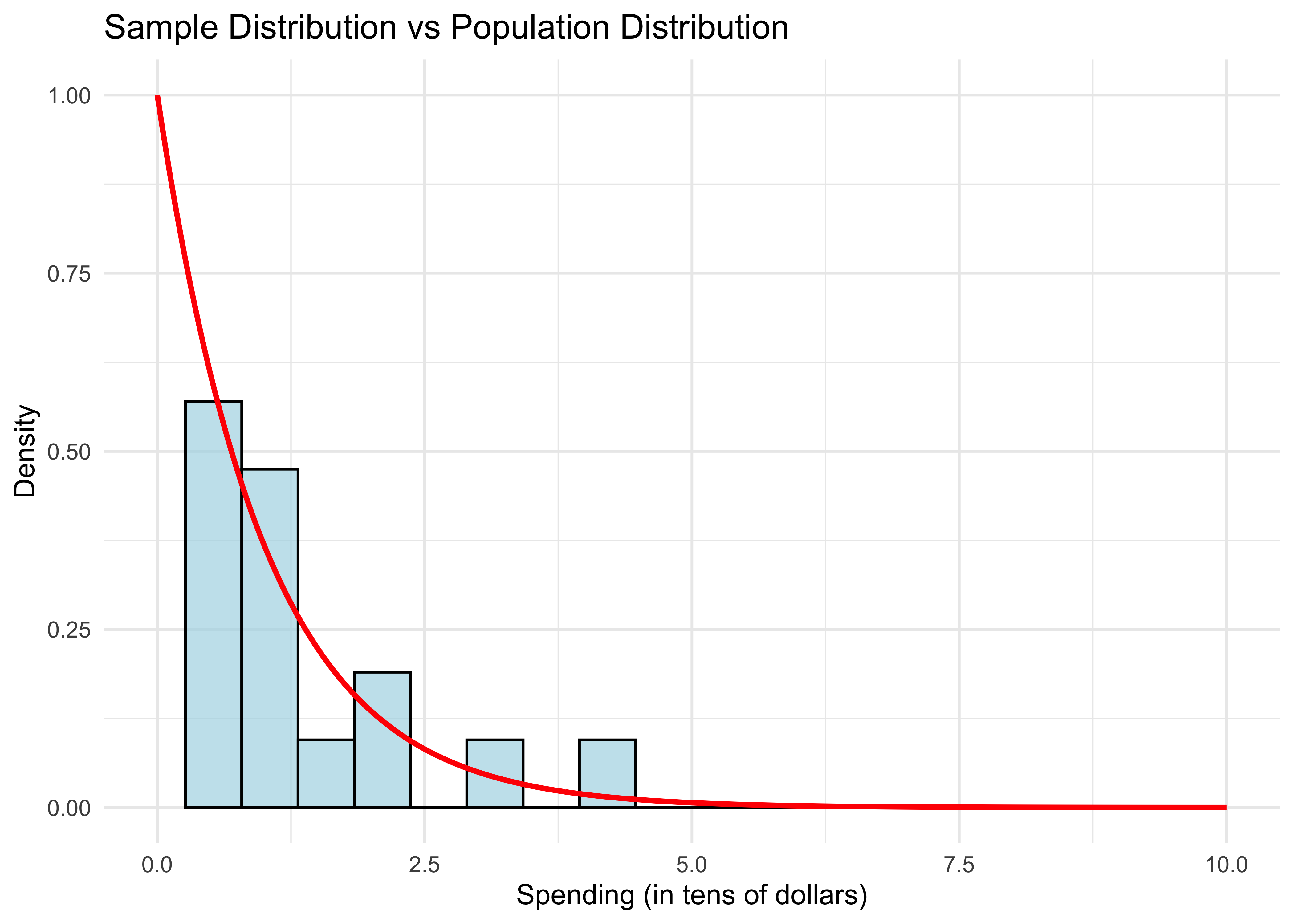
- The sample distribution doesn’t resemble the population distribution much, either. Let’s repeat this experiment with larger samples.
sample_sizes <- c(20, 100, 500, 2500)
plots <- list()

for (i in 1:length(sample_sizes)) {
  n <- sample_sizes[i]
  sample <- rexp(n)

  # Create data frames
  df_hist <- data.frame(sample = sample)
  xgrid <- seq(0, 10, length = 1000)
  df_curve <- data.frame(x = xgrid, y = dexp(xgrid))

  # Create plot
  p <- ggplot(df_hist, aes(x = sample)) +
    geom_histogram(aes(y = ..density..), bins = 20, alpha = 0.7, fill = "lightblue", color = "black") +
    geom_line(data = df_curve, aes(x = x, y = y), color = "red", size = 1) +
    xlim(0, 10) + ylim(0, 1) +
    labs(title = paste("n =", n),
         x = "Spending (in tens of dollars)",
         y = "Density") +
    theme_minimal()

  plots[[i]] <- p

  # Print statistics
  cat("For n =", n, ", the fraction is", mean(sample <= 1), ", and the mean is", mean(sample), ".\n")
}
For n = 20 , the fraction is 0.7 , and the mean is 0.7905918 .
For n = 100 , the fraction is 0.61 , and the mean is 0.9758502 .
For n = 500 , the fraction is 0.614 , and the mean is 1.002126 .
For n = 2500 , the fraction is 0.6168 , and the mean is 1.039559 .# Arrange plots in a 2x2 grid
grid.arrange(grobs = plots, ncol = 2)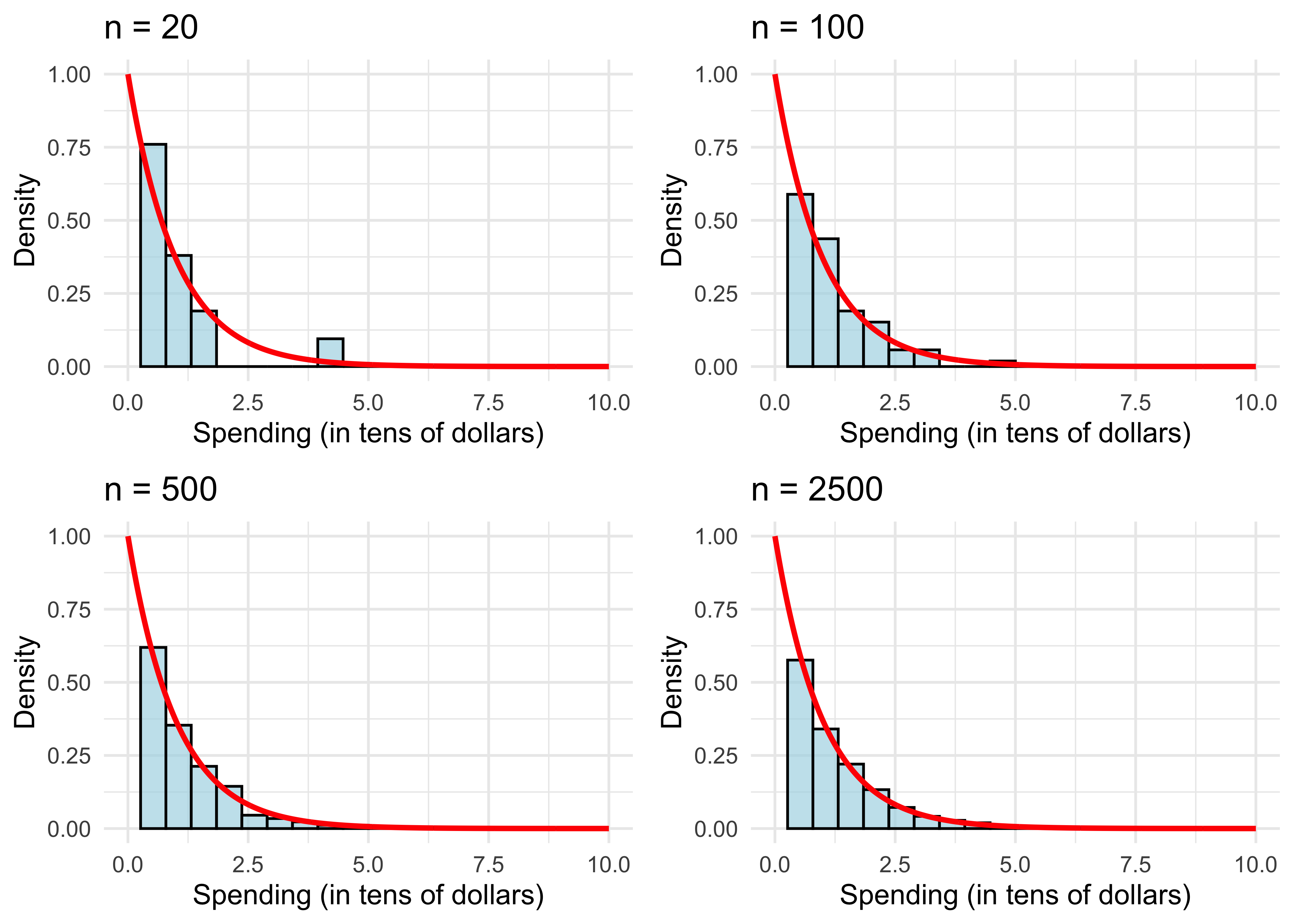
The sample distribution resembles the population more and more as \(n\) gets large.
We can also see this with the sample mean (also evaluated in the code above). It get’s closer to the population mean.
What explains the results? This is simply the law of large numbers (LLN) at work, which we will review next.
To recap, we see the distinction between sample objects (fractions and histograms) and population objects (probabilities and densities). Again, in the real world we don’t get to see or compute the latter like we just did in R. However, the LLN (which we’ll review shortly), tells us that we can get pretty close to population objects if we compute their sample analogs using a large enough random sample.
Law of Large Numbers
We mathematically represent a random sample as \(n\) independent draws from a probability distribution, denoted \[\{X_i\}_{i=1}^n = \{X_1, \dots, X_n\}.\]
The sample mean is \[\bar{X} = \frac{1}{n} \sum_{i=1}^n X_i.\]
Denote an arbitrary random draw from the distribution by \(X\). Its expected value \({\bf E}[X]\) is just the average of \(X\) in the population. E.g. for the exponential distribution, \({\bf E}[X]=1\).
The law of large numbers (LLN) says that as \(n\) gets large, \[\bar{X} \approx {\bf E}[X].\]
We can prove the LLN by calculating the expectation and variance of \(\bar{X}\). For the former,
\[\begin{aligned} {\bf E}[\bar{X}] &= {\bf E}\left[\frac{1}{n} \sum_{i=1}^n X_i\right] = \frac{1}{n} \sum_{i=1}^n {\bf E}[X_i] \\ &= \frac{1}{n} \sum_{i=1}^n {\bf E}[X] = {\bf E}[X]. \end{aligned}\]The previous derivation used the special property of the expectation that you can interchange it with sums or averages.
Let’s be clear about what \({\bf E}[\bar{X}]\) means.
If we draw a random sample of size \(n\) once, we get one \(\bar{X}\).
If we repeat this \(B\) times, we have \(B\) separate draws of \(\bar{X}\).
If we repeat this many, many times and average over all of our draws of \(\bar{X}\), the result will be \({\bf E}[\bar{X}]\).
As we saw from the R code, a single draw of \(\bar{X}\) is not necessarily close to \({\bf E}[X]\) when \(n\) is small. Instead, the value of \(\bar{X}\) fluctuates around \({\bf E}[X]\). How much it fluctuates is measured by its variance.
Recall that \(\text{Var}(X) = {\bf E}[(X - {\bf E}[X])^2]\).
Let’s calculate the variance of our average:
\[\begin{aligned} \text{Var}(\bar{X}) &= \text{Var}\left( \frac{1}{n} \sum_{i=1}^n X_i \right) = \frac{1}{n^2} \text{Var}\left( \sum_{i=1}^n X_i \right) \\ &= \frac{1}{n^2} \sum_{i=1}^n \text{Var}\left( X_i \right) = \frac{1}{n} \text{Var}(X). \end{aligned}\]Here we used the property that if \(\{X_i\}_{i=1}^n\) are independent, then \(\text{Var}(\sum_{i=1}^n X_i) = \sum_{i=1}^n \text{Var}(X_i)\).
Using this derivation, what happens to \(\text{Var}(\bar{X})\) as \(n\) gets larger? What does this tell you about the value of \(\bar{X}\) as \(n\) gets larger?
To recap, we have shown that the typical value of \(\bar{X}\) is \({\bf E}[X]\) (because \({\bf E}[\bar{X}] = {\bf E}[X]\)) and its variance shrinks with \(n\) (because \(\text{Var}(\bar{X}) = n^{-1} \text{Var}(X)\)), which implies \(\bar{X} \approx {\bf E}[X]\).
Why do we care? Because it says that if we want to learn about the expectation of some population distribution, like the average amount spent by a typical Amazon customer, we can do very well with a large random sample.
Central Limit Theorem
The central limit theorem (CLT) tells us even more about the behavior of \(\bar{X}\) in large samples, namely its population distribution.
By now we should understand the population distribution of \(X\). In the Amazon example, \(X\) corresponds to monitoring a random Amazon user that just added items to her basket and recording the purchase total.
If we monitor the universe of Amazon users in this way, the histogram of their totals is the population distribution of \(X\).
Like \(X\), \(\bar{X}\) is a random variable and thus has its own population distribution. How do we think of this?
It’s similar to how we generated \({\bf E}[\bar{X}]\).
If we draw a random sample of size \(n\) once, we get one \(\bar{X}\). This is a single draw from the population distribution of \(\bar{X}\).
If we repeat this \(B\) times, we have \(B\) separate draws of \(\bar{X}\)’s population distribution.
If we repeat this many, many times (pick \(B\) very large) and plot the histogram of all our draws of \(\bar{X}\), the result is the population distribution of \(\bar{X}\).
The CLT says when \(n\) is large, \(\bar{X}\)’s population distribution is close to a normal distribution with expectation and variance equal to what we previously derived: \[\bar{X} \approx \mathcal{N}({\bf E}[X], n^{-1} \text{Var}(X)).\]
CLT Illustration in R
In our previous R illustration, we looked at histograms of the random variable \(X\)
For the CLT, we want to look at the distribution of \(\bar X=\frac{1}{n}\sum_{i=1}^n X_i\). To illustrate this, we follow the recipe above:
- Draw a sample of size \(n\) and compute \(\bar X=\frac{1}{n}\sum_{i=1}^n X_i\).
- Do this \(B\) times to get sample means \(\bar X_1,\ldots,\bar X_B\)
- Plot a histogram of these sample means
The CLT tells us that as \(n\) gets large…
- The histogram looks like a normal disribution
- The histogram concentrates around the population mean
This type of simulation is often called a Monte Carlo analysis. Let’s try it out:
n <- 100 # number of samples
B <- 1000 # choose a large number of repetitions
means <- rep(0, B) # placeholder vector of zeros we will fill up with means

for (b in 1:B) {
  sample <- rexp(n)
  means[b] = mean(sample)
}

# Create data frames for plotting
df_means <- data.frame(means = means)
xgrid <- seq(0.6, 1.4, length = 1000)
df_normal <- data.frame(x = xgrid, y = dnorm(xgrid, 1, 1/sqrt(n)))

ggplot(df_means, aes(x = means)) +
  geom_histogram(aes(y = ..density..), bins = 30, alpha = 0.7, fill = "lightblue", color = "black") +
  geom_line(data = df_normal, aes(x = x, y = y), color = "red", size = 1) +
  xlim(0.6, 1.4) +
  labs(title = "Distribution of Sample Means (n = 100)",
       x = "Sample Mean",
       y = "Density") +
  theme_minimal()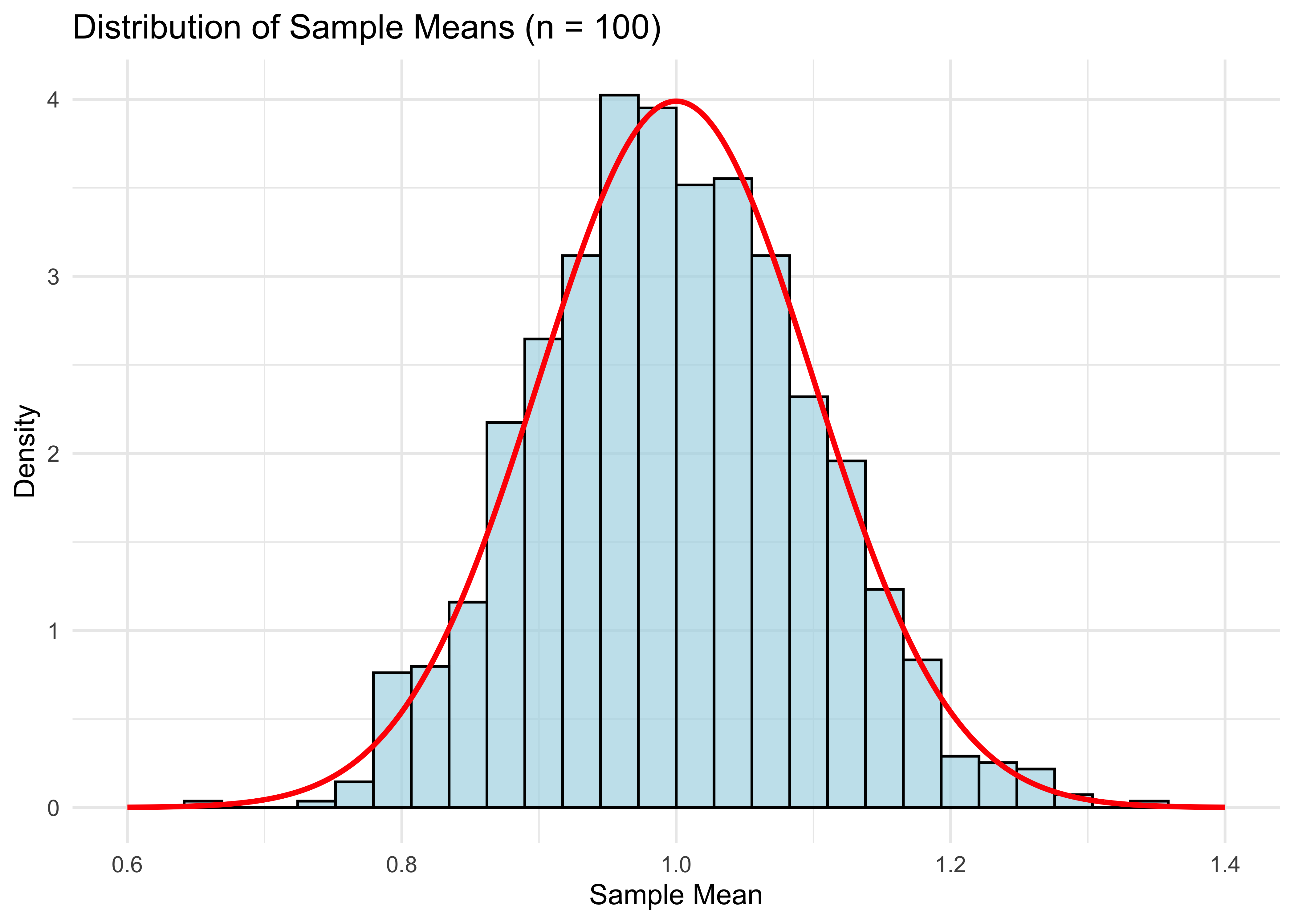
cat("Mean of means:", mean(means), "\n")Mean of means: 0.9983538 cat("Variance of means:", var(means), "\n")Variance of means: 0.009869157 Notice that mean(means) is close to the population expectation of 1, and var(means) is close to 1/100 (recall that the variance of a standard exponential is 1).
The plot looks pretty good, but of course it will be even better if n is larger.
n <- 500 # number of samples
for (b in 1:B) {
  sample <- rexp(n)
  means[b] <- mean(sample)
}

# Create data frames for plotting
df_means <- data.frame(means = means)
xgrid <- seq(0.6, 1.4, length = 1000)
df_normal <- data.frame(x = xgrid, y = dnorm(xgrid, 1, 1/sqrt(n)))

ggplot(df_means, aes(x = means)) +
  geom_histogram(aes(y = ..density..), bins = 30, alpha = 0.7, fill = "lightblue", color = "black") +
  geom_line(data = df_normal, aes(x = x, y = y), color = "red", size = 1) +
  xlim(0.6, 1.4) +
  labs(title = "Distribution of Sample Means (n = 500)",
       x = "Sample Mean",
       y = "Density") +
  theme_minimal()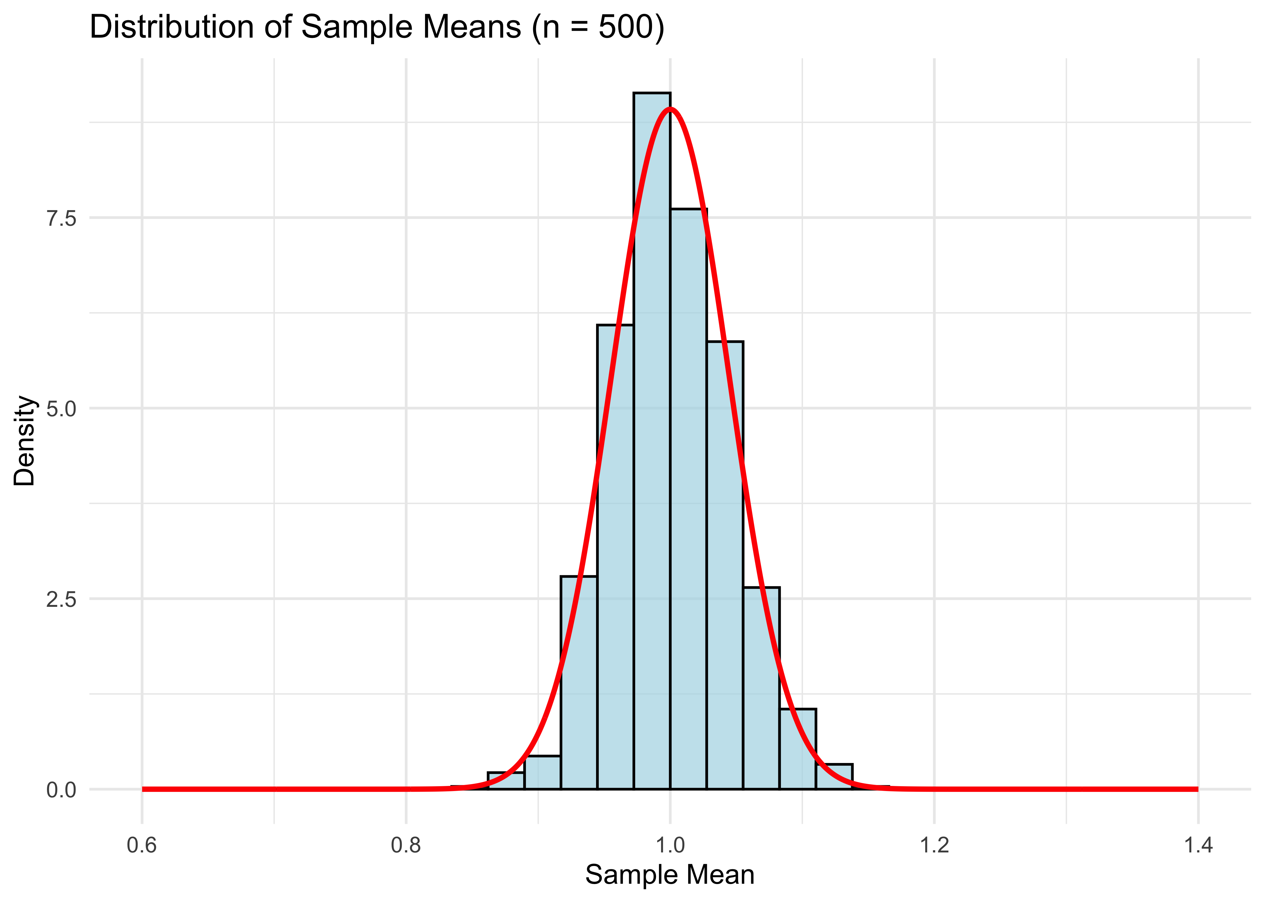
- Compared to the graph for \(n = 100\), the distribution has shrunken towards the population mean (1 in this case), as expected for the larger sample size.
Standard Errors
The CLT useful because it allows us to construct standard errors, and in turn, confidence intervals. These are important for quantifying how uncertain your estimate \(\bar{X}\) is of the population expectation \({\bf E}[X]\).
Recall that the standard error for the mean is \[\text{SE}(\bar{X}) = \frac{\widehat{\text{SD}}(X)}{\sqrt{n}},\]
where \(\widehat{\text{SD}}(X)\) is the sample standard deviation of \(\{X_i\}_{i=1}^n\).
A 95% confidence interval (CI) for \({\bf E}[X]\) is then \[\bar{X} \pm 2\cdot \text{SE}(\bar{X}).\]
Why do we multiply the SE by 2 to get a CI? Because 2 is (approximately) the 97.5% quantile of a normal distribution.
- Check this in R:
qnorm(.975)\(=1.959964\approx 2\).
- Check this in R:
Why normal? Because \(\bar{X}\) is approximately normal by the CLT.
Why is that the formula for \(\text{SE}(\bar{X})\)? Because this approximates \(\text{Var}(\bar{X})^{1/2}\), the standard deviation of \(\bar{X}\).
If we actually knew the distribution of \(\bar{X}\), there would be no need for these two levels of approximation.
In the fictitious world of our R code, we can get this distribution directly by drawing \(\bar{X}\) \(B\) times for very large \(B\). The histogram of these draws is \(\bar{X}\)’s distribution.
In reality, we never get to do this. We only ever draw one sample \(\{X_i\}_{i=1}^n\) and therefore only get compute one draw of \(\bar{X}\).
Bootstrap
However, we can mimic this idea by using the bootstrap, an all-purpose method for directly approximating the population distribution of estimators like \(\bar{X}\), which can be used to construct CIs.
Why do we need yet another way of getting CIs? While this is a solved problem for simple estimators like the mean, for more complicated estimators, the bootstrap is the easiest way of getting standard errors.
Bootstrap CIs are also a nice preview of some related methods we’ll cover later, such as random forests which use bagging (“Bootstrap AGgregation”).
Finally, the bootstrap is useful conceptually for understanding the distinction between sample and population distributions.
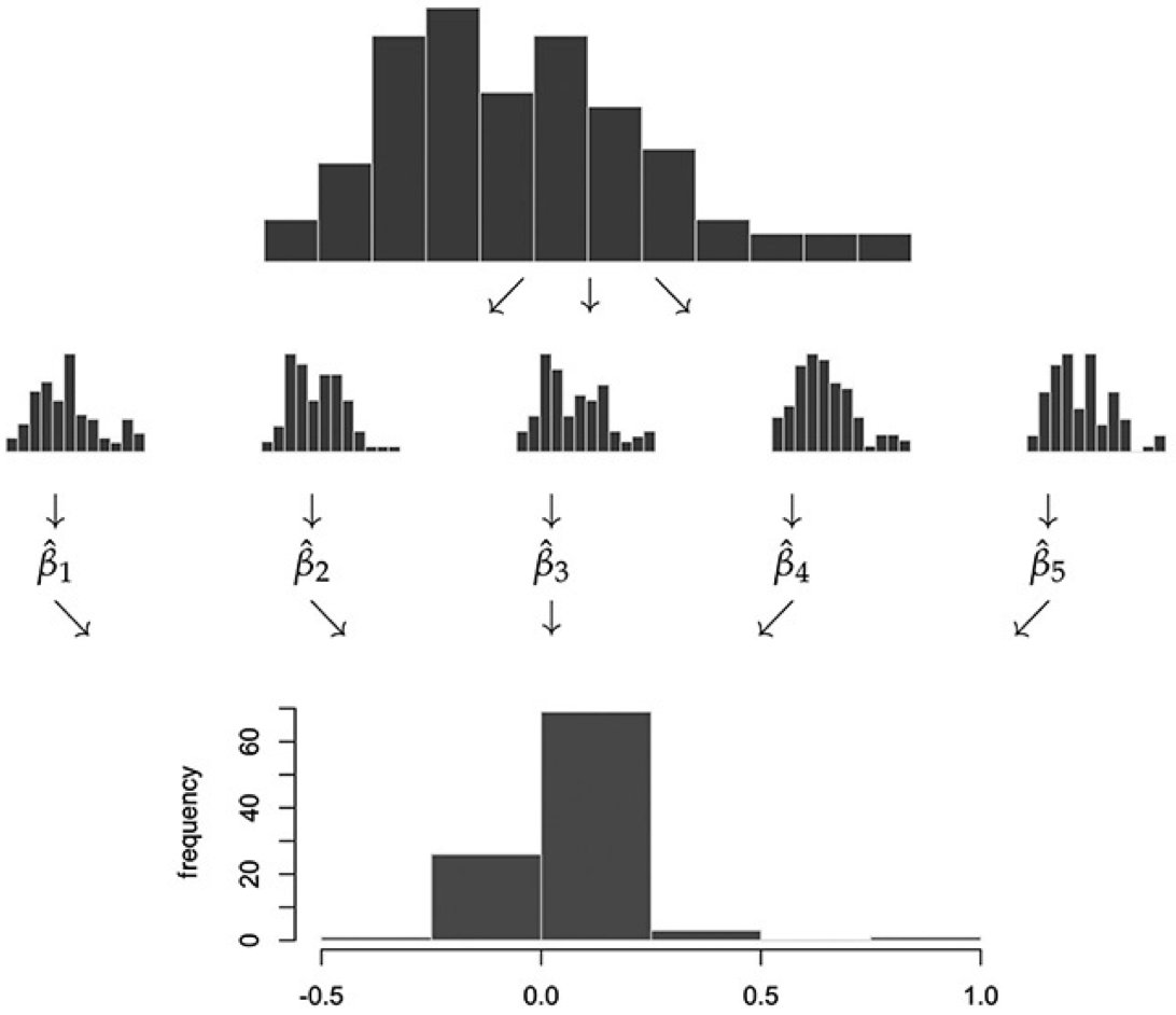
Schematic Illustration
- To explain the bootstrap, let’s first look at a schematic illustration of how we got the distribution of \(\bar X\):
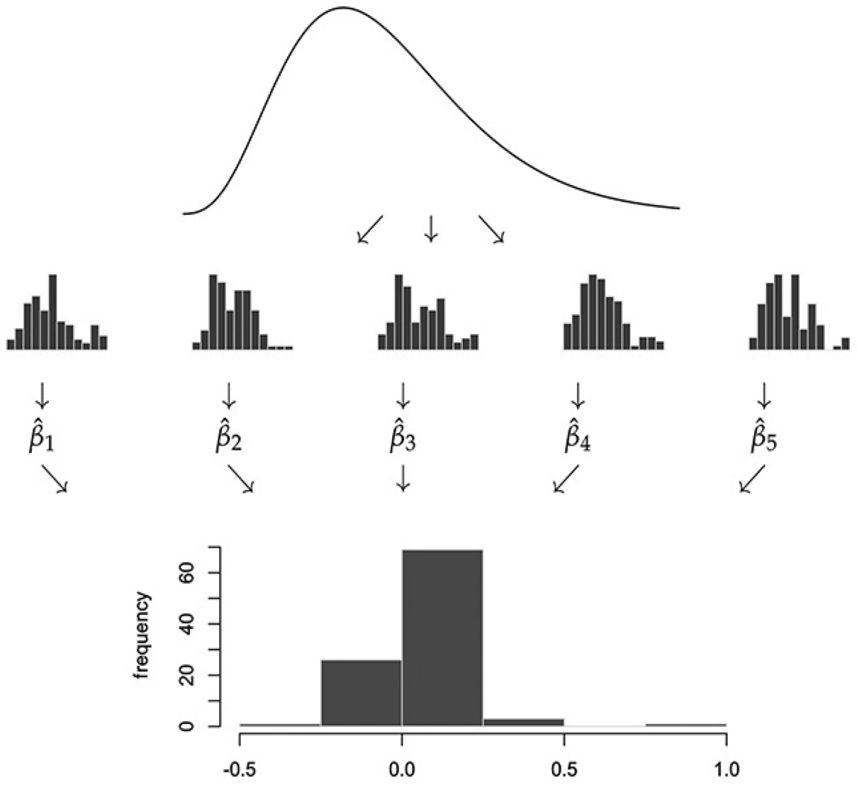
- In practice, we can’t draw more samples from the actual population distribution of \(X\), since it’s unknown. The bootstrap approximates this step by drawing from the sample distribution of \(X\):
Bootstrap Algorithm:
Start with a random sample \(\{X_i\}_{i=1}^n\).
For each \(b = 1, \dots, B\),
Resample with replacement \(n\) observations from \(\{X_i\}_{i=1}^n\). Denote this “bootstrap sample” by \(\{X_i^b\}_{i=1}^n\).
Calculate your estimator (in our case the mean) from this bootstrap sample. Denote this estimator \(\bar{X}_b\).
\(\{\bar{X}_b\}_{b=1}^B\) is the bootstrap approximation to the population distribution of our original estimator of interest (in our case \(\bar{X}\)).
Bootstrap
The bootstrap standard error \(\text{SE}_{\text{boot}}\) for \(\bar{X}\), which is an alternative to \(\widehat{\text{SD}}(X)/\sqrt{n}\), is simply the standard deviation of the bootstrap sample \(\{\bar{X}_b\}_{b=1}^B\).
- Bootstrap CI: \(\bar X \pm 2 \cdot \text{SE}_{\text{boot}}\).
Alternatively, we can use the bootstrap distribution directly to form a CI: add and subtract the \(.95\) quantile of \(|\bar X_b-\bar X|\) across \(b=1,\ldots,B\).
Using quantiles of the bootstrap distribution directly is preferred over using the bootstrap standard error to form a CI, since the bootstrap standard error can be influenced too much by outliers. However, it’s common to just report standard errors because it’s simpler.
Illustration in R
- The for loop we just ran in the CLT illustration plots B draws distribution of mean(X). We got this plot by drawing from the population distribution of X n*B times. In reality, we don’t have access to X’s population distribution. But we have the next best thing: the sample distribution X_1, …, X_n. Remember we visualized this in the histogram (for n=500):
n <- 500
sample <- rexp(n)
df_hist <- data.frame(sample = sample)
ggplot(df_hist, aes(x = sample)) +
  geom_histogram(aes(y = ..density..), bins = 30, alpha = 0.7, fill = "lightblue", color = "black") +
  xlim(0, 10) + ylim(0, 1) +
  labs(title = "Sample Distribution (n = 500)",
       x = "Spending (in tens of dollars)",
       y = "Density") +
  theme_minimal()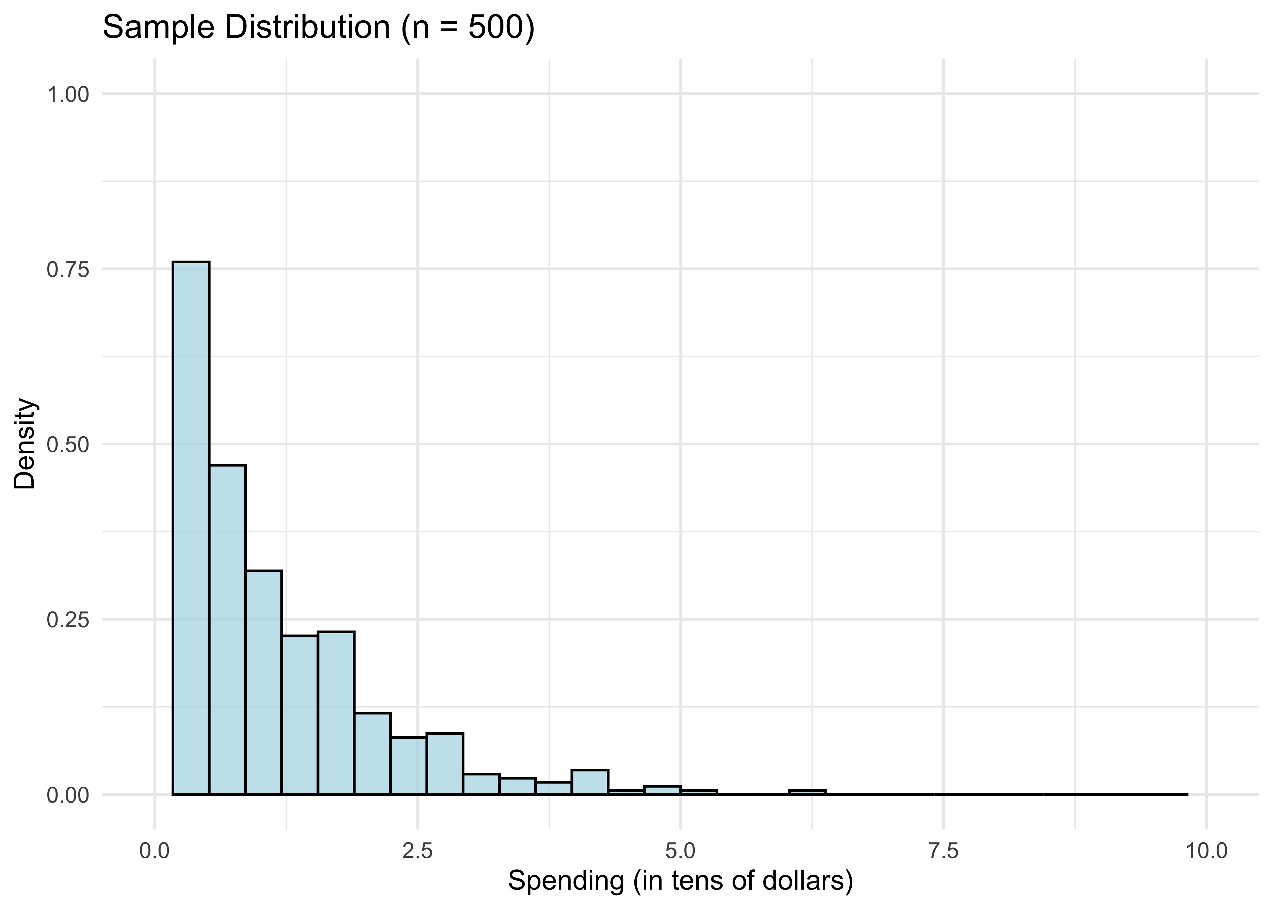
We know from above by the LLN that for n large, the sample distribution is close to the population distribution of X. So if we want to draw from the latter, we could potentially do almost as well by drawing from the former instead. This is the essential bootstrap idea.
How do we draw random samples from the sample distribution? We put \(X_1, ..., X_n\) in a bag and draw with replacement from it. Doing this \(n\) times gives ONE “bootstrap sample”:
boot_sample_indices <- sample.int(n, replace=TRUE) # n draw indices from 1:n with replacement
sort(boot_sample_indices)[1:10] # just to see what's going on
[1] 1 3 3 4 7 8 8 8 9 11boot_sample <- sample[boot_sample_indices] # bootstrap sample- That’s just one “bootstrap draw” of mean(X). We need to repeat this B times for large B to get a distribution of mean(X), just like we did in the CLT illustration:
B <- 1000
bootstrap_means = rep(0, B)
for (b in 1:B) {
  boot_sample_indices <- sample.int(n, replace=TRUE)
  boot_sample <- sample[boot_sample_indices]
  bootstrap_means[b] = mean(boot_sample)
}- Let’s plot our result and compare it to what we did in the CLT illustration.
# Create data frames for bootstrap and true distributions
df_bootstrap <- data.frame(means = bootstrap_means, type = "Bootstrap")
xgrid <- seq(0.8, 1.2, length = 1000)

# Repeat CLT illustration for true distribution
for (b in 1:B) {
  new_sample <- rexp(n)
  means[b] <- mean(new_sample)
}

df_true <- data.frame(means = means, type = "True")
df_combined <- rbind(df_bootstrap, df_true)

# Create normal curves for overlay
df_normal_bootstrap <- data.frame(x = xgrid, y = dnorm(xgrid, mean(sample), sd(sample)/sqrt(n)), type = "Bootstrap")
df_normal_true <- data.frame(x = xgrid, y = dnorm(xgrid, mean(means), sqrt(var(means))), type = "True")
df_normal_combined <- rbind(df_normal_bootstrap, df_normal_true)

# Create side-by-side comparison
ggplot(df_combined, aes(x = means)) +
  geom_histogram(aes(y = ..density..), bins = 30, alpha = 0.7, fill = "lightblue", color = "black") +
  geom_line(data = df_normal_combined, aes(x = x, y = y), color = "red", size = 1) +
  facet_wrap(~ type, ncol = 2) +
  xlim(0.8, 1.2) +
  labs(x = "Sample Mean",
       y = "Density") +
  theme_minimal()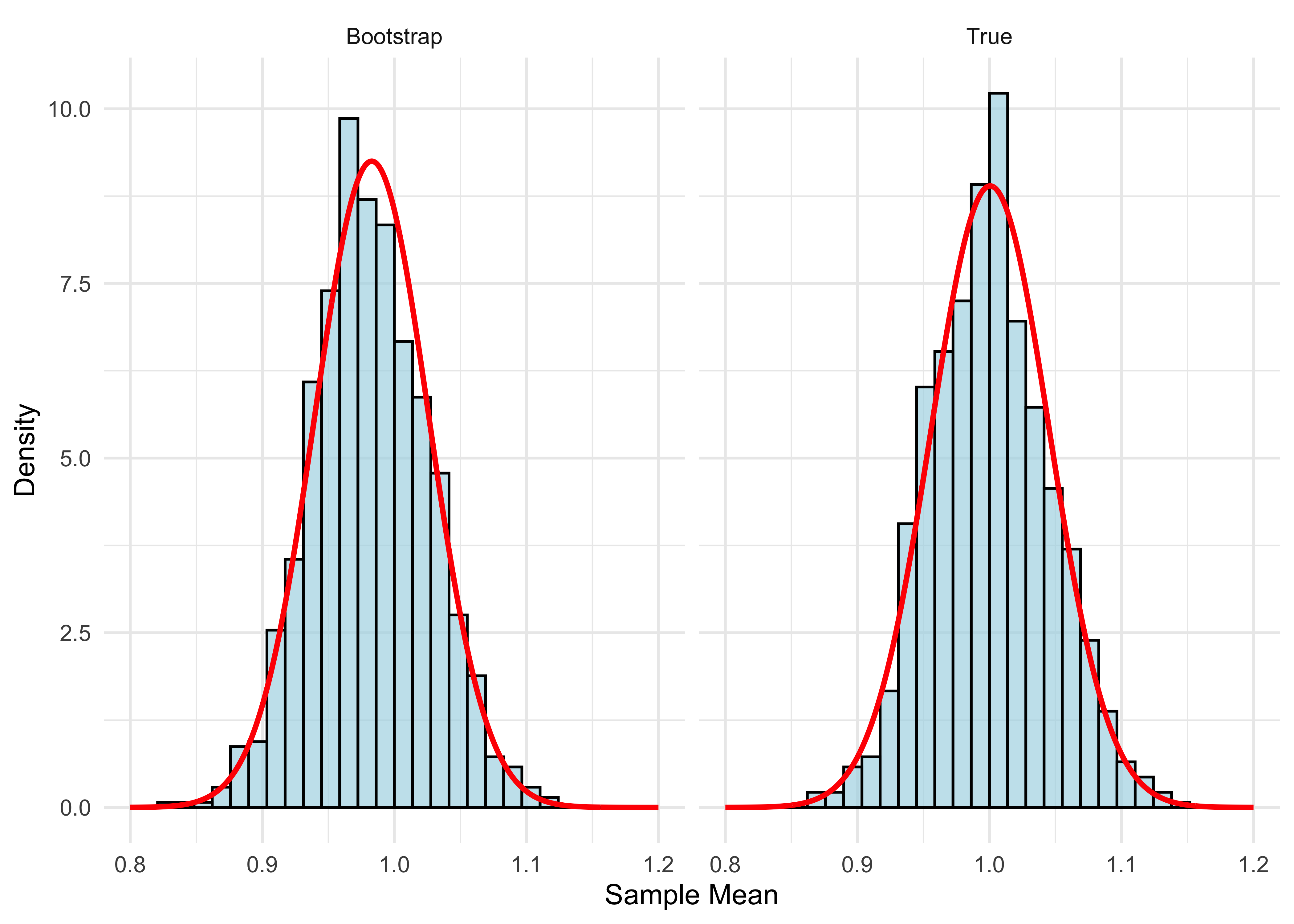
- The two distributions are very close. You might notice the bootstrap distribution is a little off-center from 1. That’s because it’s centered at the sample mean, which is not exactly 1:
mean(sample)[1] 0.9828441The red curves plot the normal density. We know that the true distribution is close to normal for n large. Since the bootstrap distribution is close to the true distribution, it follows that the bootstrap distribution is also close to normal.
Now that we understand the bootstrap idea, here’s how we use it. The bootstrap standard error is
sd(bootstrap_means)[1] 0.04396161- Compare this with our usual standard error:
sd(sample) / sqrt(n)[1] 0.04313168- bootstrap CI using bootstrap standard error
mean(sample) + c(-2,2)*sd(bootstrap_means)[1] 0.8949209 1.0707673- bootstrap CI using bootstrap distribution directly
mean(sample) + c(-1,1)*quantile(abs(bootstrap_means-mean(sample)),.95)[1] 0.8969488 1.0687394Online Spending Application
Let’s try out the bootstrap on a real dataset. We’ll use a dataset of online-spending activity for 10,000 households over a single year.
First, let’s get our data into a dataframe and take a look at it:
browser <- read.csv("data/web-browsers.csv")

dim(browser)
[1] 10000 7str(browser)'data.frame': 10000 obs. of 7 variables:
$ id : int 1 2 3 4 5 6 7 8 9 10 ...
$ anychildren: int 0 1 1 0 0 0 1 1 0 1 ...
$ broadband : int 1 1 1 1 1 1 1 1 1 1 ...
$ hispanic : int 0 0 0 0 0 0 0 0 0 0 ...
$ race : chr "white" "white" "white" "white" ...
$ region : chr "MW" "MW" "MW" "MW" ...
$ spend : int 424 2335 279 829 221 2305 18 5609 2313 185 ...summary(browser) id anychildren broadband hispanic
Min. : 1 Min. :0.000 Min. :0.0000 Min. :0.0000
1st Qu.: 2501 1st Qu.:0.000 1st Qu.:1.0000 1st Qu.:0.0000
Median : 5000 Median :1.000 Median :1.0000 Median :0.0000
Mean : 5000 Mean :0.601 Mean :0.8251 Mean :0.1932
3rd Qu.: 7500 3rd Qu.:1.000 3rd Qu.:1.0000 3rd Qu.:0.0000
Max. :10000 Max. :1.000 Max. :1.0000 Max. :1.0000
race region spend
Length:10000 Length:10000 Min. : 1
Class :character Class :character 1st Qu.: 162
Mode :character Mode :character Median : 510
Mean : 1946
3rd Qu.: 1523
Max. :401338 # Create data frames for plotting
df_spend <- data.frame(spend = browser$spend, log_spend = log(browser$spend))
# Create side-by-side histograms
p1 <- ggplot(df_spend, aes(x = spend)) +
geom_histogram(bins = 30, alpha = 0.7, fill = "lightblue", color = "black") +
labs(title = "Distribution of Spending",
x = "Spending",
y = "Count") +
theme_minimal()
p2 <- ggplot(df_spend, aes(x = log_spend)) +
geom_histogram(bins = 30, alpha = 0.7, fill = "lightgreen", color = "black") +
labs(title = "Distribution of Log Spending",
x = "Log Spending",
y = "Count") +
theme_minimal()
# Arrange plots side by side
grid.arrange(p1, p2, ncol = 2)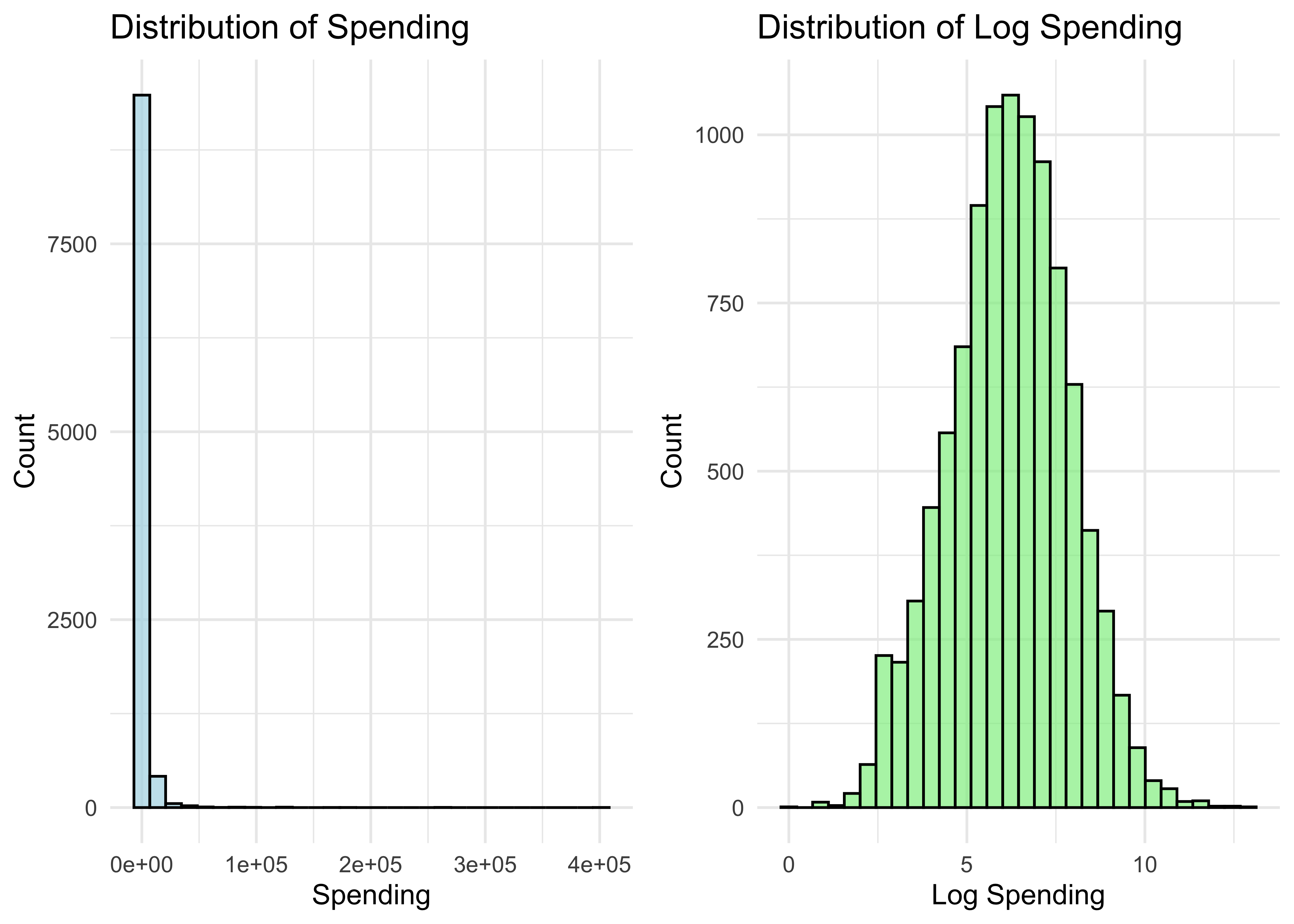
- Let’s get a bootstrap CI for the mean of the spending distribution (same code as before, using browser$spend instead of the simulated sample):
B <- 1000
n <- nrow(browser)
bootstrap_spend_means = rep(0, B)
for (b in 1:B) {
  boot_sample_indices <- sample.int(n, replace=TRUE)
  boot_sample <- browser$spend[boot_sample_indices]
  bootstrap_spend_means[b] = mean(boot_sample)
}- Bootstrap standard error:
sd(bootstrap_spend_means)[1] 79.95447- Usual standard error:
sd(browser$spend)/sqrt(nrow(browser))[1] 80.3861- Bootstrap CI using bootstrap standard error
mean(browser$spend) + c(-2,2)*sd(bootstrap_spend_means)[1] 1786.530 2106.348- Bootstrap CI using bootstrap distribution directly
mean(browser$spend) + c(-1,1)*quantile(abs(bootstrap_spend_means-mean(browser$spend)), .95)[1] 1786.180 2106.698When Can We Use the Bootstrap?
The bootstrap typically works well in settings where the “usual CI” (adding and subtracting \(2\cdot \text{SE}\)) also works well. Otherwise, it typically fails.
So why should we use bootstrap? Deriving standard error formulas is often harder than coding up the bootstrap!
We will cover settings such as LASSO where standard CIs fail. In these settings, bootstrap typically also fails (unless adjusted properly).
Typical approaches to high-dimensional data (LASSO and other estimators in this course) involve (1) penalties for model complexity and (2) data-driven model selection. Both are a problem for the bootstrap.
Nonetheless, bootstrap is useful in many settings, and is a nice introduction to other simulation-based techniques that we will use in this course.