Average online spending of 10,000 households: $1,946 a year
one sample
how far the population average could be from it
Share of surveyed voters backing a candidate
one survey
whether another survey would agree
A regression coefficient
one dataset
whether the effect is distinguishable from zero
Every estimate comes from one sample. Today we ask how much it would move in another sample or to what extent we can quantify the uncertainty given the sample we have: first with theory (the law of large numbers and the central limit theorem), then by resampling the data we already have (the bootstrap).
Random numbers come from R’s pseudo-random generator, so set.seed() makes every chunk reproducible. The appendix also uses the boot package.
Population and sample
Two kinds of objects, and why the distinction matters
Population versus sample
A population is the large pool of units we want to learn about: individuals, counties, firms, states.
Example: the proportion of US citizens who support a presidential candidate.
Resource constraints mean the econometrician observes only a random sample of units and uses it to learn about the population.
Example: a survey of potential voters. Estimate the proportion above by the fraction of supporters in the survey.
We model the population as a probability distribution and the sample as draws from that distribution.
Why bother with an abstract population?
The population lets us use the language of probability theory to
compare procedures, for example LASSO against CART later in the course;
assess uncertainty about estimates and predictions.
Sometimes the population is not a literal set of people. What is the population when we observe one time series of US GDP? Such conceptual questions matter, but we set them aside in this course.
Every object we meet in this course is either a population object or a sample object. It is critical to know which.
Sample objects estimate population objects
Sample object (computed from the data)
Population object (never observed)
average \bar{X}
expectation \mathbf{E}[X]
proportion
probability
histogram
density or mass function
model estimate \hat{\beta}
model parameter \beta
Sample objects are things we see directly in the data. Population objects are things we never see but want to learn about.
The rest of today asks how well a sample object approximates its population counterpart, and how to measure the gap.
A fictitious population: online spending
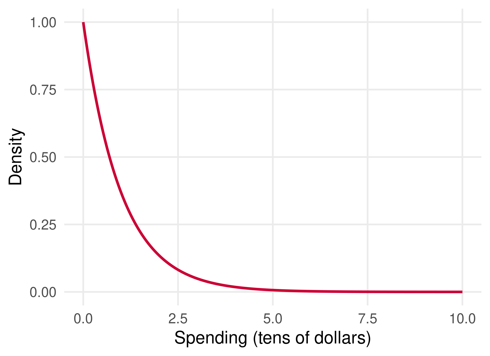
Suppose the amount an Amazon customer spends follows an exponential distribution with mean 1, in tens of dollars. dexp() is its density.
Most customers spend little and a few spend a lot.
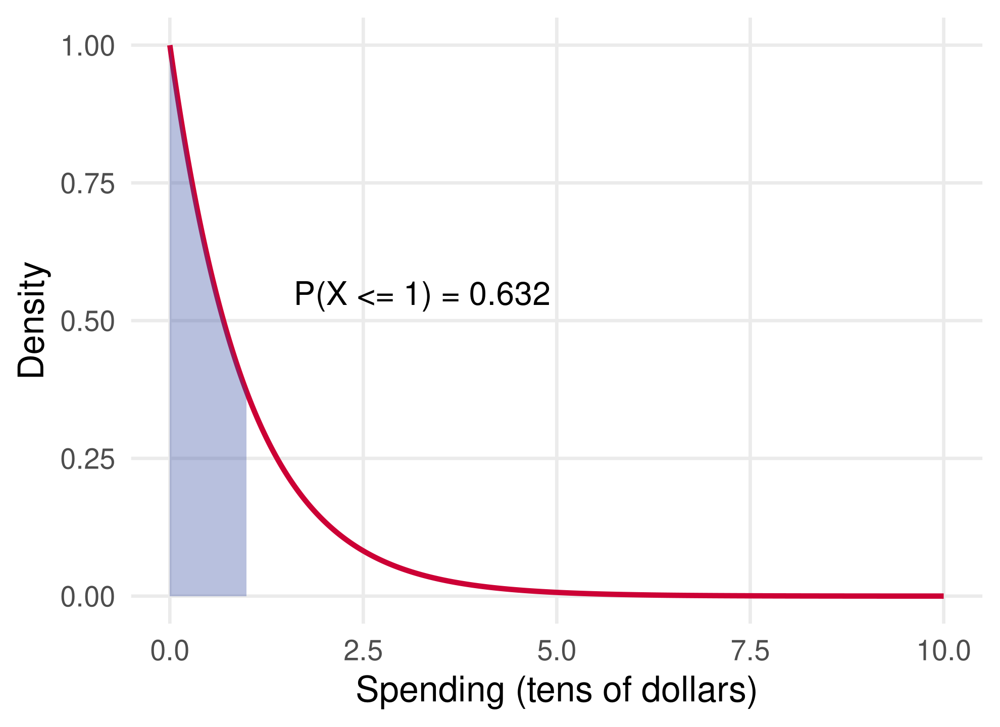
Areas under the density are probabilities
The shaded area is the population proportion of customers who spend at most $10, or equivalently the probability that a random customer spends at most $10.
pexp() is the cumulative distribution function: pexp(x) is the probability of spending at most x (times ten dollars).
pexp(1) -pexp(0)
## [1] 0.6321206
Is this a population or a sample quantity?
Four functions for every distribution in R
Prefix
Meaning
Exponential
Normal
d
density (or mass) function
dexp()
dnorm()
p
cumulative probability \mathbf{P}(X \le x)
pexp()
pnorm()
q
quantile, the inverse of p
qexp()
qnorm()
r
random draws
rexp()
rnorm()
The same pattern covers unif, binom, pois, t, chisq and many more; see ?Distributions.
The d, p and q functions describe population objects. Only r produces a sample.
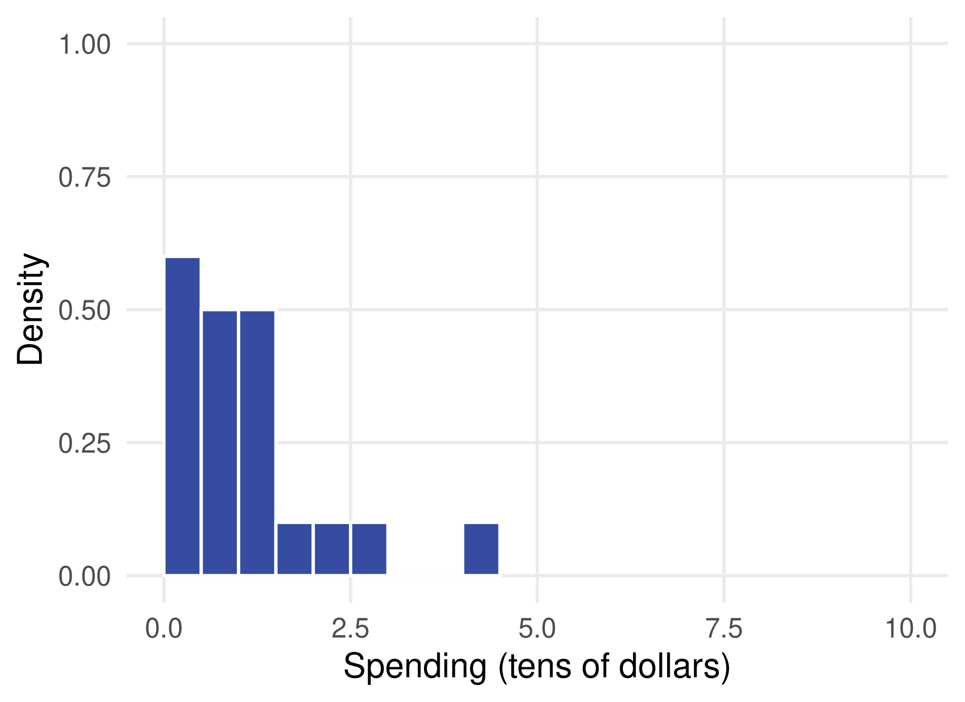
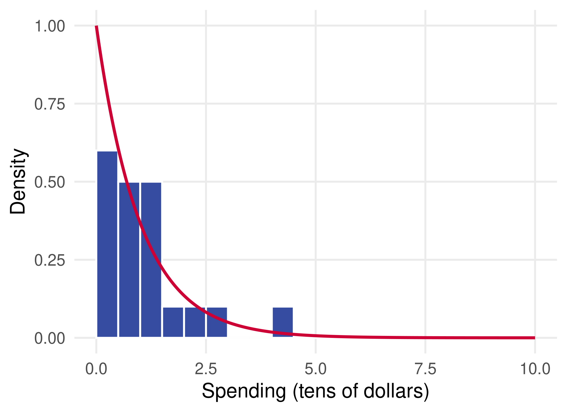
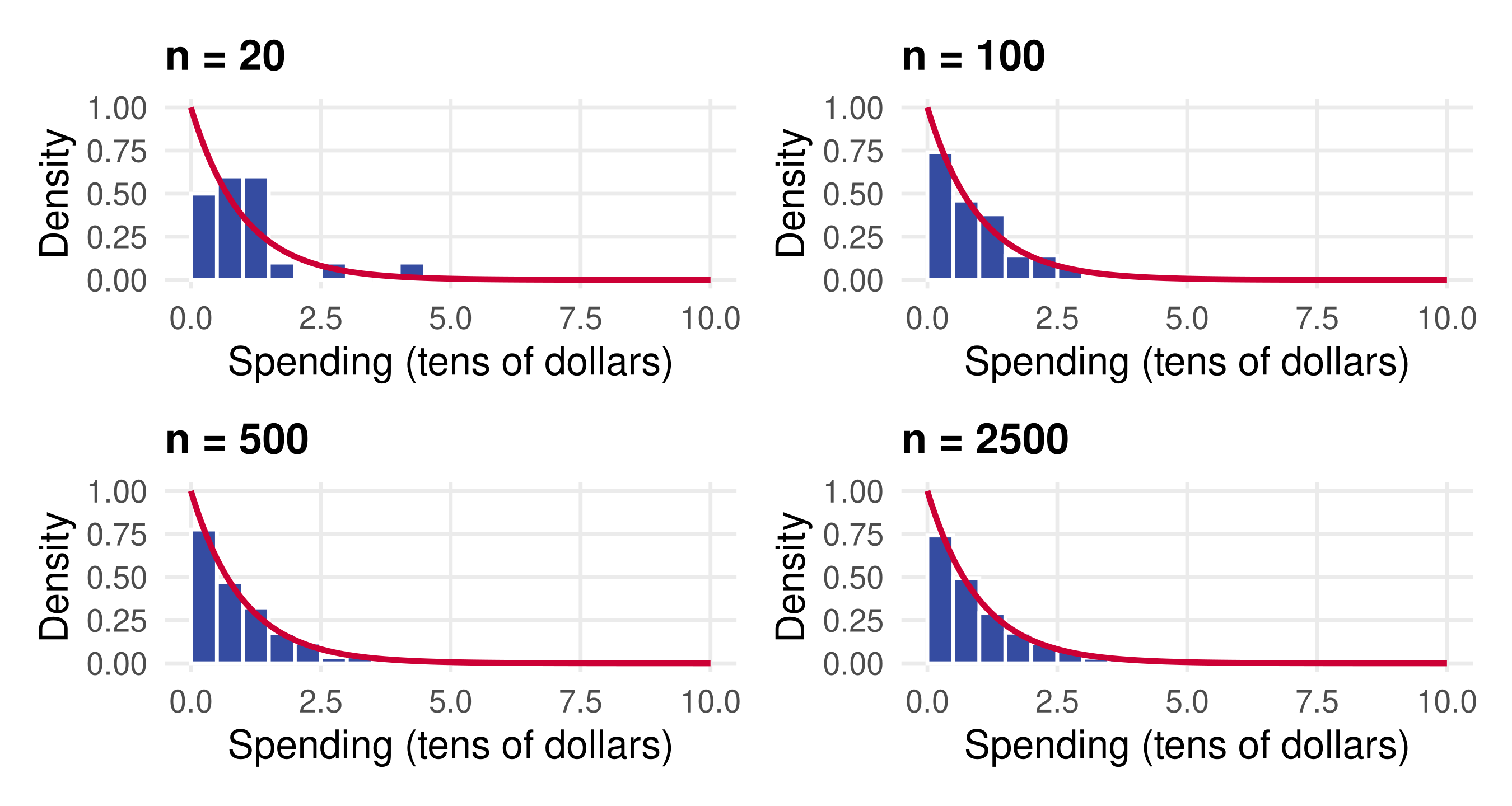
The bars between 0 and 1 give the sample fraction spending at most $10: 0.55 against the population value 0.632. The sample mean 1.12 sits closer to \mathbf{E}[X] = 1.
The histogram tracks the density more closely as n grows, and the fraction and mean settle near 0.632 and 1: the law of large numbers at work.
Checkpoint: sample or population?
mean(spend <= 1) and pexp(1): which is a sample object and which a population object?
Amazon records every transaction for a year. Is the average of those transactions a sample or a population object?
With one million draws, would the histogram ever coincide with the density exactly?
Law of large numbers and central limit theorem
What repeated sampling does to the sample mean
Notation
A random sample is n independent draws from the population distribution: \{X_i\}_{i=1}^n = \{X_1, \dots, X_n\}, \qquad \bar{X} = \frac{1}{n} \sum_{i=1}^n X_i .
X denotes an arbitrary draw. Its expectation \mathbf{E}[X] is the average of X in the population, and \text{Var}(X) = \mathbf{E}[(X - \mathbf{E}[X])^2] measures its spread. For the exponential distribution above, \mathbf{E}[X] = 1 and \text{Var}(X) = 1.
The second equality is linearity: the expectation of a sum is the sum of the expectations. The third uses that every X_i has the same distribution as X.
What does \mathbf{E}[\bar{X}] mean?
Draw a random sample of size n once: one value of \bar{X}.
Repeat B times: B separate draws of \bar{X}.
Average over many, many repetitions: the result is \mathbf{E}[\bar{X}].
Step 2: the variance of the sample mean
A single \bar{X} need not be close to \mathbf{E}[X] when n is small; it fluctuates around it. How much is measured by its variance:
The second equality pulls the constant 1/n out as its square. The third uses independence: the variance of a sum of independent draws is the sum of the variances.
As n grows, \text{Var}(\bar{X}) shrinks towards zero. What does this say about the value of \bar{X}?
Step 3: combine the two
Chebyshev’s inequality bounds the probability of a large deviation by the variance:
To recap: the typical value of \bar{X} is \mathbf{E}[X], because \mathbf{E}[\bar{X}] = \mathbf{E}[X], and its spread shrinks with n, because \text{Var}(\bar{X}) = n^{-1}\,\text{Var}(X). Together they give \bar{X} \approx \mathbf{E}[X].
Why we care. To learn the expectation of a population distribution, such as the average amount a customer spends, a large random sample does very well. At n = 2{,}500 the standard deviation of \bar{X} is 1/\sqrt{2500} = 0.02.
The sample mean has its own distribution
By now we understand the population distribution of X: monitor a random Amazon customer who just filled a basket and record the total. Do this for the universe of customers and the histogram of totals is the distribution of X.
Like X, \bar{X} is a random variable, so it has a population distribution too. How do we think of it?
Draw a random sample of size n once: one \bar{X}. This is a single draw from the distribution of \bar{X}.
Repeat B times: B draws from that distribution.
Pick B very large and plot the histogram of all the draws: this is the population distribution of \bar{X}, also called its sampling distribution.
The central limit theorem
Central limit theorem (CLT). When n is large, the distribution of \bar{X} is close to a normal distribution with the expectation and variance we just derived: \bar{X} \approx \mathcal{N}\!\left(\mathbf{E}[X],\; n^{-1}\,\text{Var}(X)\right).
Formally, \sqrt{n}\,(\bar{X} - \mathbf{E}[X]) converges in distribution to \mathcal{N}(0, \text{Var}(X)), whatever the shape of the distribution of X, provided \text{Var}(X) is finite.
The exponential distribution is far from normal, so this is a strong claim. Let us check it by simulation.
A Monte Carlo experiment
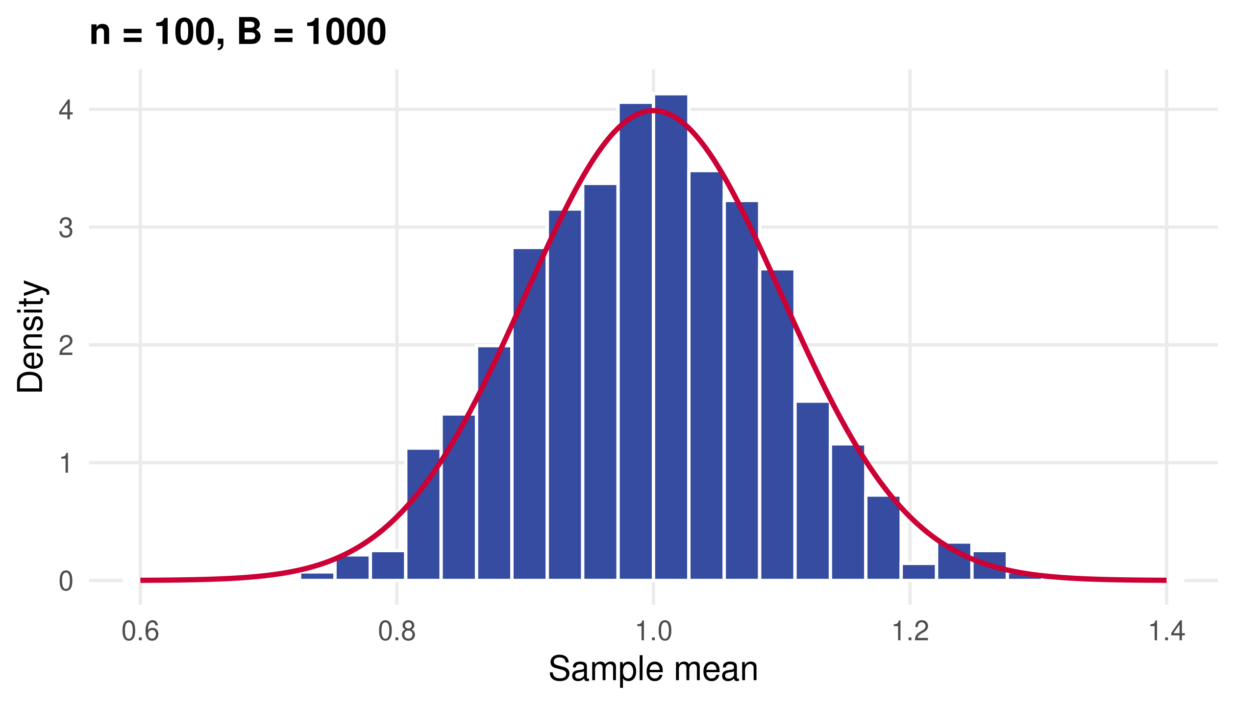
Follow the recipe: draw a sample of size n and compute \bar{X}; do this B times; compare the histogram of \bar{X}_1, \dots, \bar{X}_B with the normal density \mathcal{N}(1, 1/n).
set.seed(2)n <-100# sample sizeB <-1000# number of repetitionsmeans <-rep(0, B) # placeholder to fillfor (b in1:B) { s <-rexp(n) means[b] <-mean(s)}c(mean =mean(means), variance =var(means), `1/n`=1/ n)
##        mean    variance         1/n
## 0.998033537 0.009626014 0.010000000
The average of the sample means is close to \mathbf{E}[X] = 1 and their variance is close to \text{Var}(X)/n = 0.01.
Plot the sample means against the normal density
mean_plot <-function(m, n) { grid <-seq(0.6, 1.4, length.out =400) normal <-data.frame(x = grid, y =dnorm(grid, mean =1, sd =1/sqrt(n)))ggplot(data.frame(m), aes(m)) +geom_histogram(aes(y =after_stat(density)), bins =30,fill = smu_blue, colour ="white") +geom_line(data = normal, aes(x, y), colour = smu_red, linewidth =1) +coord_cartesian(xlim =c(0.6, 1.4)) +labs(title =paste0("n = ", n, ", B = ", length(m)),x ="Sample mean", y ="Density")}
The red curve is the CLT’s prediction \mathcal{N}(1, 1/n), not a curve fitted to the histogram.
The histogram is bell-shaped at n = 100
A thousand sample means, each from 100 draws of a skewed population, follow the normal density closely.
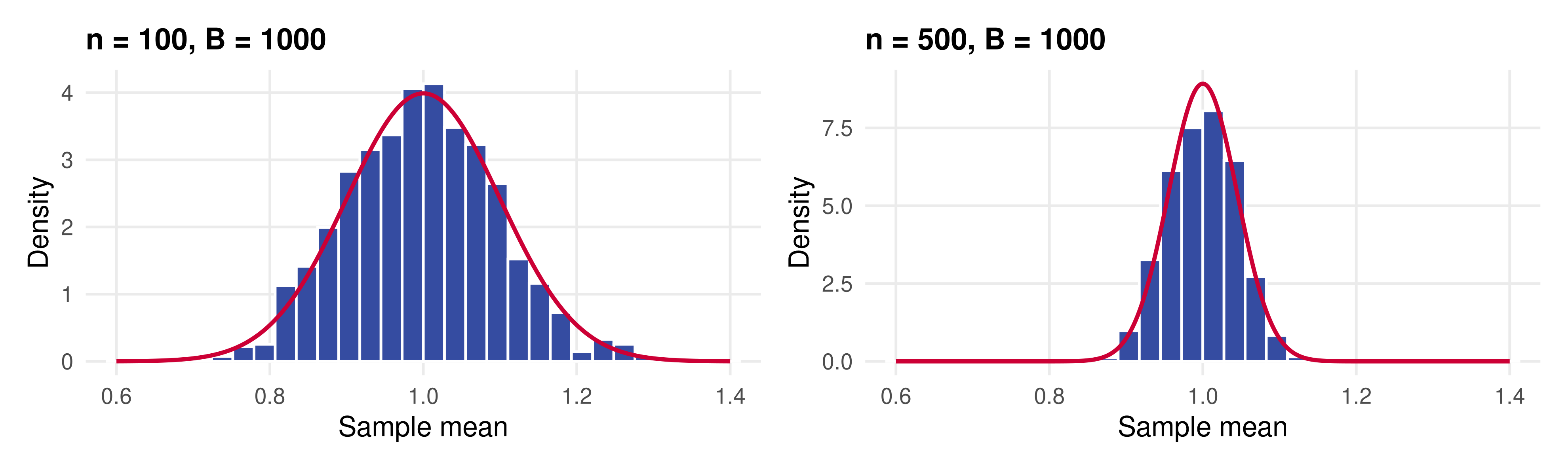
At n = 500 the distribution concentrates
set.seed(3)means500 <-replicate(B, mean(rexp(500))) # the same loop in one linec(mean =mean(means500), variance =var(means500), `1/n`=1/500)
##        mean    variance         1/n
## 0.999790718 0.001994272 0.002000000
Same axes: the spread shrinks by \sqrt{5}, from a standard deviation of 0.10 to 0.045.
Checkpoint: LLN versus CLT
Which theorem says the histogram of \bar{X} narrows as n grows, and which says it becomes bell-shaped?
Step 2 used independence. Where would the argument break for a time series of quarterly GDP?
The variance of the sample means was about 0.0096 at n = 100. What would you expect at n = 400?
Standard errors and confidence intervals
Turning the CLT into a statement about one sample
From the CLT to a standard error
In practice we see one sample and want to know how far \bar{X} could be from \mathbf{E}[X].
The CLT says the spread of \bar{X} is \text{SD}(\bar{X}) = \sqrt{\text{Var}(X)/n}. We do not know \text{Var}(X), so we replace it by its sample analogue:
qnorm(0.975) # the 97.5% quantile of the standard normal
## [1] 1.959964
Two layers of approximation
The normal distribution stands in for the exact distribution of \bar{X} (the CLT).
The estimated \text{SE}(\bar{X}) stands in for the true \text{SD}(\bar{X}).
If we knew the distribution of \bar{X}, neither would be needed. Compute the interval for one sample of 500 customers:
set.seed(5)n <-500spend <-rexp(n)se <-sd(spend) /sqrt(n)c(estimate =mean(spend), se = se)
##   estimate         se
## 1.05845529 0.04701586
mean(spend) +c(-2, 2) * se
## [1] 0.9644236 1.1524870
The interval covers the population mean of 1, which in a real application we would not know.
What does “95%” promise?
The interval is random and \mathbf{E}[X] = 1 is fixed. Over repeated samples, 95% of the intervals should cover 1. In the R world we can check:
covers <-function(n, R =2000) {set.seed(4)mean(replicate(R, { s <-rexp(n)abs(mean(s) -1) <=2*sd(s) /sqrt(n) }))}ns <-c(10, 20, 100, 500)sapply(setNames(ns, ns), covers)
##     10     20    100    500
## 0.8715 0.9185 0.9555 0.9625
With a skewed population and n = 10, the normal approximation is poor and the interval covers too rarely. By n = 100 it keeps its promise.
One sample, one sample mean
In the fictitious world of our R code we can draw \bar{X}B times for a very large B. The histogram of those draws is the distribution of \bar{X}, and we can read standard errors and quantiles straight off it.
In reality we never get to do this. We draw one sample \{X_i\}_{i=1}^n and compute one \bar{X}.
We cannot draw more samples from the population. Can we draw from something that resembles it?
The bootstrap
Resample the sample to mimic resampling the population
The bootstrap idea
The LLN says that when n is large, the sample distribution of X (the histogram) is close to the population distribution (the density).
If we want to draw from the population, we can do almost as well by drawing from the sample instead.
The bootstrap recomputes the estimator on many such draws and uses the spread of the results as the sampling distribution of the estimator.
The bootstrap approximates the population distribution of an estimator (here \bar{X}) by the distribution of the same estimator across resamples of the data.
It is all-purpose: the same recipe works for means, medians, ratios, regression coefficients and much more.
Why yet another way of getting CIs?
For simple estimators like the mean, the standard-error formula is easy. For complicated estimators, the bootstrap is often the easiest way to get a standard error.
Bootstrap CIs preview related methods later in the course: random forests use bagging, short for bootstrap aggregation.
Conceptually, the bootstrap sharpens the distinction between sample and population distributions.
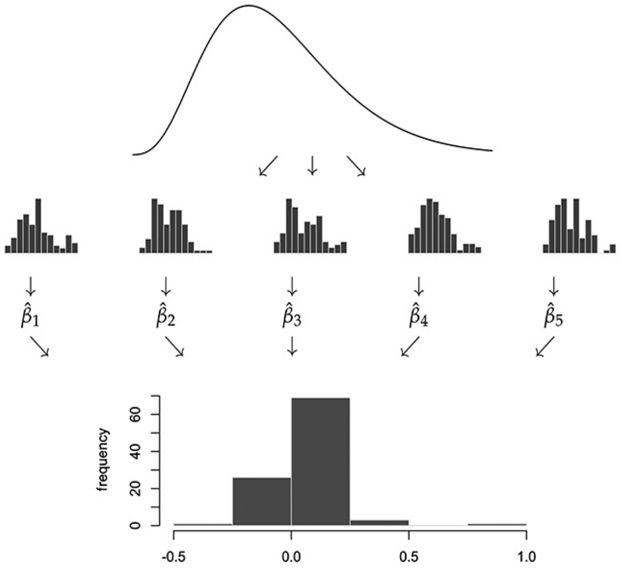
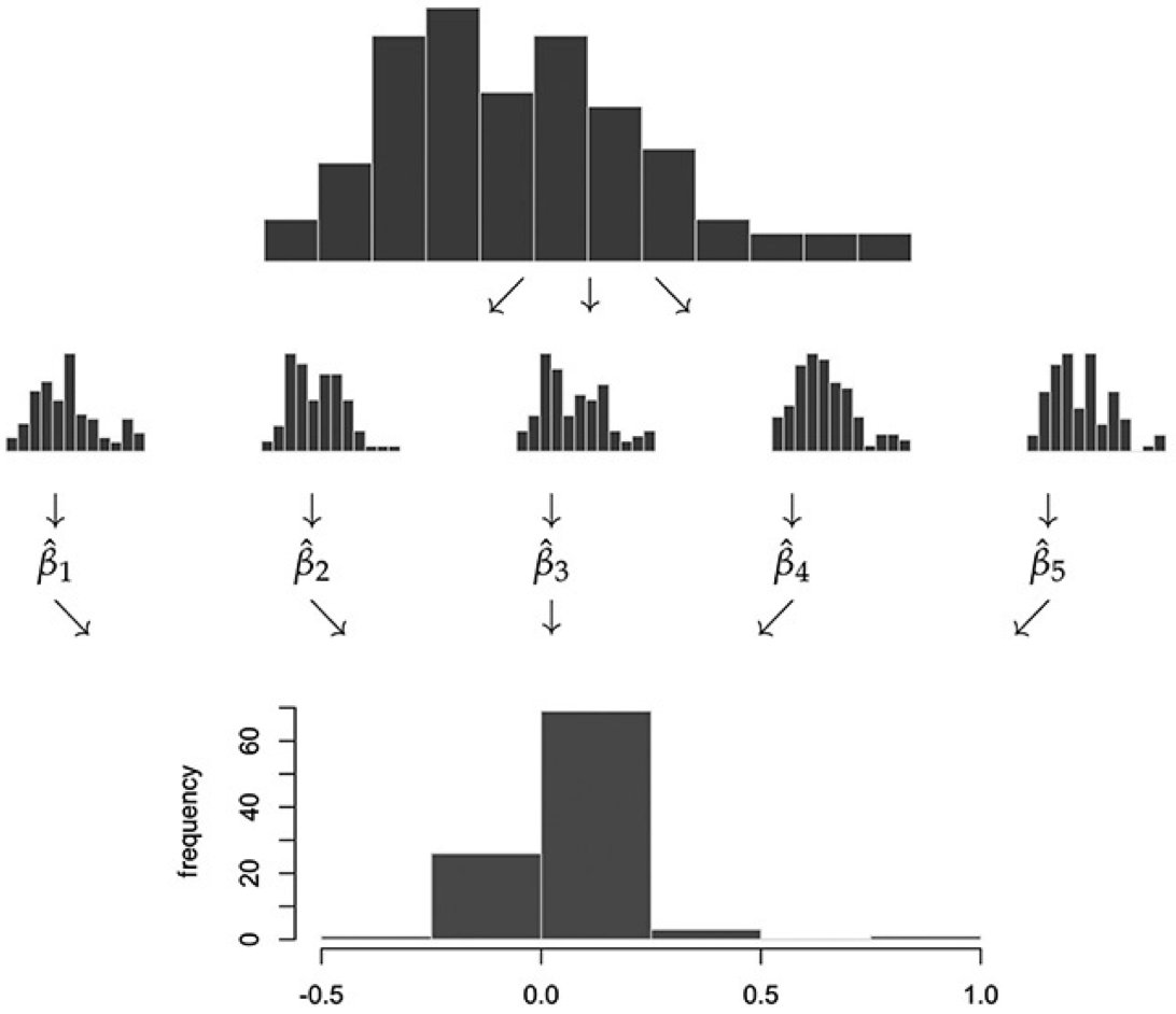
The ideal: repeated draws from the population
Top: the population density.
Middle: five samples drawn from it, each producing one estimate \hat{\beta}_b. Here \hat{\beta} plays the role of \bar{X}.
Bottom: the histogram of the estimates is the sampling distribution.
This is exactly what the Monte Carlo loop did. It requires the population, which we never have.
The bootstrap: repeated draws from the sample
Top: the population density is replaced by the histogram of the one sample we have.
Middle: five bootstrap samples drawn with replacement from it, each producing \hat{\beta}_b.
Bottom: the histogram of the bootstrap estimates approximates the sampling distribution.
Everything below the top panel is the same recipe as before. Only the source of the draws has changed.
The bootstrap algorithm
Start with a random sample \{X_i\}_{i=1}^n.
For each b = 1, \dots, B:
Resample with replacementn observations from \{X_i\}_{i=1}^n. Call this bootstrap sample \{X_i^b\}_{i=1}^n.
Compute the estimator on the bootstrap sample. For the mean, call it \bar{X}_b.
\{\bar{X}_b\}_{b=1}^B is the bootstrap approximation to the population distribution of \bar{X}.
“With replacement” matters: a bootstrap sample repeats some observations and omits others. Without replacement, every resample would be the original sample in a different order.
Bootstrap standard errors and confidence intervals
The bootstrap standard error\text{SE}_{\text{boot}} is the standard deviation of \{\bar{X}_b\}_{b=1}^B, an alternative to \widehat{\text{SD}}(X)/\sqrt{n}.
Two 95% confidence intervals:
Interval
Formula
Uses
Normal
\bar{X} \pm 2 \cdot \text{SE}_{\text{boot}}
the bootstrap spread and the normal shape
Quantile
\bar{X} \pm q_{0.95}, where q_{0.95} is the 0.95 quantile of \lvert \bar{X}_b - \bar{X} \rvert over b
the bootstrap distribution directly
The quantile interval is preferred, because a few extreme bootstrap draws can inflate \text{SE}_{\text{boot}}. Standard errors are nonetheless reported more often because they are simpler.
One bootstrap sample in R
We have the sample of n = 500 customers in spend. Put X_1, \dots, X_n in a bag and draw from it n times with replacement:
set.seed(6)idx <-sample.int(n, replace =TRUE) # n indices drawn from 1:n with replacementsort(idx)[1:10] # some indices repeat, others never appear
## [1] 3 4 5 6 6 6 7 8 10 11
boot_sample <- spend[idx]mean(boot_sample) # one bootstrap draw of the mean
## [1] 1.037495
length(unique(idx)) / n
## [1] 0.62
Each observation is left out of a bootstrap sample with probability (1 - 1/n)^n \approx e^{-1} = 0.37, so about 63% of the original observations appear at least once.
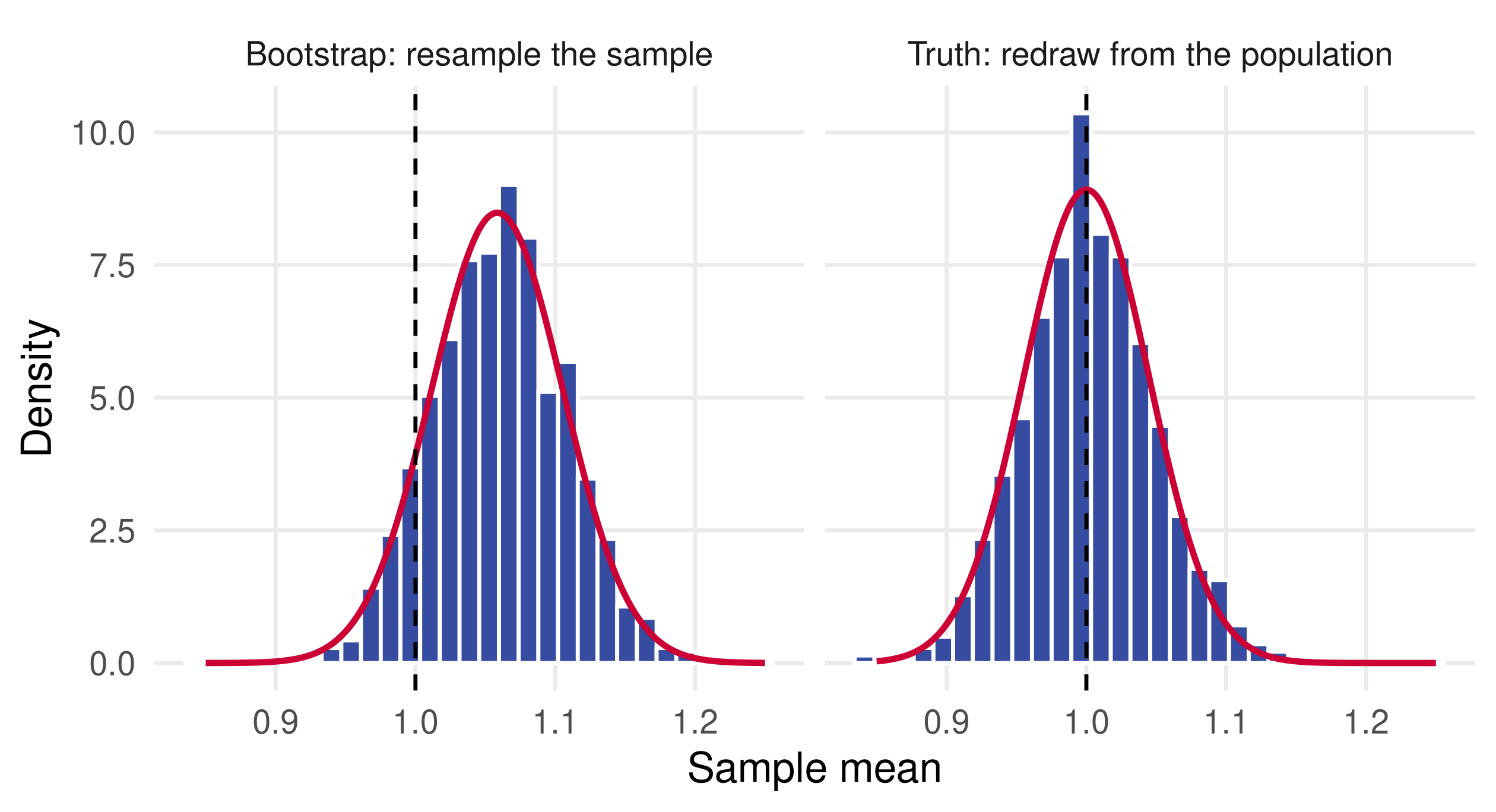
grid <-seq(0.85, 1.25, length.out =400)draws <-bind_rows(data.frame(source ="Bootstrap: resample the sample", m = boot_means),data.frame(source ="Truth: redraw from the population", m = true_means))normals <-bind_rows(data.frame(source ="Bootstrap: resample the sample", x = grid,y =dnorm(grid, mean(spend), sd(spend) /sqrt(n))),data.frame(source ="Truth: redraw from the population", x = grid,y =dnorm(grid, 1, 1/sqrt(n))))p_compare <-ggplot(draws, aes(m)) +geom_histogram(aes(y =after_stat(density)), bins =30, fill = smu_blue, colour ="white") +geom_line(data = normals, aes(x, y), colour = smu_red, linewidth =1) +geom_vline(xintercept =1, linetype ="dashed") +facet_wrap(~ source) +labs(x ="Sample mean", y ="Density")
The red curves are the normal approximations: \mathcal{N}(\bar{X}, \text{SE}^2) for the bootstrap and the CLT’s \mathcal{N}(1, 1/n) for the truth. The dashed line marks \mathbf{E}[X] = 1.
Bootstrap versus truth: the picture
Nearly the same shape and spread. The bootstrap distribution is centred at the sample mean \bar{X} = 1.06 rather than at 1, because it is built from the sample.
Read off the standard errors and intervals
c(bootstrap =sd(boot_means), formula =sd(spend) /sqrt(n),monte_carlo =sd(true_means), exact =1/sqrt(n))
##   bootstrap     formula monte_carlo       exact
##  0.04685660  0.04701586  0.04604075  0.04472136
Four routes to the same spread, and three intervals that agree to within 0.005. The truth is close to normal by the CLT, so the bootstrap distribution is too.
Checkpoint: bootstrap mechanics
What would happen if step 2a resampled without replacement?
Raising B from 1,000 to 100,000: does \text{SE}_{\text{boot}} get closer to the true \text{SD}(\bar{X})?
The bootstrap intervals are centred at \bar{X} = 1.06, not at 1. Is that a problem?
##   id anychildren broadband hispanic  race region spend
## 1  1           0         1        0 white     MW   424
## 2  2           1         1        0 white     MW  2335
## 3  3           1         1        0 white     MW   279
summary(browser$spend)
##    Min. 1st Qu.  Median    Mean 3rd Qu.    Max.
##       1     162     510    1946    1523  401338
One row per household: annual online spending in dollars plus a few demographics. The mean is almost four times the median, the sign of a heavy right tail.
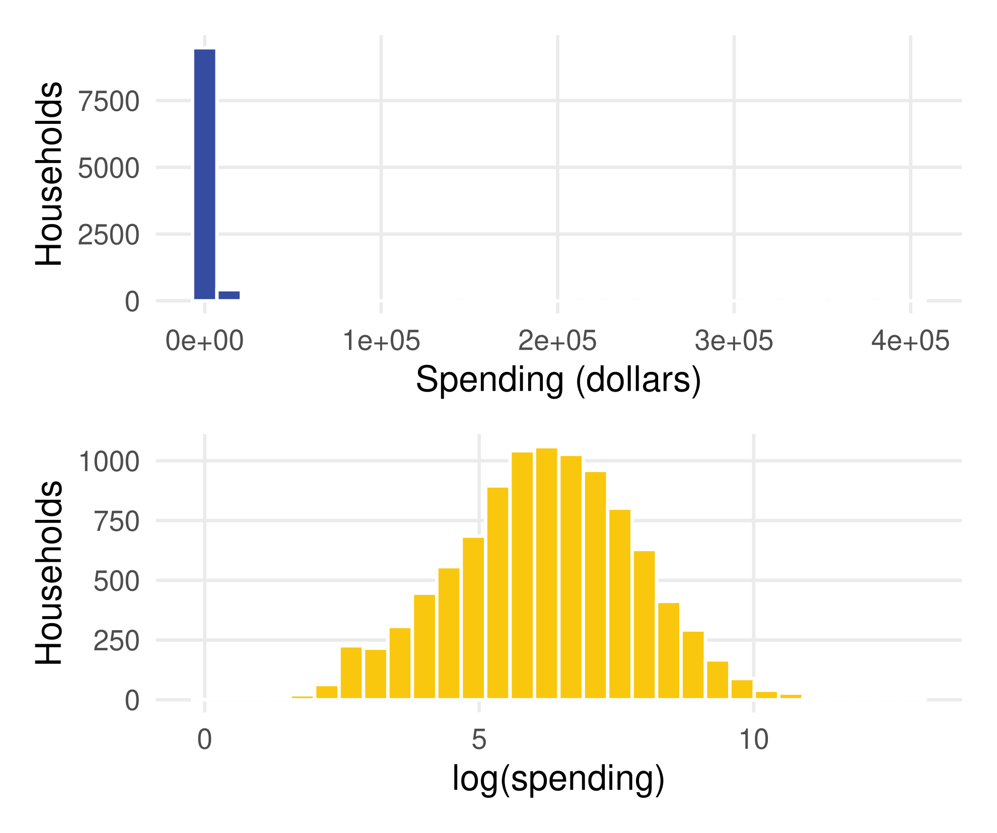
Spending is heavily skewed
p_raw <-ggplot(browser, aes(spend)) +geom_histogram(bins =30, fill = smu_blue,colour ="white") +labs(x ="Spending (dollars)", y ="Households")p_log <-ggplot(browser, aes(log(spend))) +geom_histogram(bins =30, fill = smu_gold,colour ="white") +labs(x ="log(spending)", y ="Households")
In dollars, a handful of households with enormous spending stretch the axis. In logs the distribution is roughly bell-shaped.
The CLT still applies to the mean in dollars, but the heavy tail is why a large n helps.
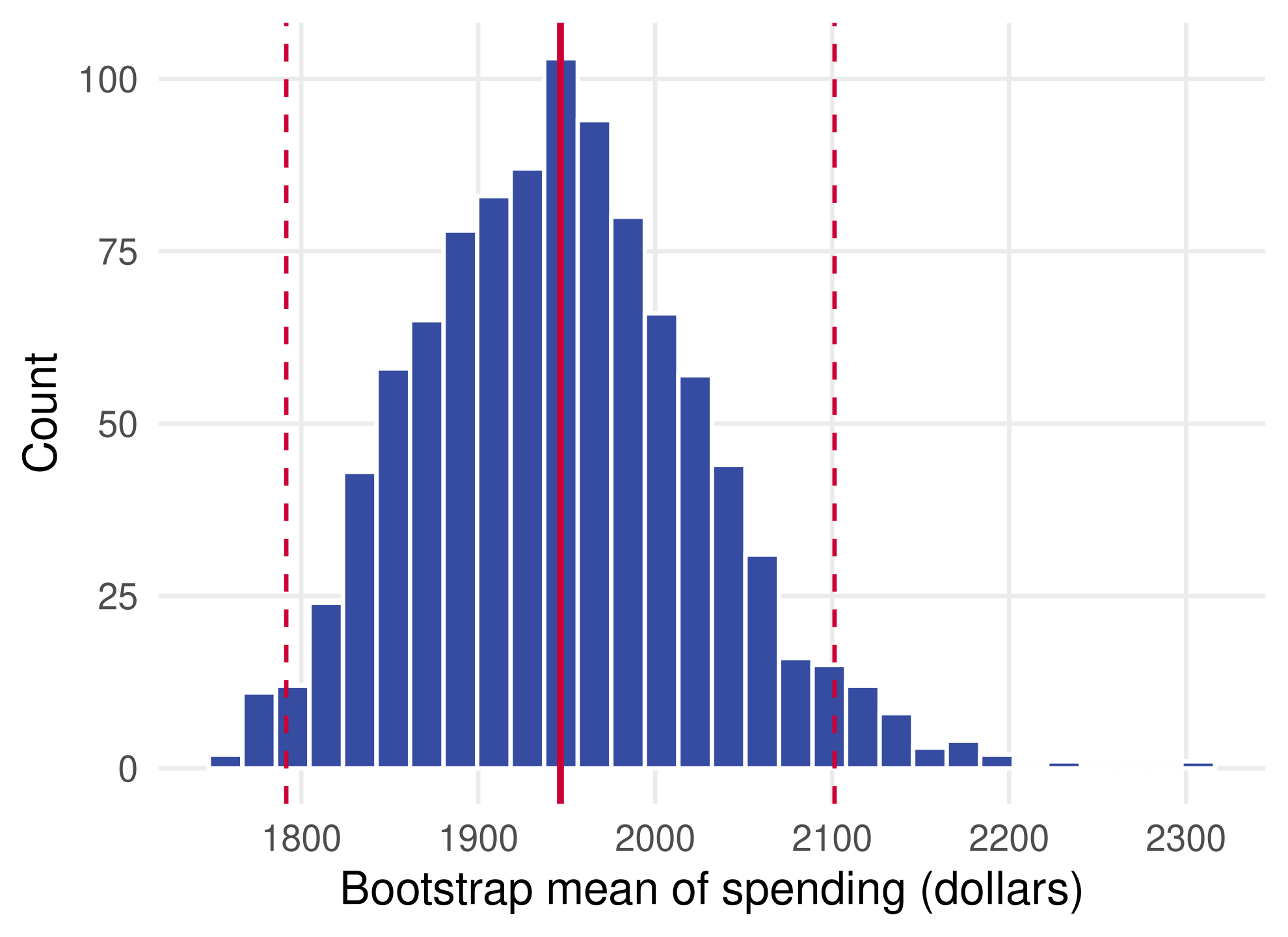
The average household spends about $1,950 a year online, and the population average is plausibly between $1,790 and $2,105.
A general bootstrap function
The loop changes only in the statistic it computes, so wrap it:
boot_stat <-function(x, stat, B =1000) {replicate(B, stat(x[sample.int(length(x), replace =TRUE)]))}
The median of spending has no simple standard-error formula: it involves the density of spending at the median, which we do not know. The bootstrap needs one line:
med +c(-1, 1) *unname(quantile(abs(boot_med - med), 0.95))
## [1] 491 529
Beyond one variable: a ratio of two averages
Households with broadband spend on average about twice as much as those without. To bootstrap the ratio, resample rows, so that each household keeps its own spend and broadband:
A delta-method formula for the standard error of a ratio exists, but it is tedious to derive. The bootstrap is three lines. Resampling rows is also how the bootstrap handles regression coefficients (appendix).
When can we use the bootstrap?
The bootstrap typically works well where the usual interval \bar{X} \pm 2 \cdot \text{SE} also works well: smooth estimators and a large sample. Otherwise it typically fails too.
So why use it? Deriving standard-error formulas is often harder than coding up the bootstrap.
Later in the course, LASSO and other high-dimensional methods involve penalties for model complexity and data-driven model selection. Standard CIs fail there, and so does the plain bootstrap unless it is adjusted.
The bootstrap remains useful in many settings, and it is a gateway to other simulation-based tools: cross-validation (lecture 12) and bagging (lecture 14).
Checkpoint: design a bootstrap
You want a 95% interval for (a) the share of households spending more than $5,000 a year and (b) the difference in median spending between households with and without children.
What is the statistic function in each case?
Which of the two has an easy formula for its standard error?
How would you check that B = 1{,}000 replications are enough?
Sampling variation is the price of using a sample
Two kinds of objects. Sample objects (averages, fractions, histograms, estimates) approximate population objects (expectations, probabilities, densities, parameters). Know which is which.
Two theorems. The law of large numbers says \bar{X} \approx \mathbf{E}[X] because \text{Var}(\bar{X}) = \text{Var}(X)/n shrinks. The central limit theorem adds the shape: approximately normal.
One sample, one interval.\text{SE}(\bar{X}) = \widehat{\text{SD}}(X)/\sqrt{n}, and \bar{X} \pm 2 \cdot \text{SE} covers the truth in about 95% of samples once n is moderate.
Resample when there is no formula. The bootstrap draws with replacement from the sample, recomputes the estimator, and reads the standard error and quantiles off the result. It works where the usual interval works.
Reading and data sources
Taddy (2019), Business Data Science, McGraw-Hill, chapter 1: sampling, the bootstrap, and the web-browser data.
Efron and Tibshirani (1993), An Introduction to the Bootstrap, Chapman and Hall: the standard reference.
A rule of thumb: the Monte Carlo standard error of \text{SE}_{\text{boot}} is roughly \text{SE}_{\text{boot}}/\sqrt{2B}, about 2% of \text{SE}_{\text{boot}} at B = 1{,}000.
Quantile intervals need more replications than standard errors, because they depend on the tails of the bootstrap distribution. B = 1{,}000 or more is common for a 95% interval.
Where the bootstrap fails: the sample maximum
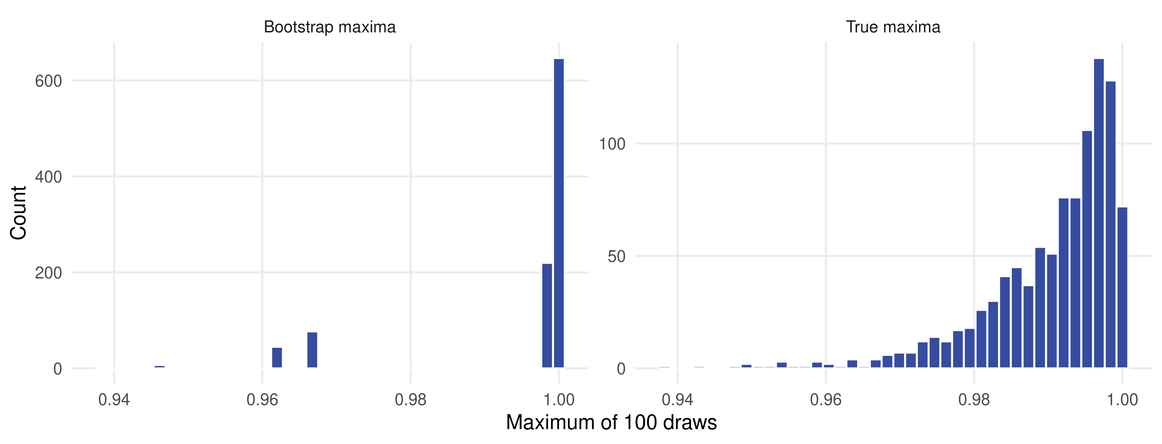
The maximum of m draws from \text{Uniform}(0, 1) estimates the upper end point 1. It is not a smooth function of the data, and the bootstrap breaks:
About 65% of the bootstrap maxima equal the sample maximum itself, close to the 63% chance that the largest observation is drawn at least once. The bootstrap spread is a third too large, and its shape is wrong.
The bootstrap distribution of the maximum is lumpy
The true sampling distribution is smooth and skewed towards 1; the bootstrap version is a spike. Estimators that select among models, such as LASSO, are non-smooth in a related way.
Where the law of large numbers fails: infinite variance
Both theorems need moments. The Cauchy distribution has no expectation, and averages of even 100,000 draws do not settle down:
Heavy tails in economic data, such as firm sizes, city populations or wealth, are usually less extreme than this, but they slow the CLT down: compare the coverage at n = 10 earlier. Log transformations, as with log(spend), tame the tails.
boot ships with R as a recommended package, so it is usually installed already. The web-browser data are in lectures/data/ and the schematic figures in lectures/images/, so the deck renders without network access.
Return to the question
Where did the estimate come from, and how much would it move in another sample?
The standard error answers with a formula when one exists. The bootstrap answers by resampling when one does not.