ECON 4370 / 6370 Computing for Economics
Lecture 6: Taming the Data Zoo
15 September 2026
What does one row represent?
The same R tools answer different questions depending on how observations are organized.
Cross-sectional One unit in a common period
Across workers, firms, or households
Time series One unit or aggregate at one date
Across ordered time periods
Panel One unit at one date
Between and within units
Before plotting or fitting a model, identify the unit , the time index , and the comparison .
Packages and data
library (tidyverse)library (readxl)library (lubridate)library (gapminder)library (forecast)library (fixest)<- c (Female = "#CC0035" , Male = "#354CA1" )
CPS workers
data/cps09mar.csv
Monthly predictors
data/PredictorData2018.xlsx, sheet Monthly
Countries and years
gapminder::gapminder
Plotting packages: hexbin, patchwork, ggridges, and GGally.
Cross-sectional data
How do earnings differ across workers?
A snapshot of workers
The Current Population Survey (CPS) collects information on U.S. households and employment.
Our March 2009 extract contains 50,742 workers selected for full-time work in the previous year.
At least 36 hours per week and 48 weeks during that year.
Records with allocated values were excluded by the data provider.
Annual wage and salary earnings refer to the previous calendar year .
One row is one worker. These examples describe this selected sample; the extract contains no survey weights.
[Sources] - https://users.ssc.wisc.edu/~bhansen/econometrics/cps09mar_description.pdf - https://www.census.gov/programs-surveys/cps/technical-documentation/subject-definitions.html The original CPS has a rotating sample. This teaching extract is used as a single cross-section.
Read and inspect the variables
<- read_csv ("data/cps09mar.csv" , show_col_types = FALSE )%>% select (age, education, earnings, hours, week, female) %>% slice_head (n = 5 )
## # A tibble: 5 × 6
##     age education earnings hours  week female
##   <dbl>     <dbl>    <dbl> <dbl> <dbl>  <dbl>
## 1    52        12   146000    45    52      0
## 2    38        18    50000    45    52      0
## 3    38        14    32000    40    51      0
## 4    41        13    47000    40    52      1
## 5    42        13   161525    50    52      0
earnings: annual wage and salary income in dollars.hours and week: weekly hours and weeks worked during the year.education: educational attainment mapped to years of schooling.female: the source’s binary sex indicator, 1 = female and 0 = male.
Start with summary statistics
<- cps %>% summarise (n = n (),mean_age = mean (age),mean_education = mean (education),mean_earnings = mean (earnings),median_earnings = median (earnings):: kable (cps_summary, digits = 1 )
50742
42.1
13.9
55091.5
42000
Mean earnings exceed median earnings. A few high earners can pull the mean upward; a plot will show the shape.
The file has no missing values in these fields. In a new dataset, inspect missingness before deciding whether na.rm = TRUE is appropriate.
Compare age groups
Use cut() to create ordered groups, then reuse the group_by() → summarise() workflow.
<- cps %>% mutate (age_group = cut (breaks = c (0 , 25 , 35 , 45 , 55 , 65 , Inf ),right = FALSE ,labels = c ("Under 25" , "25–34" , "35–44" , "45–54" , "55–64" , "65+" )%>% group_by (age_group) %>% summarise (n = n (),mean_earnings = mean (earnings),median_earnings = median (earnings),sd_earnings = sd (earnings), .groups = "drop" )
right = FALSE means the interval includes its lower boundary: [25, 35).
Age groups compare different people
Under 25
2,909
27,482
25,000
22,515
25–34
11,643
44,874
37,900
34,244
35–44
14,404
59,412
45,760
54,970
45–54
13,883
62,255
48,000
59,547
55–64
6,855
60,329
46,000
56,733
65+
1,048
56,706
40,000
60,571
A cross-section compares workers of different ages. It does not track the earnings growth of the same worker.
Build a plot in layers
Data Which observations?
cps
Aesthetics Which variables map to x, y, colour?
aes(x = earnings)
Geom How should observations be drawn?
geom_histogram()
Scales and labels How should values be read?
Dollars, axis titles
Theme How should the plot look?
theme_minimal()
ggplot (data, aes (...)) + geom_something () + labs (...) + theme_minimal ()
A mapping needs a geom
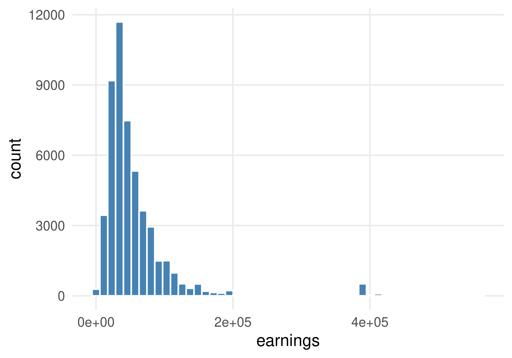
<- ggplot (cps, aes (x = earnings))<- p_hist + geom_histogram (bins = 50 ,fill = "steelblue" ,colour = "white"
aes() links earnings to the x-axis.
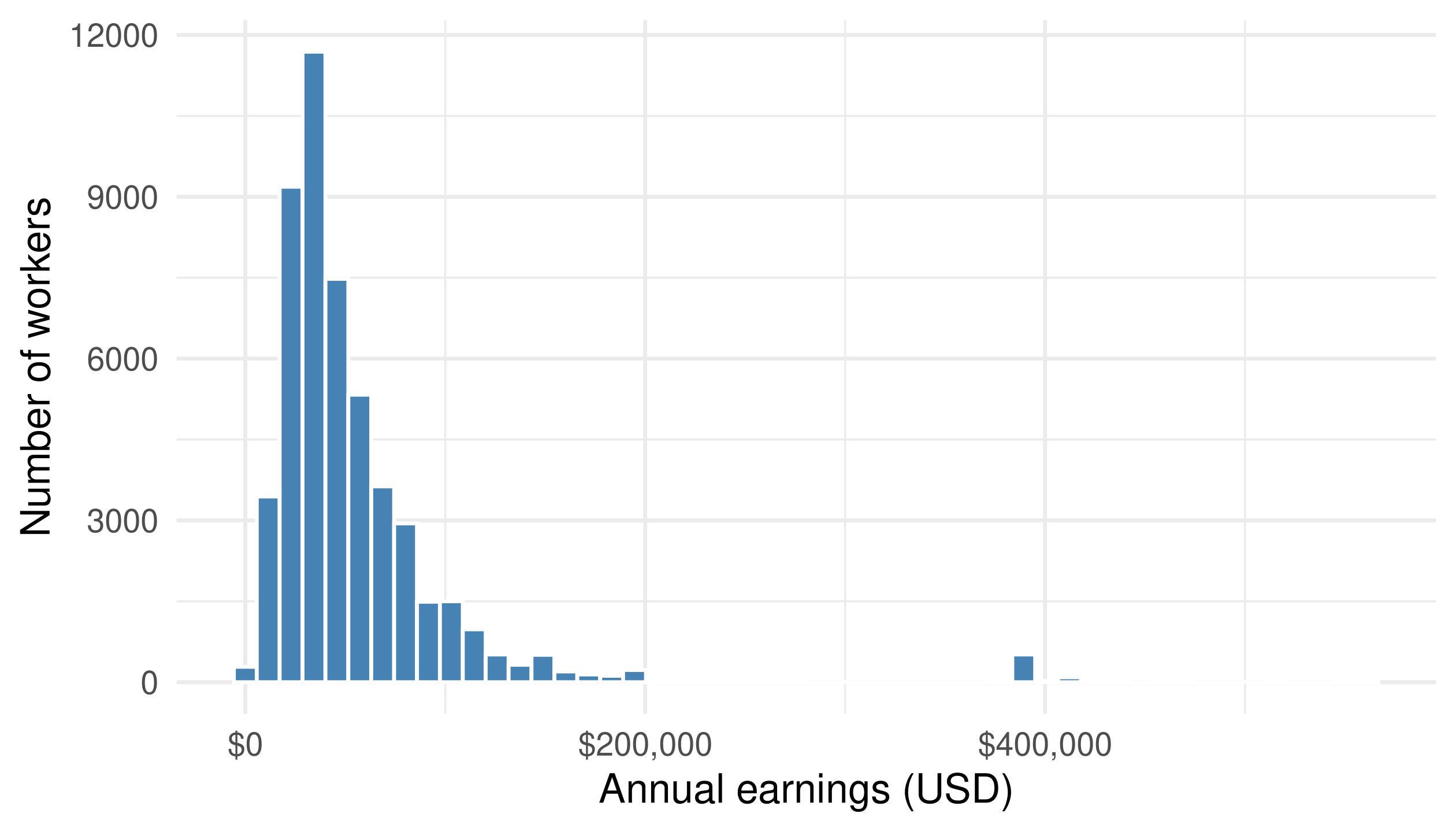
The histogram groups observations into bins and counts workers in each bin.
Add readable scales and labels
<- p_hist + scale_x_continuous (labels = scales:: label_dollar ()) + labs (x = "Annual earnings (USD)" , y = "Number of workers" ) + theme_minimal (base_size = 14 )
Scales control how values are displayed.Labels tell the audience what is measured and in which units.Themes change styling, such as gridlines and fonts.
The data and counting rule stay the same when we change labels or the theme.
Earnings have a long right tail
Most workers earn far less than the largest observed values. Try a different number of bins: which features remain?
Summarize before plotting group means
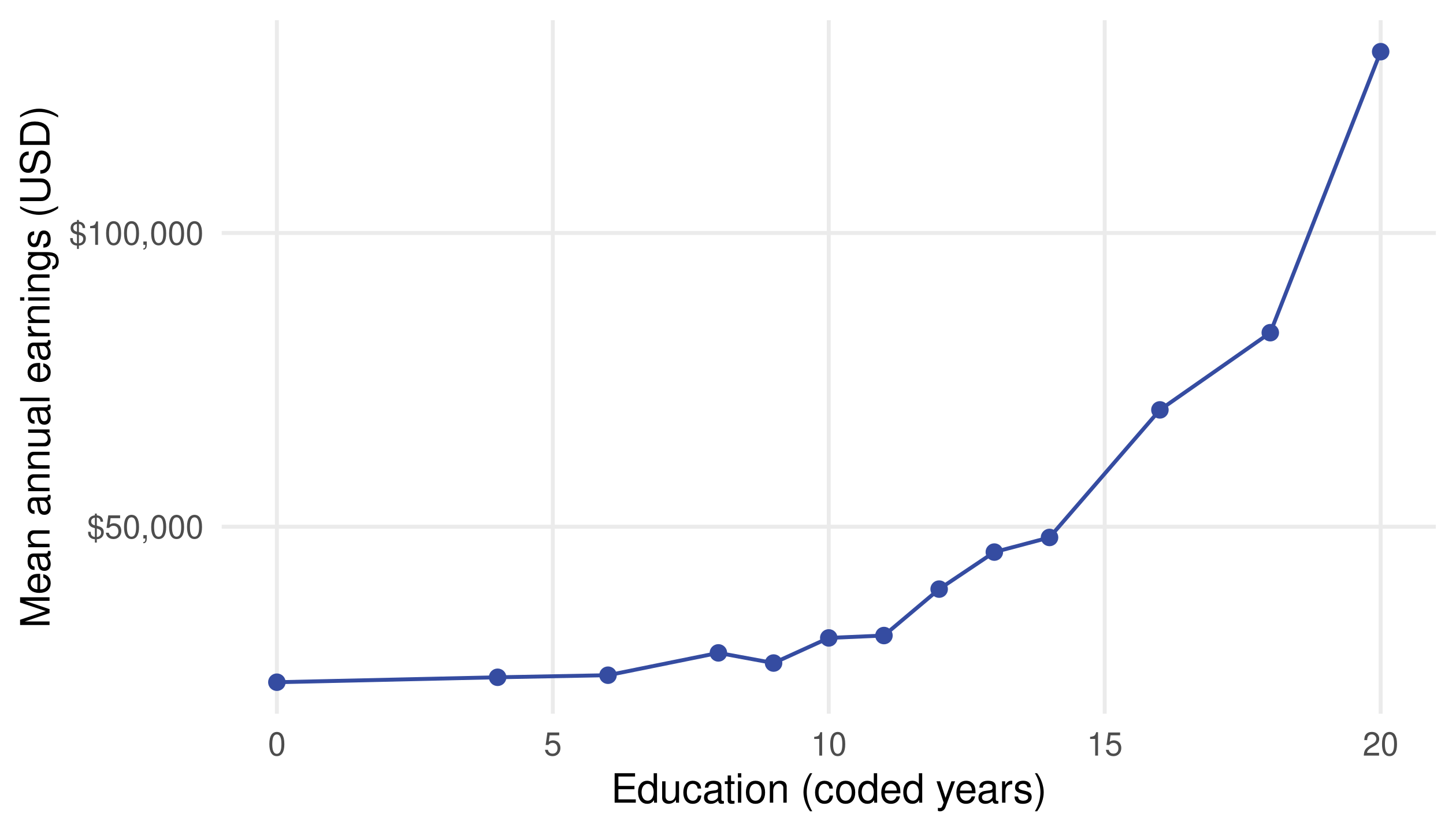
<- cps %>% group_by (education) %>% summarise (mean_earn = mean (earnings), n = n (), .groups = "drop" )<- ggplot (earn_by_edu, aes (education, mean_earn)) + geom_line (colour = "#354CA1" ) + geom_point (colour = "#354CA1" , size = 2 ) + scale_y_continuous (labels = scales:: label_dollar ()) + labs (x = "Education (coded years)" , y = "Mean annual earnings (USD)" )
geom_line() connects the group means; geom_point() marks the observed education categories.
Education and earnings are associated
These are unadjusted group means . Differences in experience, occupation, and selection can also matter.
A bar chart of group means
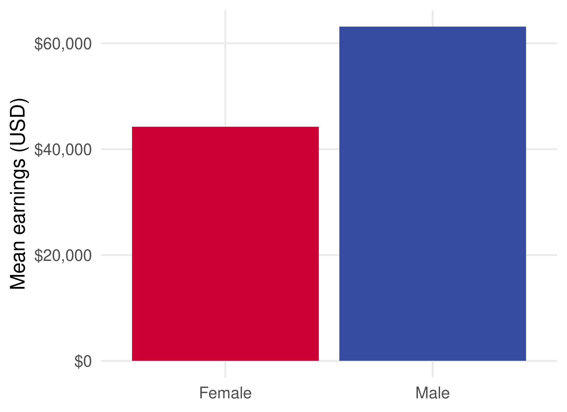
<- cps %>% group_by (female) %>% summarise (mean_earn = mean (earnings)) %>% mutate (sex = if_else (== 1 , "Female" , "Male" ))<- ggplot (earn_by_sex,aes (sex, mean_earn, fill = sex)) + geom_col (show.legend = FALSE ) + scale_fill_manual (values = sex_colours) + scale_y_continuous (labels = scales:: label_dollar ()) + labs (x = NULL , y = "Mean earnings (USD)" )
geom_col() uses the supplied means. geom_bar() counts rows by default.
Construct an hourly wage measure
Annual earnings reflect both pay rates and time worked. Approximate hourly pay by dividing by annual hours.
<- cps %>% filter (earnings > 0 , hours > 0 , week > 0 ,<= 80 , week <= 52 ) %>% mutate (wage_hourly = earnings / (hours * week),log_earn = log (earnings),log_wage = log (wage_hourly),sex = if_else (female == 1 , "Female" , "Male" )
The 80-hour cap is an illustrative cleaning choice . It leaves 50,545 workers; check whether conclusions depend on it.
Use the codebook for education groups
<- cps_w %>% mutate (edu_bin = cut (breaks = c (- Inf , 11 , 12 , 14 , 16 , Inf ),labels = c ("Below HS" , "HS" , "Some college / AA" , "BA" , "Graduate" )
12 = high-school diploma or equivalent.
13–14 = some college or an associate degree; 16 = a bachelor’s degree.
18 and 20 = graduate or professional education.
-Inf keeps education code 0 in the first bin.
These labels use the CPS extract’s coding . Numeric category codes should not be relabeled by guesswork.
Show distributions with density plots
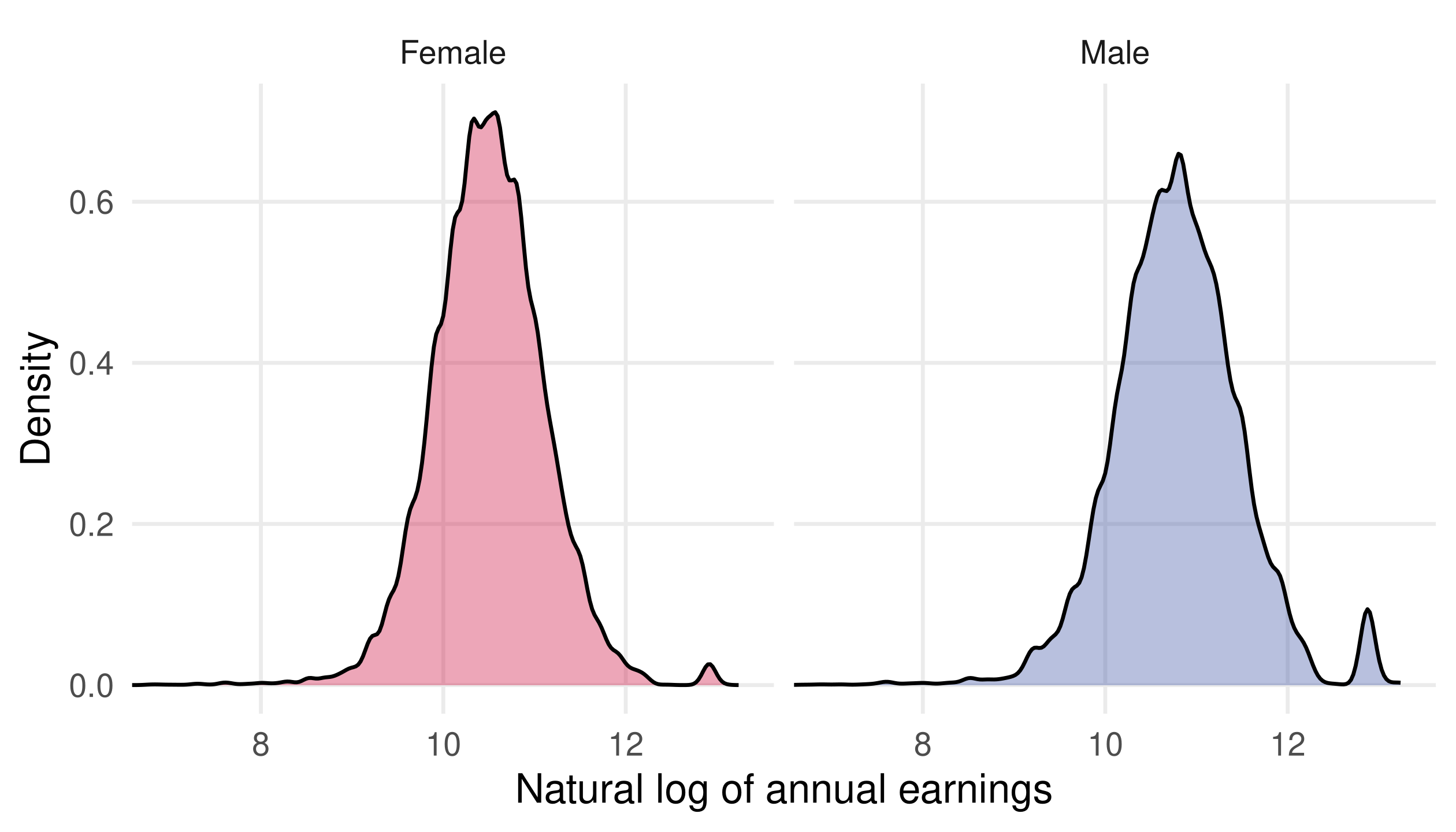
<- ggplot (cps_w, aes (log_earn, fill = sex)) + geom_density (alpha = 0.35 ) + scale_fill_manual (values = sex_colours) + coord_cartesian (xlim = log (c (1000 , 600000 ))) + labs (x = "Natural log of annual earnings" , y = "Density" , fill = NULL )<- p_density + facet_wrap (~ sex, nrow = 1 ) + theme (legend.position = "none" )
alpha controls transparency.facet_wrap() gives each group its own panel with common axes.Each density integrates to one: its height describes concentration , not the number of workers.
coord_cartesian() zooms the view; all observations still enter the density estimate.
Facets make each distribution easier to read
View: earnings from $1,000 to $600,000 on a log scale. A one-unit log difference means an earnings ratio of about 2.72.
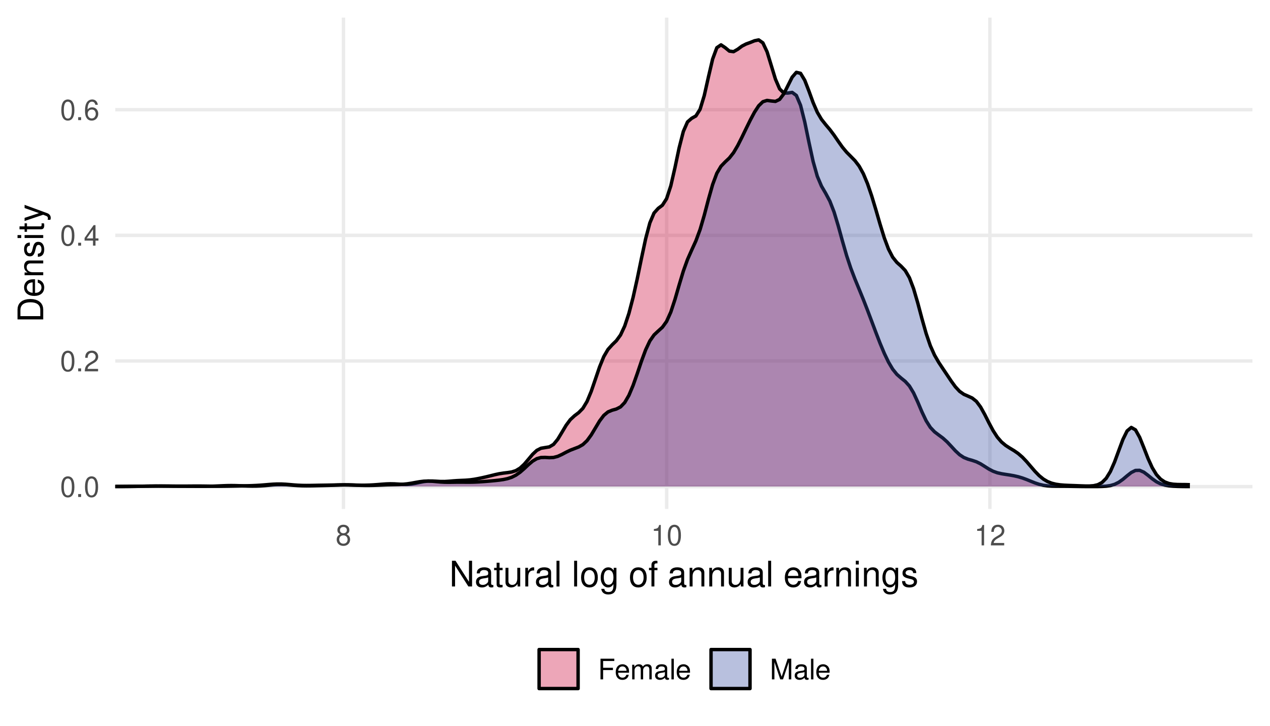
Overlay groups to compare their locations
The same zoomed distributions overlap substantially. A difference between group averages does not describe every worker.
Compare wages within education groups
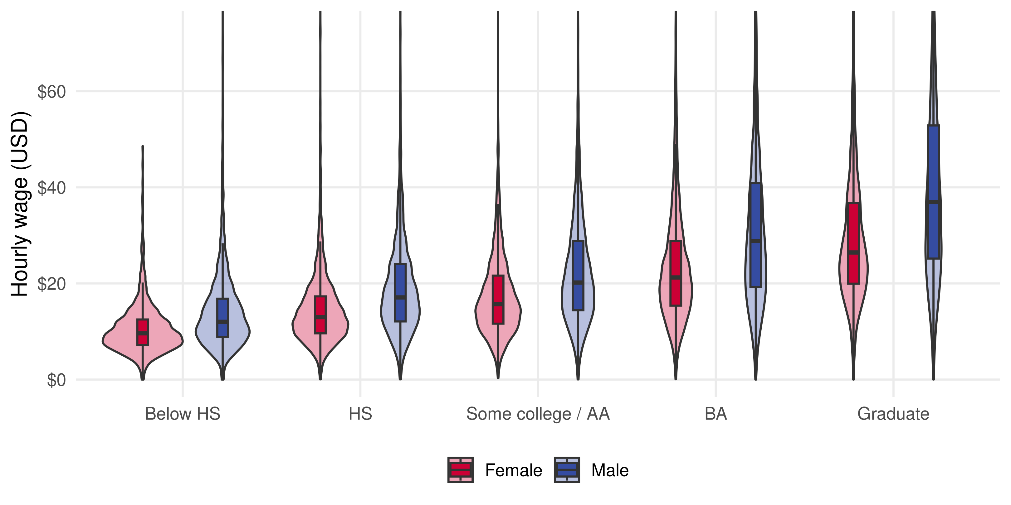
<- ggplot (cps_w, aes (edu_bin, wage_hourly, fill = sex)) + geom_violin (alpha = 0.35 , position = position_dodge (0.9 )) + geom_boxplot (width = 0.12 , outlier.shape = NA ,position = position_dodge (0.9 )) + scale_fill_manual (values = sex_colours) + scale_y_continuous (labels = scales:: label_dollar ()) + coord_cartesian (ylim = c (0 , quantile (cps_w$ wage_hourly, 0.98 ))) + labs (x = NULL , y = "Hourly wage (USD)" , fill = NULL )
coord_cartesian() zooms the view while retaining observations for the density and boxplot calculations.
A group mean hides substantial variation
Violins show distribution shape; boxes show the median and middle 50%. The view ends at the sample’s 98th percentile.
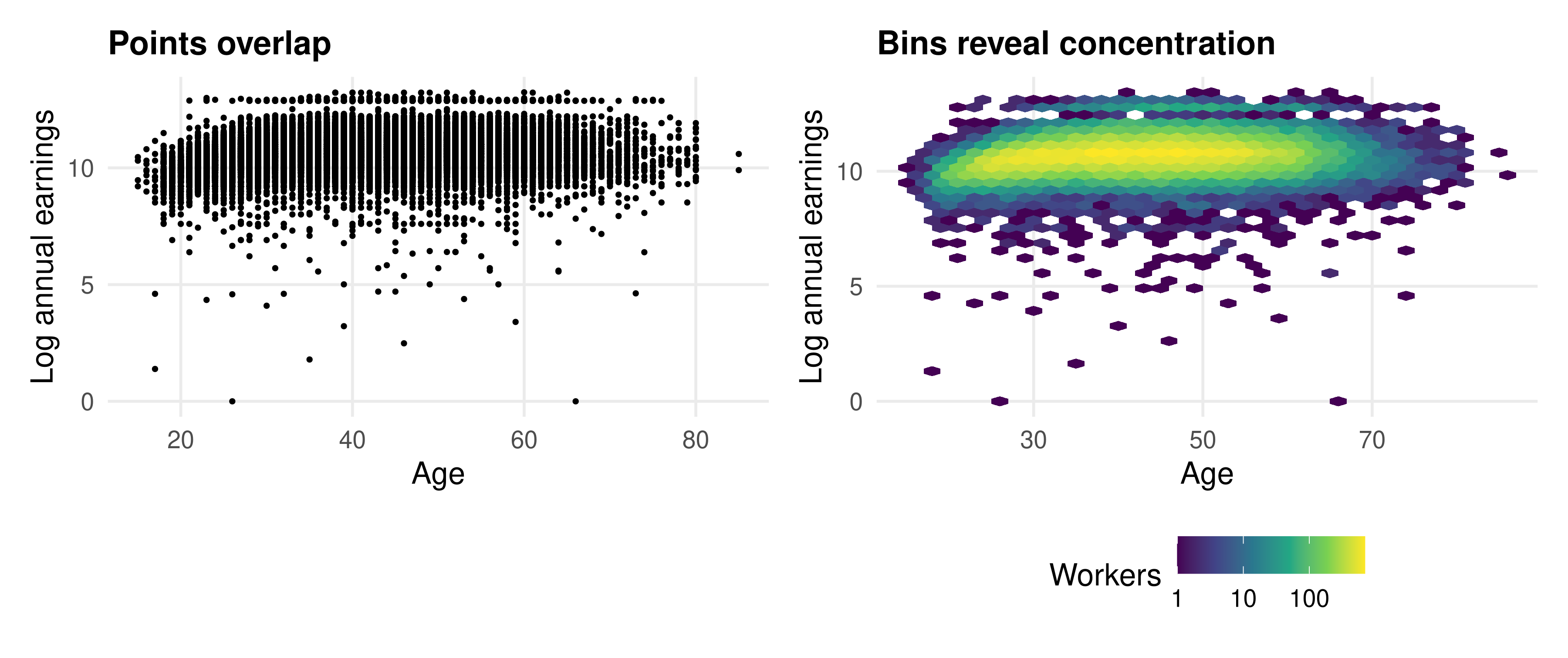
Large samples can hide observations
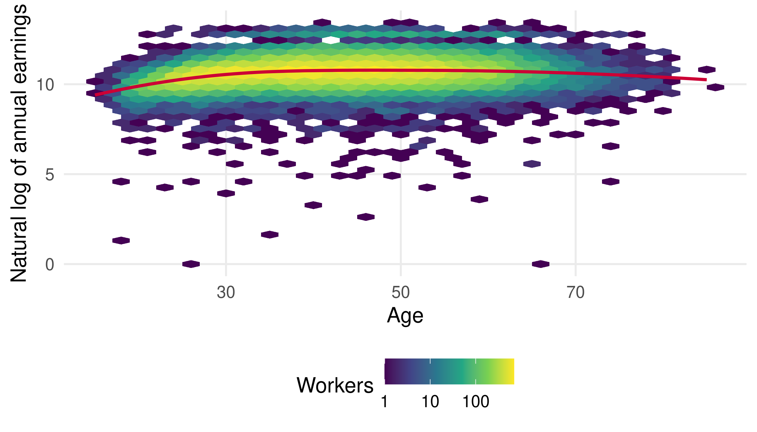
Hexagons count nearby observations. The colour scale is logarithmic; the x-axis remains age in years.
Add a smooth to summarize the pattern
<- ggplot (cps_w, aes (age, log_earn)) + geom_hex (bins = 35 ) + geom_smooth (method = "loess" , se = FALSE ,colour = "#CC0035" , linewidth = 1 ) + scale_fill_viridis_c (trans = "log10" ) + labs (x = "Age" , y = "Natural log of annual earnings" , fill = "Workers" )
The smooth uses the individual observations. It summarizes an age–earnings association , not a worker’s life-cycle path.
Earnings rise and then flatten across ages
This motivates a regression with experience and a quadratic experience term.
A Mincer wage equation
\log(wage_i) = \beta_0 + \beta_1 education_i
+ \beta_2 experience_i + \beta_3 experience_i^2 + u_i
<- cps %>% filter (earnings > 0 , hours > 0 , week > 0 ) %>% mutate (wage_hourly = earnings / (hours * week),log_wage = log (wage_hourly),experience = pmax (age - education - 6 , 0 ),exp2 = experience^ 2
Potential experience approximates time since schooling; it is not observed work experience. This model uses the original sample, before the plotting cap on hours.
Estimate the wage equation
<- lm (log_wage ~ education + experience + exp2,data = cps_mincer)summary (mincer_model)
(Intercept)
0.93683
0.01646
56.91
<0.001
education
0.11257
0.00098
115.43
<0.001
experience
0.03626
0.00081
44.85
<0.001
exp2
-0.00058
0.00002
-34.55
<0.001
lm() fits ordinary least squares. summary(mincer_model) also reports residual and model-fit information.
Displayed standard errors are the conventional lm standard errors. In empirical work, assess heteroskedasticity and the survey design before relying on them for inference.
Interpret the association carefully
For one additional coded year of education, holding potential experience fixed:
Approximate fitted wage difference: 11.3% .
Exact fitted wage ratio minus one: 11.9% .
The marginal log-wage association with experience is
\beta_2 + 2\beta_3 experience.
These are conditional associations. Schooling choices, ability, occupation, and selection prevent a causal interpretation from this regression alone.
Practice: make a defensible comparison
Compare median hourly wages across education groups.
Plot the result and label the units.
Repeat with and without the 80-hour cap.
Explain what the comparison describes and which question it cannot answer.
We have compared different workers in one period. Next, we follow an aggregate through ordered months.
Time series data
What changes when the order of rows matters?
Monthly financial data
Welch and Goyal (2008) study predictors of the equity premium. We use the 2018 vintage of their data.
<- read_excel ("data/PredictorData2018.xlsx" ,sheet = "Monthly" , na = "NaN" )%>% select (yyyymm, Index, D12, lty, tbl, infl) %>% slice_head (n = 4 )
## # A tibble: 4 × 6
##   yyyymm Index   D12    lty    tbl     infl
##    <dbl> <dbl> <dbl>  <dbl>  <dbl>    <dbl>
## 1 192612  13.5 0.69  0.0354 0.0307  0
## 2 192701  13.2 0.697 0.0351 0.0323 -0.0113
## 3 192702  13.8 0.703 0.0347 0.0329 -0.00571
## 4 192703  13.9 0.71  0.0331 0.032  -0.00575
One row is a month. The workbook covers December 1926 through December 2018 ; it also contains quarterly and annual sheets.
[Sources] - https://sites.google.com/view/agoyal145 The lecture deliberately uses the existing PredictorData2018.xlsx rather than a moving online update. Later work using these predictors includes Koo et al. (2020), Journal of Econometrics 219(2), 456–477; and Lee, Shi, and Gao (2022), Journal of Econometrics 229(2), 322–349.
Parse dates, sort, and check gaps
<- data_raw %>% mutate (date = ymd (paste0 (yyyymm, "01" ))) %>% arrange (date)stopifnot (! anyNA (data_raw$ date), ! anyDuplicated (data_raw$ date))stopifnot (all (data_raw$ date == seq (min (data_raw$ date), max (data_raw$ date), by = "month" )))%>% select (yyyymm, date) %>% slice_head (n = 3 )
## # A tibble: 3 × 2
##   yyyymm date
##    <dbl> <date>
## 1 192612 1926-12-01
## 2 192701 1927-01-01
## 3 192702 1927-02-01
lag() means the previous row . It means the previous month only after checking the order and calendar spacing.
Define the return before computing it
The change in the log price index is a log price return :
r_t^{price} = \log(P_t) - \log(P_{t-1}).
<- data_raw %>% mutate (price_return = log (Index) - log (lag (Index)))
The first return is NA because the previous price is unavailable.
This measure excludes dividends and does not subtract a risk-free return.
An excess return requires a consistent total-return measure minus the corresponding risk-free return.
We use price_return throughout the examples so its name matches its construction.
Construct predictors with explicit lags
<- data_raw %>% transmute (dp = log (D12) - log (Index),dy = log (D12) - log (lag (Index)),ep = log (E12) - log (Index),tms = lty - tbl,dfy = BAA - AAA,dfr = corpr - ltr,bm = ` b/m ` , tbl, ltr, ntis, svar, infl%>% filter (! is.na (price_return))
transmute() keeps only the listed variables. The retained observations start in January 1927 .
Read the definitions and units
dplog(D12) - log(Index)Log dividend–price ratio
dylog(D12) - log(lag(Index))Log dividend yield, using lagged price
eplog(E12) - log(Index)Log earnings–price ratio
tmslty - tblAnnualized long–short yield spread
dfyBAA - AAACorporate bond yield spread
inflFrom the workbook
Monthly inflation rate
A decimal value of 0.01 is one percentage point. Check the time horizon too: a monthly inflation rate and an annualized yield spread measure different things.
Reshape for multiple time series
<- data_wg %>% select (date, tms, infl) %>% pivot_longer (c (tms, infl),names_to = "variable" , values_to = "value" )head (x_plot, 4 )
## # A tibble: 4 × 3
##   date       variable    value
##   <date>     <chr>       <dbl>
## 1 1927-01-01 tms       0.00280
## 2 1927-01-01 infl     -0.0113
## 3 1927-02-01 tms       0.00180
## 4 1927-02-01 infl     -0.00571
Each row now represents one variable in one month . The measurement remains a time series; reshaping does not create new independent observations.
Draw a line for each variable
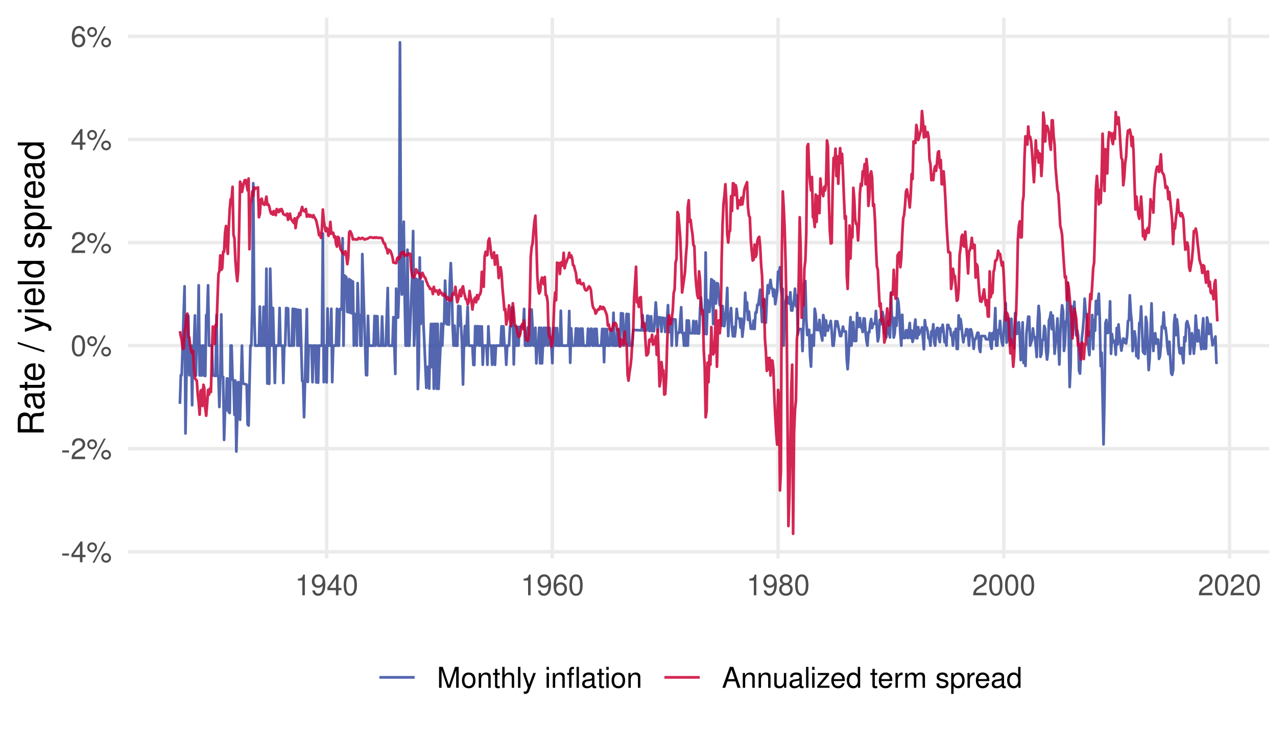
<- ggplot (x_plot, aes (date, value, colour = variable)) + geom_line (linewidth = 0.5 , alpha = 0.85 ) + scale_colour_manual (values = c (infl = "#354CA1" , tms = "#CC0035" ),labels = c (infl = "Monthly inflation" , tms = "Annualized term spread" )+ scale_y_continuous (labels = scales:: label_percent ()) + labs (x = NULL , y = "Rate / yield spread" , colour = NULL )
Colour identifies the variable and determines separate groups for geom_line().
Compare timing without confusing units
The common percentage scale helps locate episodes, but the series have different economic meanings and time horizons.
Facet series with different scales
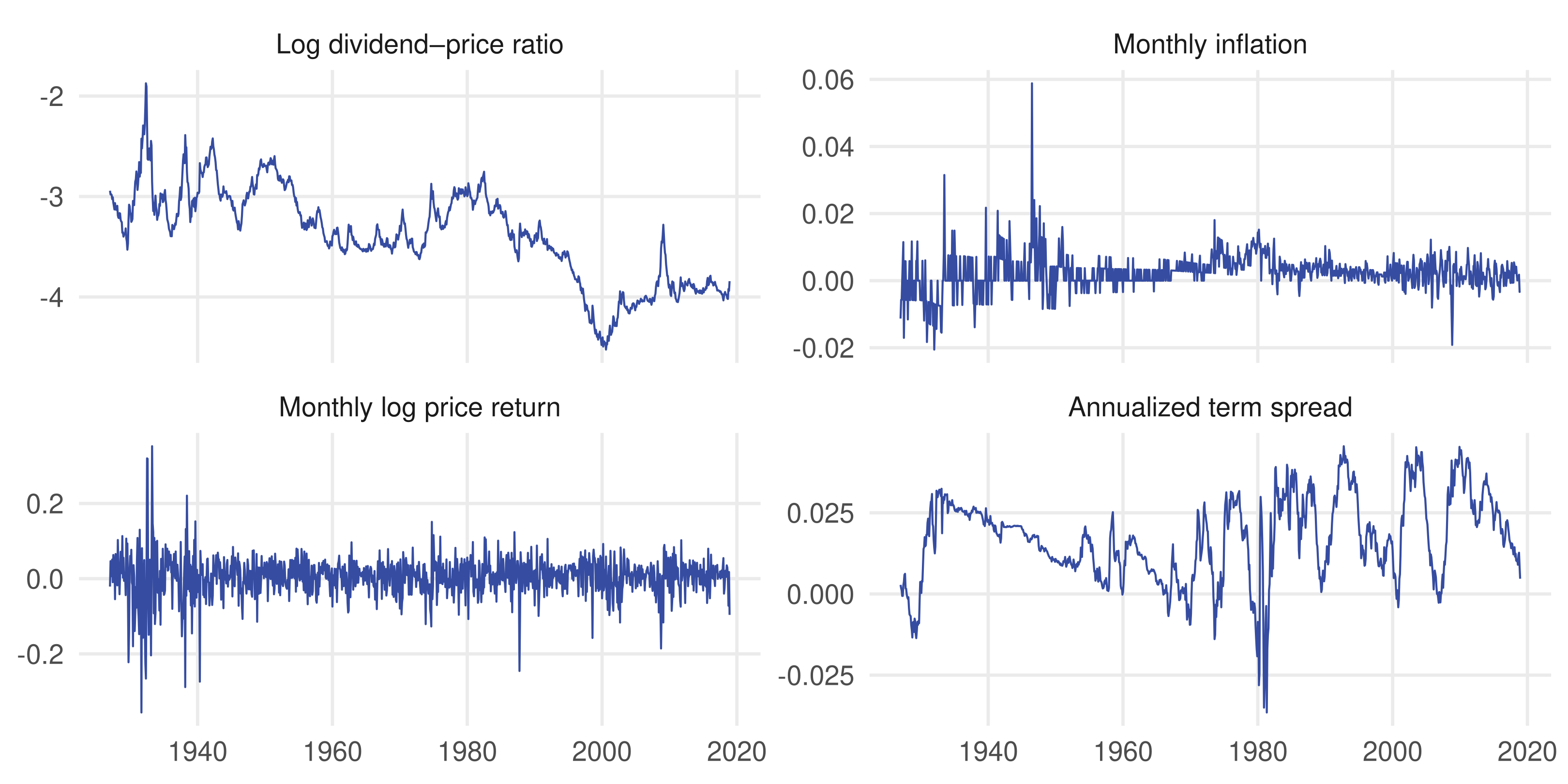
<- c (dp = "Log dividend–price ratio" ,infl = "Monthly inflation" , price_return = "Monthly log price return" ,tms = "Annualized term spread" )<- data_wg %>% select (date, dp, tms, price_return, infl) %>% pivot_longer (- date, names_to = "variable" , values_to = "value" )<- ggplot (x_facets, aes (date, value)) + geom_line (colour = "#354CA1" , linewidth = 0.4 ) + facet_wrap (~ variable, ncol = 2 , scales = "free_y" ,labeller = as_labeller (series_labels)) + labs (x = NULL , y = NULL )
free_y lets each panel use its own y-axis; the time axes remain common.
Separate panels reveal different dynamics
Persistent ratios and volatile returns look different. Read each y-axis before comparing the size of movements.
ARIMA models use a series’ own history
An ARIMA(p, d, q) model combines:
AR(p): lagged values of the series.I(d): differencing to model a more stable series.MA(q): lagged forecast errors.
auto.arima() searches for a specification using statistical tests and an information criterion.
Model selection is a starting point. Inspect residuals and evaluate predictions on later observations.
Keep the monthly index
<- ts (data_wg$ price_return,start = c (1927 , 1 ), frequency = 12 )<- auto.arima (stock_return, seasonal = FALSE ,approximation = FALSE )
## Series: stock_return
## ARIMA(2,0,2) with non-zero mean
##
## Coefficients:
##           ar1      ar2     ma1     ma2    mean
##       -0.3938  -0.7461  0.4913  0.8046  0.0047
## s.e.   0.1168   0.0750  0.1039  0.0741  0.0017
##
## sigma^2 = 0.002863:  log likelihood = 1668.32
## AIC=-3324.64   AICc=-3324.56   BIC=-3294.6
frequency = 12 records monthly spacing. seasonal = FALSE restricts this example to nonseasonal models; it does not change the calendar.
Practice: does the model change over time?
<- window (stock_return, end = c (1979 , 12 ))<- window (stock_return, start = c (1980 , 1 ))auto.arima (early, seasonal = FALSE , approximation = FALSE )auto.arima (late, seasonal = FALSE , approximation = FALSE )checkresiduals (arima_model)
Compare the selected orders and coefficients across periods.
Look for residual autocorrelation and changing volatility.
For a forecasting comparison, fit on earlier months and evaluate on later months using the same test period and a simple benchmark.
Suggested benchmark: the historical mean computed only from the training sample. Different orders in two subsamples alone are not a formal structural-break test. Do not randomly shuffle a time series into training and test sets.
Panel data
What can we learn by following the same units over time?
Gapminder follows countries over time
The gapminder data contain 142 countries observed every five years , 1952–2007: 1,704 country–year observations .
<- gapminder %>% mutate (log_gdp = log (gdpPercap))%>% select (country, year, lifeExp, gdpPercap) %>% slice_head (n = 4 )
## # A tibble: 4 × 4
##   country      year lifeExp gdpPercap
##   <fct>       <int>   <dbl>     <dbl>
## 1 Afghanistan  1952    28.8      779.
## 2 Afghanistan  1957    30.3      821.
## 3 Afghanistan  1962    32.0      853.
## 4 Afghanistan  1967    34.0      836.
lifeExp measures life expectancy at birth in years; gdpPercap is inflation-adjusted GDP per capita.
[Sources] - https://jennybc.github.io/gapminder/reference/gapminder.html The package is a fixed historical excerpt, not the latest Gapminder release. Distinguish a panel from repeated cross-sections that sample different units in each period.
Check the country–year key
%>% count (country, year) %>% filter (n != 1 )
## # A tibble: 0 × 3
## # ℹ 3 variables: country <fct>, year <int>, n <int>
<- gap %>% count (country, name = "periods" )%>% count (periods, name = "countries" )
## # A tibble: 1 × 2
##   periods countries
##     <int>     <int>
## 1      12       142
stopifnot (n_distinct (gap$ year) == 12 ,all (coverage$ periods == 12 ),! anyDuplicated (gap[c ("country" , "year" )]))
A balanced panel observes each country in the same set of periods. In an unbalanced panel, some country–year observations are absent.
Start with a single-year snapshot
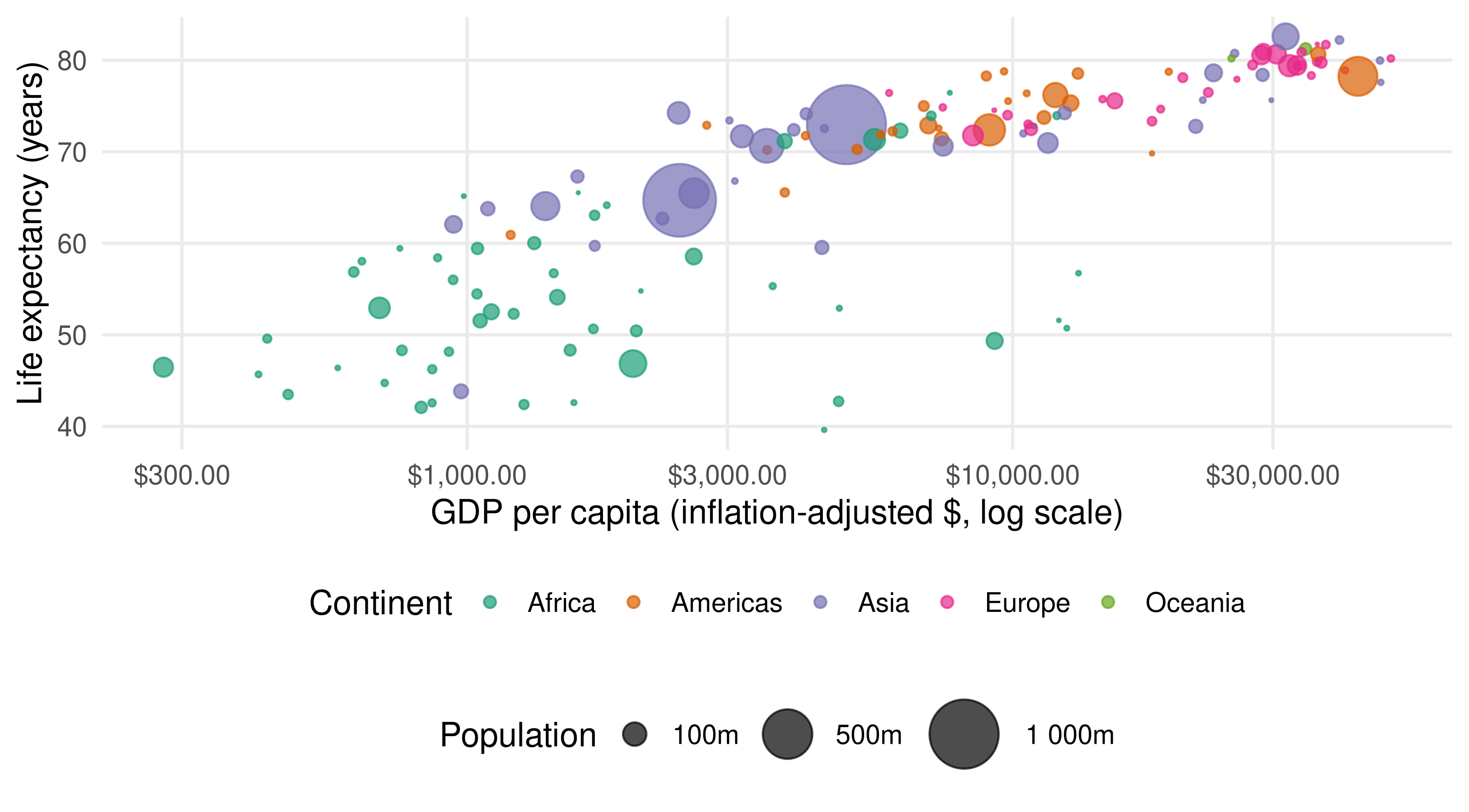
<- gap %>% filter (year == 2007 )<- ggplot (gap_2007, aes (gdpPercap, lifeExp)) + geom_point (aes (size = pop, colour = continent), alpha = 0.7 ) + scale_x_log10 (labels = scales:: label_dollar ()) + scale_size_area (max_size = 15 , breaks = c (1e8 , 5e8 , 1e9 ),labels = scales:: label_number (scale = 1e-6 , suffix = "m" )) + scale_colour_brewer (palette = "Dark2" ) + labs (x = "GDP per capita (inflation-adjusted $, log scale)" ,y = "Life expectancy (years)" , size = "Population" ,colour = "Continent" ) + theme (legend.box = "vertical" )
Position maps two variables; colour maps continent; bubble area maps population.
A snapshot shows between-country differences
In 2007 , richer countries tend to have longer life expectancy. The x-axis shows dollar values on a logarithmic scale .
Put a mapping where it is needed
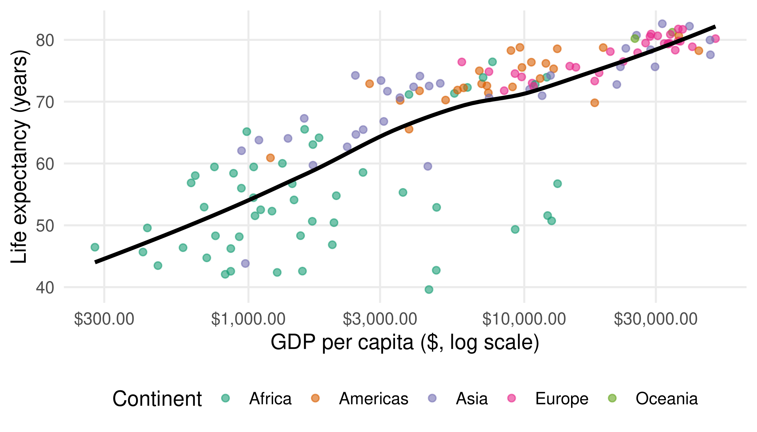
<- ggplot (gap_2007, aes (gdpPercap, lifeExp)) + geom_point (aes (colour = continent), alpha = 0.6 ) + geom_smooth (method = "loess" , se = FALSE , colour = "black" ) + scale_x_log10 (labels = scales:: label_dollar ()) + scale_colour_brewer (palette = "Dark2" ) + labs (x = "GDP per capita ($, log scale)" ,y = "Life expectancy (years)" , colour = "Continent" )
Global x/y mappings apply to both layers.
The continent mapping applies only to the points, so there is one overall smooth .
To fit a smooth for each continent, move colour = continent into the global aes() and remove the fixed black colour.
One smooth summarizes the whole snapshot
The point layer distinguishes continents; the smooth pools all 142 countries in 2007.
Plot within-country paths
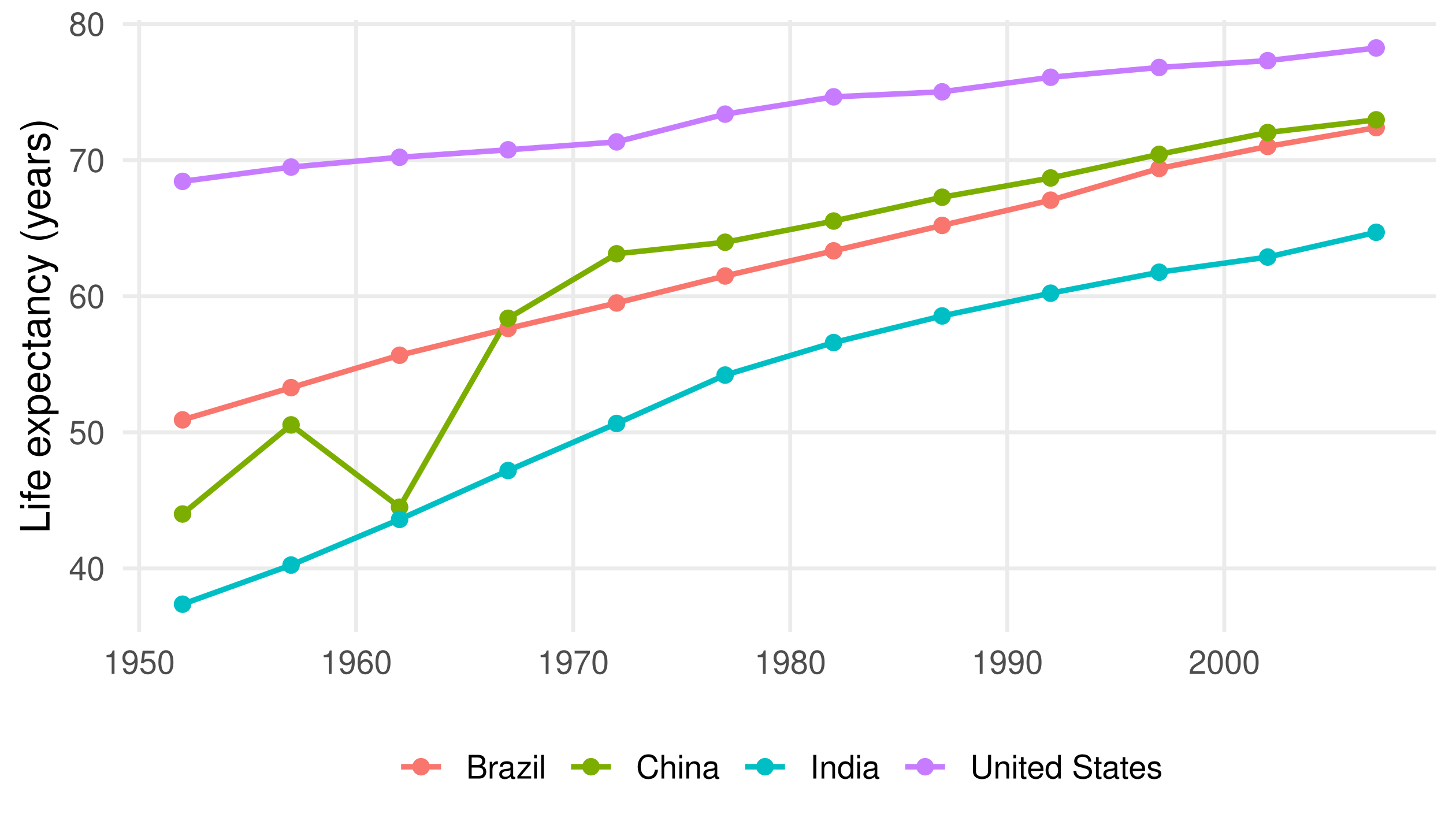
<- gap %>% filter (country %in% c ("Brazil" , "China" , "India" , "United States" ))<- ggplot (selected_countries,aes (year, lifeExp, colour = country, group = country)) + geom_line (linewidth = 0.9 ) + geom_point (size = 2 ) + labs (x = NULL , y = "Life expectancy (years)" , colour = NULL )
group = country connects observations within each country . It prevents a line from linking different countries.
The same countries change over time
Lines connect five-year observations for four selected countries; intervening years are unobserved.
Pooling ignores the panel structure
<- lm (lifeExp ~ log_gdp, data = gap)summary (ols_model)
(Intercept)
-9.101
1.228
-7.41
<0.001
log_gdp
8.405
0.149
56.50
<0.001
This slope mixes:
Between-country variation: richer and poorer countries differ.Within-country variation: the same country changes over time.
The conventional standard errors shown here also ignore within-country dependence.
Country and year fixed effects
lifeExp_{it} = \alpha_i + \lambda_t + \beta\log(GDPpc_{it}) + u_{it}
\alpha_i : country fixed effectsCountry characteristics that are constant over time
\lambda_t : year fixed effectsShifts common to all countries in each observed year
\beta : log GDP coefficientAssociation using variation left after removing both sets of effects
We compare within-country changes after accounting for common year effects.
Estimate both sets of fixed effects
<- feols (lifeExp ~ log_gdp | country + year,data = gap, vcov = ~ country)summary (fe_model)
log_gdp
1.45
0.679
2.13
0.035
Variables after | identify the fixed effects.
vcov = ~ country clusters standard errors by country.Clustering allows errors within a country to be correlated over time; it does not change the slope estimate.
Different comparisons give different slopes
Pooled OLS
8.405
0.801
Country + year fixed effects
1.450
0.138
The fixed-effects slope is smaller in this dataset . Fixed effects do not guarantee that a coefficient will shrink.
The coefficient is an association, measured in life-expectancy years per log point of GDP. Time-varying confounding and reverse causality can remain.
Practice: separate the two comparisons
Plot life expectancy against log GDP in 1952 and 2007 using common axes.
Plot the time paths of two countries of your choice.
Fit pooled, country-only, and country-plus-year models.
Explain which variation each model uses and why none alone establishes causality.
<- feols (lifeExp ~ log_gdp | country,data = gap, vcov = ~ country)
Match the analysis to the observation structure
Cross-sectional
Unit, sample selection, units
Distributions and group comparisons
Mincer wage equation
Time series
Dates, ordering, gaps
Lines and time-series facets
ARIMA
Panel
Unit–time key, coverage
Snapshots and within-unit paths
Country and year fixed effects
Identify the observation, verify the structure, visualize the comparison, then explain what the model can tell you.
Additional plotting examples
Ridgelines, group comparisons, pairs, themes, and animation
Ridgelines compare several distributions
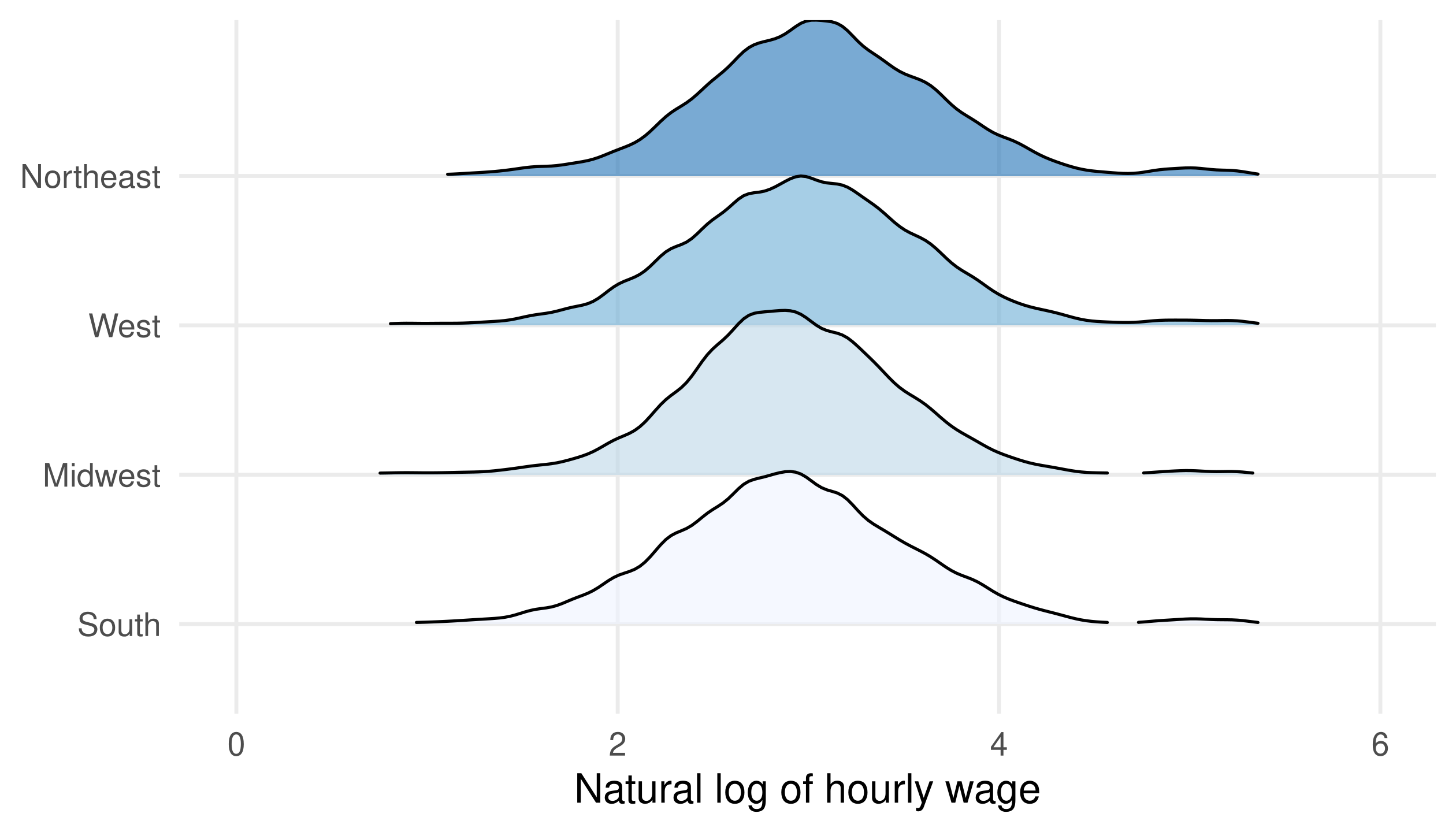
<- cps_w %>% mutate (region_lab = factor (region, levels = 1 : 4 ,labels = c ("Northeast" , "Midwest" , "South" , "West" )),region_lab = fct_reorder (region_lab, log_wage, median))<- ggplot (cps_w, aes (log_wage, region_lab, fill = region_lab)) + :: geom_density_ridges (alpha = 0.6 , scale = 1.1 ,rel_min_height = 0.01 ) + scale_fill_brewer (palette = "Blues" ) + coord_cartesian (xlim = log (c (1 , 400 ))) + labs (x = "Natural log of hourly wage" , y = NULL ) + theme (legend.position = "none" )
Regions are ordered by their median log wage. Ridge shape describes the distribution within a region, not its sample size.
Wage distributions differ across regions
View: hourly wages from $1 to $400 on a log scale. The regional distributions overlap substantially.
Build a within-group comparison
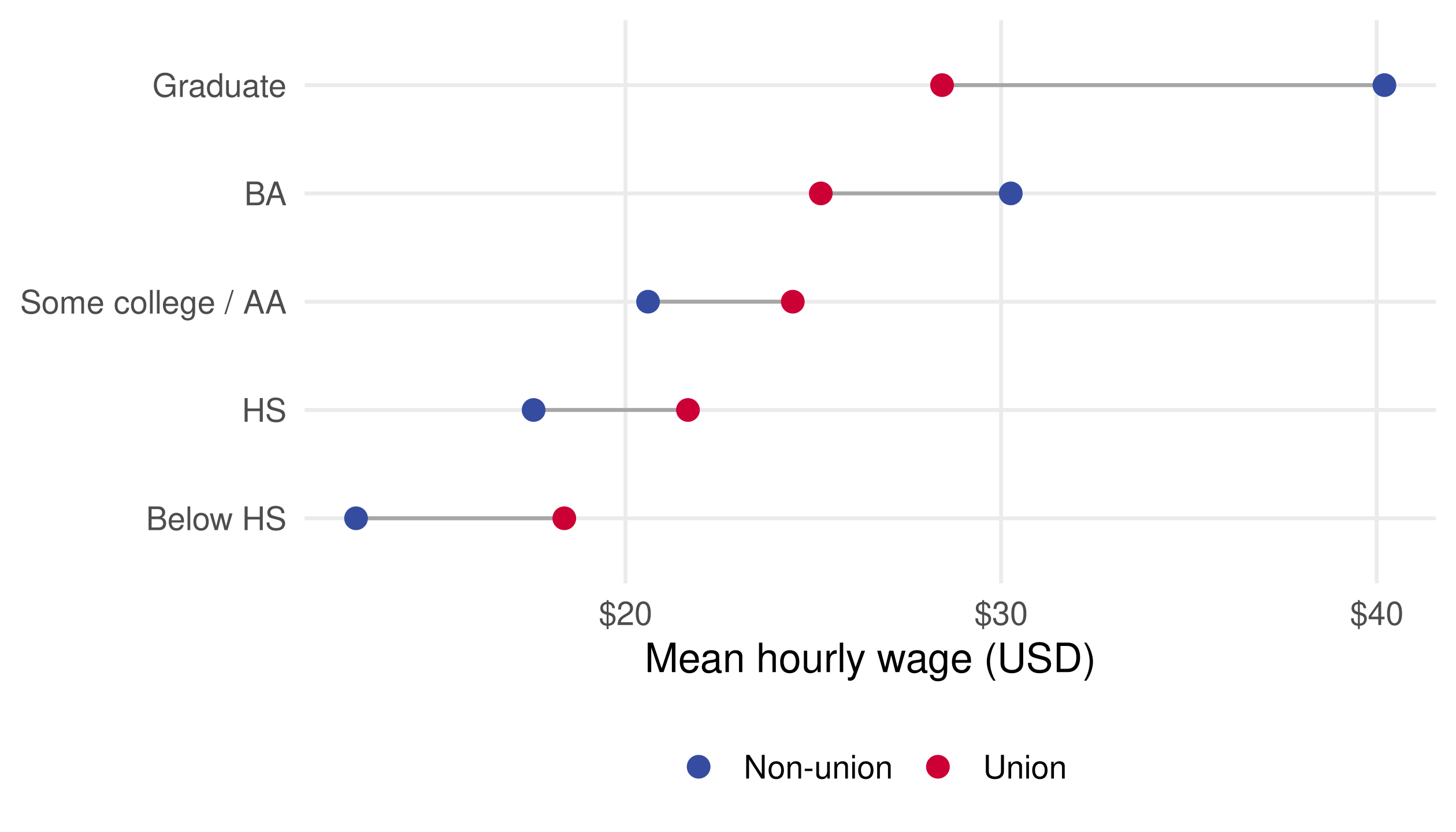
For a union-status comparison, compute the mean for each education × union group, then calculate segment endpoints within education groups.
<- cps_w %>% mutate (union_lab = if_else (union == 1 , "Union" , "Non-union" )) %>% group_by (edu_bin, union_lab) %>% summarise (mean_wage = mean (wage_hourly), n = n (), .groups = "drop" )<- union_means %>% group_by (edu_bin) %>% summarise (low = min (mean_wage), high = max (mean_wage),.groups = "drop" )
Each connecting segment must use its own education group’s endpoints.
Draw segments, then group means
<- ggplot (union_means, aes (mean_wage, edu_bin, colour = union_lab)) + geom_segment (data = union_segments,aes (x = low, xend = high, y = edu_bin, yend = edu_bin),inherit.aes = FALSE , colour = "grey65" ) + geom_point (size = 3 ) + scale_colour_manual (values = c ("Non-union" = "#354CA1" , "Union" = "#CC0035" )) + scale_x_continuous (labels = scales:: label_dollar ()) + labs (x = "Mean hourly wage (USD)" , y = NULL , colour = NULL )
inherit.aes = FALSE lets the segment layer use its own data and mappings.
These are descriptive union-status gaps
These sample means compare 1,086 union members with 49,459 nonmembers; they do not identify a causal premium.
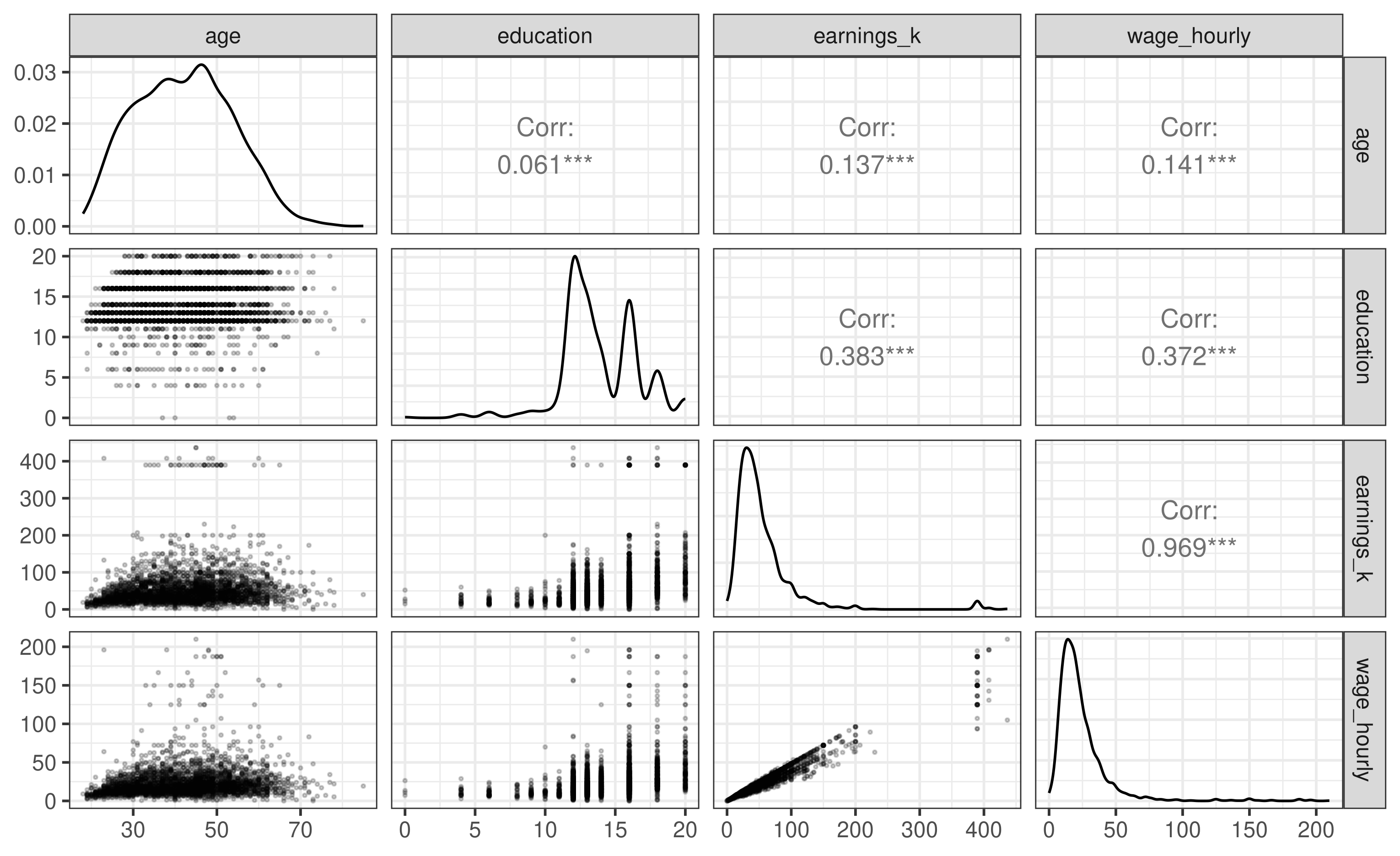
A pairs plot gives a compact overview
set.seed (123 )<- cps_w %>% mutate (earnings_k = earnings / 1000 ) %>% select (age, education, earnings_k, wage_hourly) %>% slice_sample (n = 3000 )<- GGally:: ggpairs (pairs_sample, progress = FALSE ,lower = list (continuous = GGally:: wrap ("points" , alpha = 0.2 , size = 0.4 )),diag = list (continuous = GGally:: wrap ("densityDiag" )),upper = list (continuous = GGally:: wrap ("cor" , size = 4 ))) + theme_bw (base_size = 12 )
The seed makes the sample reproducible; earnings_k is in thousands of dollars. The diagonal shows distributions, the lower triangle shows pairs, and the upper triangle reports correlations.
Read one pair at a time
Earnings and hourly wages share the same numerator, so part of their association is mechanical.
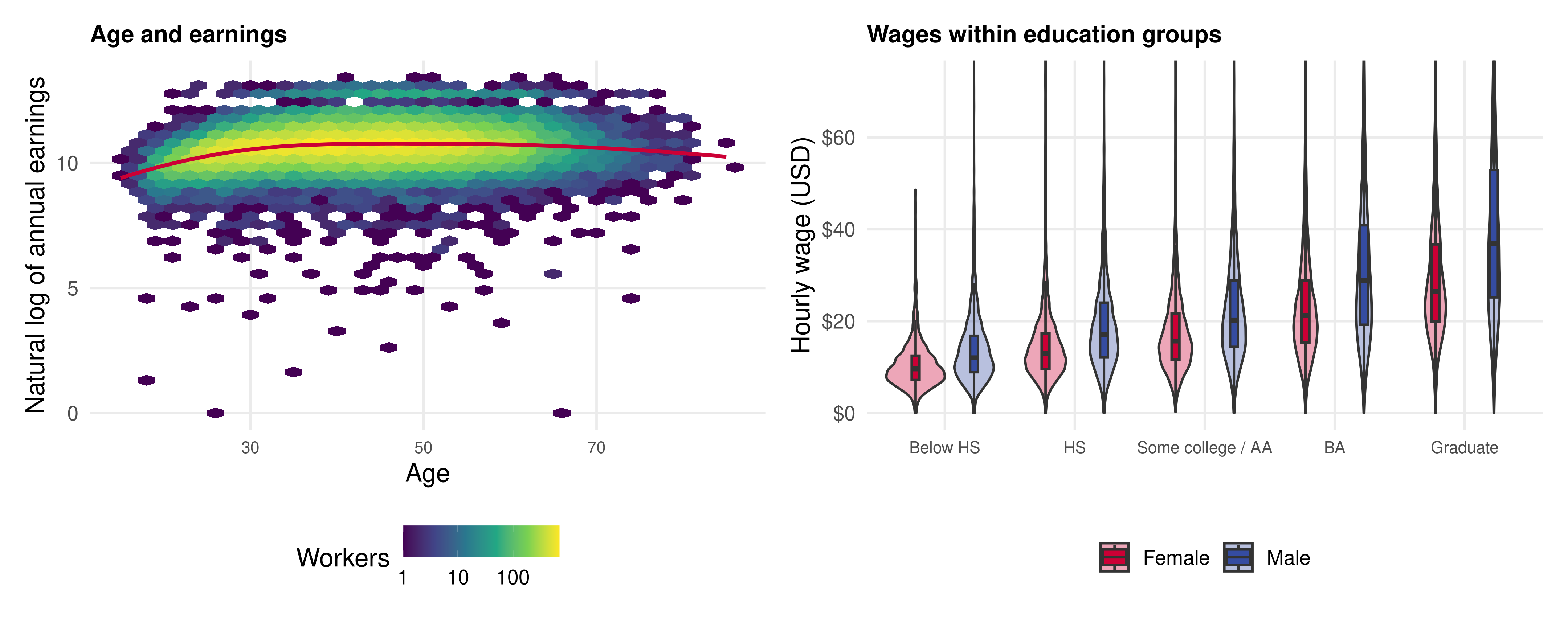
Combine plots with patchwork
<- patchwork:: wrap_plots (+ labs (title = "Age and earnings" ),+ labs (title = "Wages within education groups" ),ncol = 2
Use a common figure when two plots answer complementary questions.
Keep the units and legend visible in each panel.
Allocate enough width for category labels.
Let each panel retain its own scale when the measurements differ.
Two views of the same workers
The age plot summarizes a broad pattern; the wage distributions show variation within education groups.
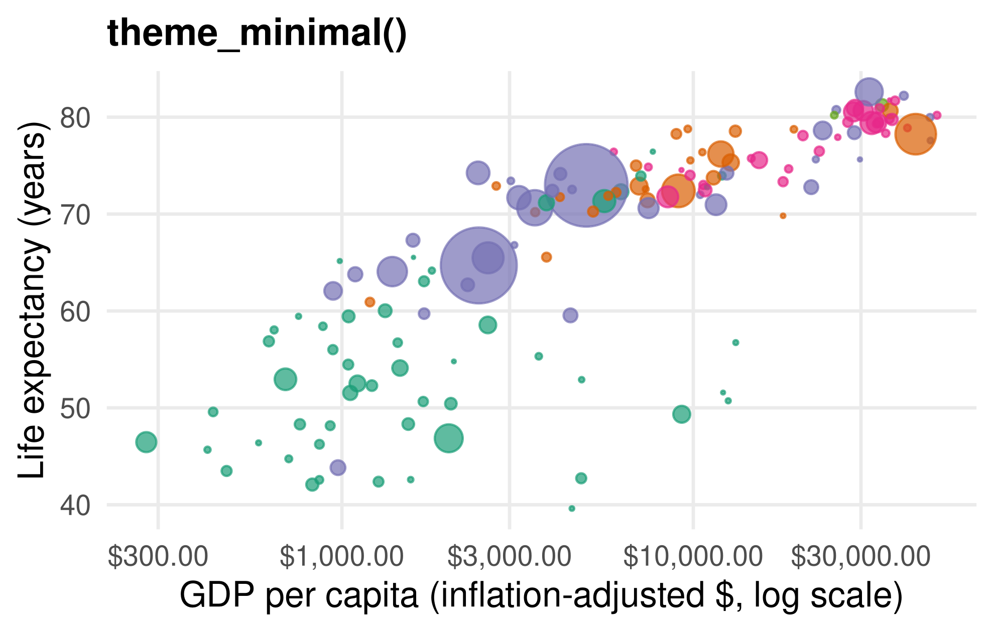
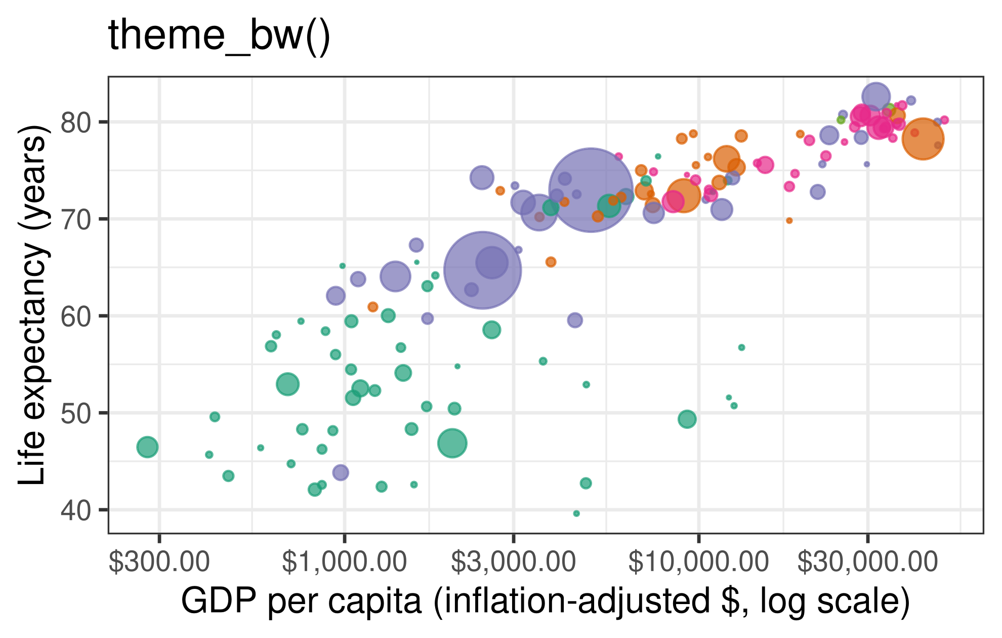
A theme changes styling
<- p_gap + theme_bw (base_size = 14 ) + theme (legend.position = "bottom" )
The data, mappings, and scales are unchanged. External theme packages follow the same idea.
Match the mappings to the geom
A scatterplot uses x and y. A density plot needs one measured variable; its y-values are computed by the density statistic.
<- ggplot (gap_2007) + geom_density (aes (x = gdpPercap, fill = continent), alpha = 0.3 ) + scale_x_log10 (labels = scales:: label_dollar ()) + labs (x = "GDP per capita ($, log scale)" , y = "Density" , fill = NULL )
Starting with ggplot(gap_2007) avoids inheriting the y = lifeExp mapping from a scatterplot.
With scale_x_log10(), the density statistic operates on log10 GDP. Its area is one with respect to log10 GDP, not dollar increments. Oceania contains only two countries, so a density estimate is very unstable there; this is a mapping demonstration, not a reliable continent comparison.
Animation adds a time dimension
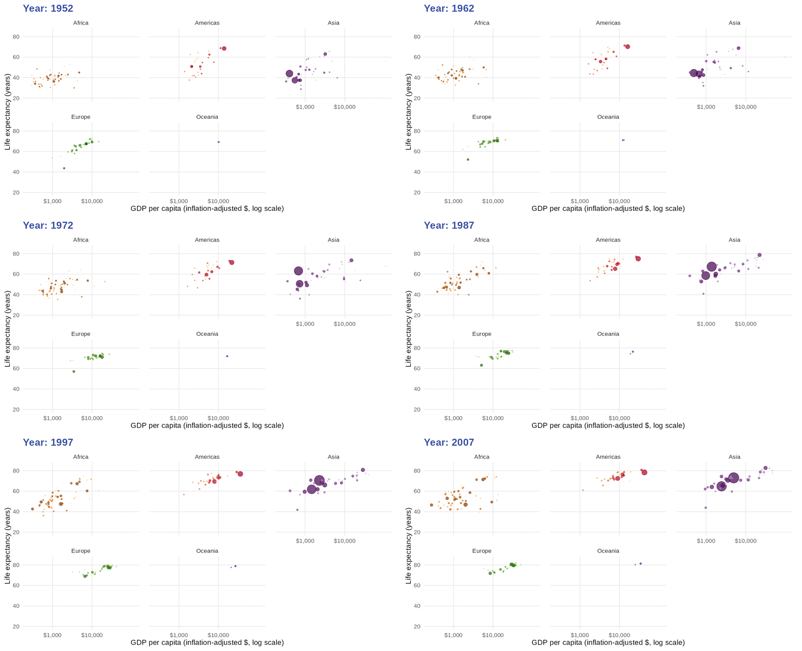
The notes also introduce gganimate. Show one observed year at a time:
library (gganimate)ggplot (gapminder, aes (gdpPercap, lifeExp, size = pop, colour = country)) + geom_point (alpha = 0.7 , show.legend = FALSE ) + scale_colour_manual (values = country_colors) + scale_size_area (max_size = 10 , limits = c (0 , max (gapminder$ pop))) + scale_x_log10 (breaks = c (1000 , 10000 ), labels = scales:: dollar) + facet_wrap (~ continent) + labs (title = "Year: {closest_state}" ,x = "GDP per capita ($, log scale)" , y = "Life expectancy" ) + transition_states (year, transition_length = 0 , state_length = 1 )Each frame is an observed year. For smooth motion, use transition_time(year); movement between observations is interpolation .
Follow the countries through time