Lecture 4 listed five steps in a forecasting task. Step 3 was exploratory analysis, and it has a one-line instruction attached:
Always start by graphing the data.
Compared with the modern arsenal of statistical methods, this looks almost too simple to be worth a lecture.
It is not. In many respects the human eye is a more sophisticated pattern detector than anything we will fit this semester — and it is the only tool that can find the patterns you did not think to look for.
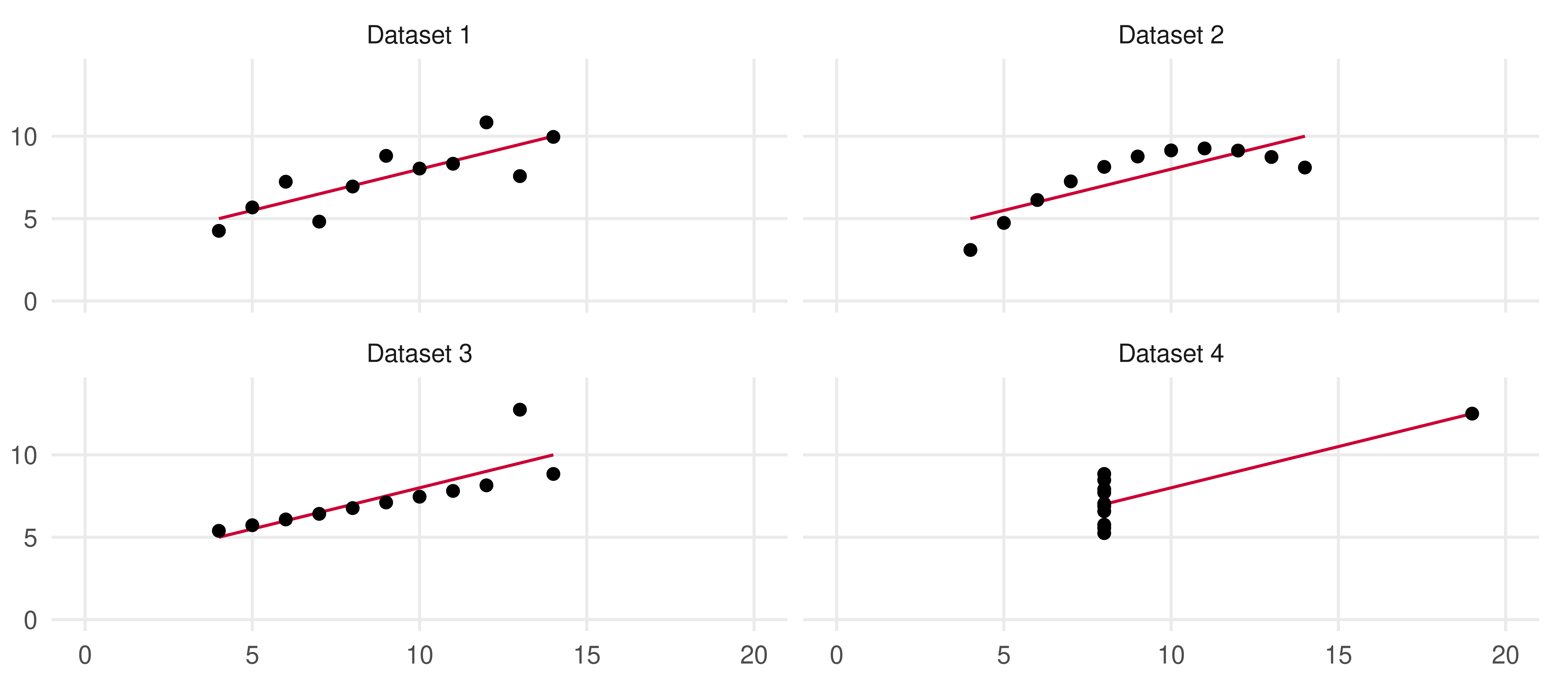
Identical to three decimals: same fitted line \hat y = 3 + \tfrac12 x, same standard errors, same t-statistics, same R^2, same regression standard error.
So the relationship must be the same in all four. Right?
Anscombe’s quartet
What the graph says
Dataset 1. Everything is fine. A noisy but genuinely linear relationship; the classical linear model is appropriate.
Dataset 2. There is a relationship — an almost perfect one — but it is quadratic. Fitting a line here is simply the wrong model.
Dataset 3. A perfect linear relationship, plus one outlier that drags the fitted line away from every other point.
Dataset 4. All the x values are identical except one. That single point determines the slope entirely: an extreme case of leverage.
Three of the four regressions should never have been run. The numbers could not tell us; the picture told us instantly.
Four things graphics does for us
Reveals patterns. Linear versus nonlinear, as in datasets 1 and 2. This is the whole of model specification.
Identifies anomalies. Outliers and leverage points, as in datasets 3 and 4. We fit models to historical data, and garbage in, garbage out applies.
Facilitates comparison. We drew all four panels in one figure, on common scales, so the comparison is effortless. This is called multiple comparison.
Compresses. A year of five-minute scanner data on four product categories cannot be tabulated. It can be graphed.
Anscombe (1973). The modern descendant is the “Datasaurus dozen” (Matejka and Fitzmaurice, 2017): thirteen datasets sharing means, variances and correlation to two decimals, one of which is a dinosaur.
The tidy time series toolkit
Why time series need their own object
A data.frame does not know that its rows are ordered, that they are equally spaced, or that one column is a date.
That means it cannot tell you a month is missing, cannot lag a variable safely, and cannot know that “January” recurs.
A tsibble is a data frame that knows three things:
an index: the time variable, with a declared frequency;
a key: the columns that identify which series a row belongs to (optional);
measurements: everything else.
Index plus key must uniquely identify every row. The package enforces it.
The packages
install.packages("fpp3") # oncelibrary(fpp3) # every session
Package
What it gives you
tsibble
the data structure, plus fill_gaps(), index_by(), difference()
feasts
the graphics and features: gg_season(), gg_lag(), ACF()
fable
forecasting models
tsibbledata, fpp3
the example datasets
dplyr, ggplot2, tidyr
the tidyverse underneath all of it
library(fpp3) attaches all of these at once, and reports which of your objects it has masked. dplyr::filter() shadows stats::filter(), which matters if you use the latter.
Time index classes
The index type declares the frequency, and everything downstream depends on it.
Frequency
Function
Example
Annual
integer
2024
Quarterly
yearquarter()
2024 Q1
Monthly
yearmonth()
2024 Jan
Weekly
yearweek()
2024 W01
Daily
as.Date()
2024-01-01
Sub-daily
as.POSIXct()
2024-01-01 09:30:00
Get this wrong and gg_season() has no idea what a season is.
Example: US Treasury bond rates
Diebold’s interest rate data: 1-, 10-, 20- and 30-year US Treasury bond rates, monthly, 1953M4–2005M3.
rates <-read.delim("data/fcst4_interest.dat") |>mutate(Month =yearmonth(seq(as.Date("1953-04-01"),by ="month", length.out =n()))) |>as_tsibble(index = Month) |>filter(Month >=yearmonth("1960 Jan")) |># the sample used in the bookrelocate(Month)rates
## # A tsibble: 543 x 5 [1M]
##       Month    Y1   Y10   Y20   Y30
##       <mth> <dbl> <dbl> <dbl> <dbl>
##  1 1960 Jan  5.03  4.72  4.42    NA
##  2 1960 Feb  4.66  4.49  4.28    NA
##  3 1960 Mar  4.02  4.25  4.14    NA
##  4 1960 Apr  4.04  4.28  4.23    NA
##  5 1960 May  4.21  4.35  4.2     NA
##  6 1960 Jun  3.36  4.15  4.04    NA
##  7 1960 Jul  3.2   3.9   3.91    NA
##  8 1960 Aug  2.95  3.8   3.84    NA
##  9 1960 Sep  3.07  3.8   3.86    NA
## 10 1960 Oct  3.04  3.89  3.92    NA
## # ℹ 533 more rows
Markets close at weekends and holidays, so on a regular daily calendar this series has 113 holes in 56 blocks. Either fill_gaps() and decide what belongs in them, or declare the index irregular — which is exactly what gafa_stock itself does.
gafa_stock prints as [!], tsibble’s mark for an irregular index; on it has_gaps() returns FALSE, because trading days are not supposed to be a regular calendar. Forcing a regular index, as above, is what exposes the holes.
Time plots
The workhorse: the time series plot
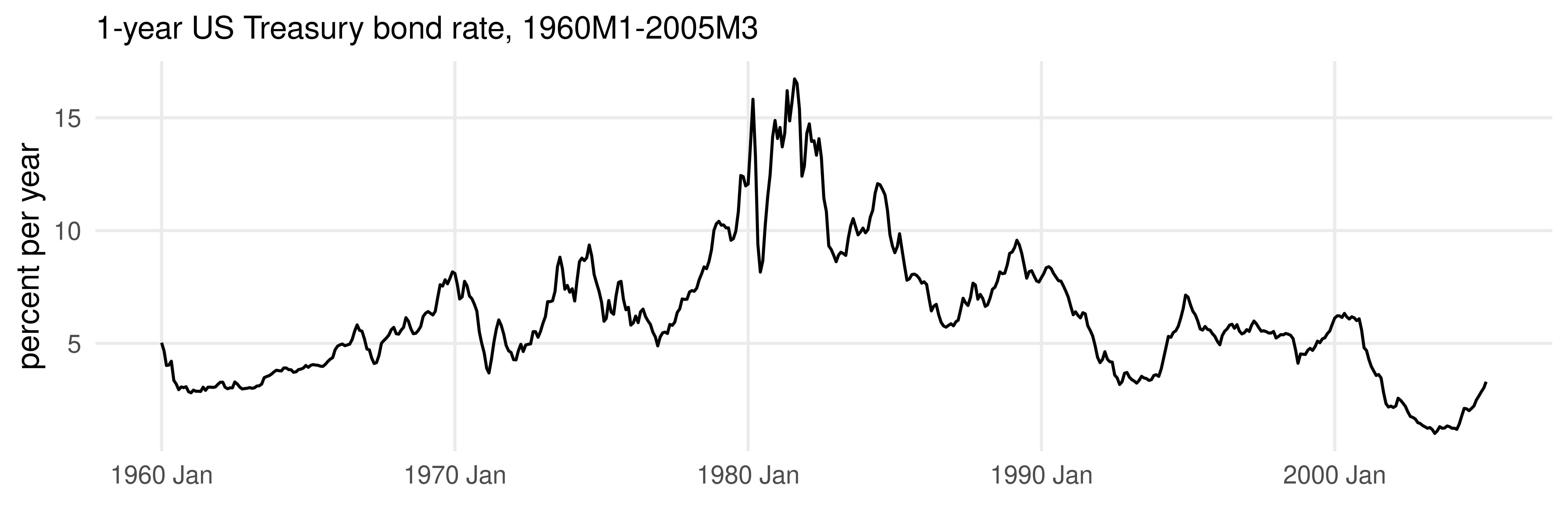
The series on the vertical axis, time on the horizontal, points connected. autoplot() reads the index and does the rest.
rates |>autoplot(Y1) +labs(y ="percent per year", x =NULL,title ="1-year US Treasury bond rate, 1960M1-2005M3")
Reading a time plot
Persistence. Movements are sluggish: this month’s rate is very close to last month’s. Nothing jumps.
Trend. Drifting up to about 1980, then down for twenty-five years.
An episode. The spike around 1980–82 is far outside the rest of the sample.
No seasonality. Nothing repeats within the year.
Every one of those four observations constrains the model we will eventually fit. We got them for free.
The 1979–82 episode is the Volcker disinflation: the Federal Reserve targeted money growth rather than the interest rate, and let rates go where they had to. It returns twice more in this lecture.
Plotting the change
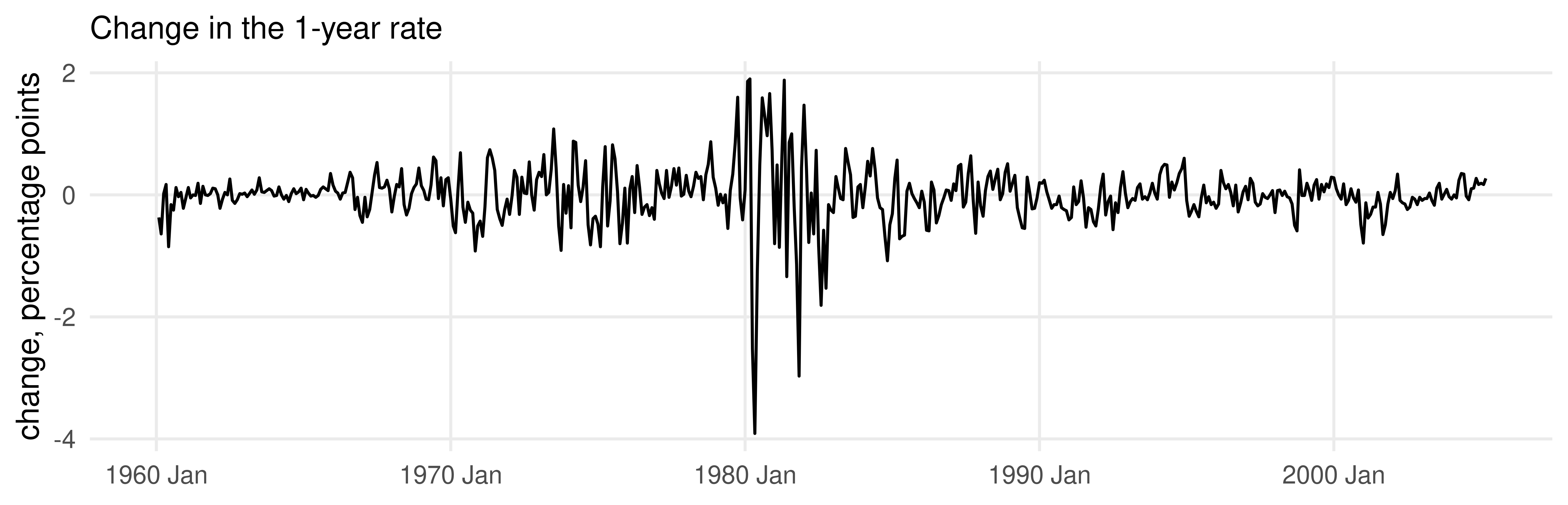
The same series, differenced. difference() is the tsibble-aware lag operator.
rates |>mutate(dY1 =difference(Y1)) |>autoplot(dY1) +labs(y ="change, percentage points", x =NULL,title ="Change in the 1-year rate")
What differencing revealed
The level plot showed trend and persistence. The difference plot shows something the level plot hid: the variance is not constant.
Quiet through the 1960s.
Somewhat more volatile in the 1970s.
Violent from late 1979 to late 1982.
Gradually calming thereafter.
Clustered volatility (big changes followed by big changes) is one of the most robust facts in financial data.
Different transformations reveal different features. Plot more than one.
A series with everything: US liquor sales
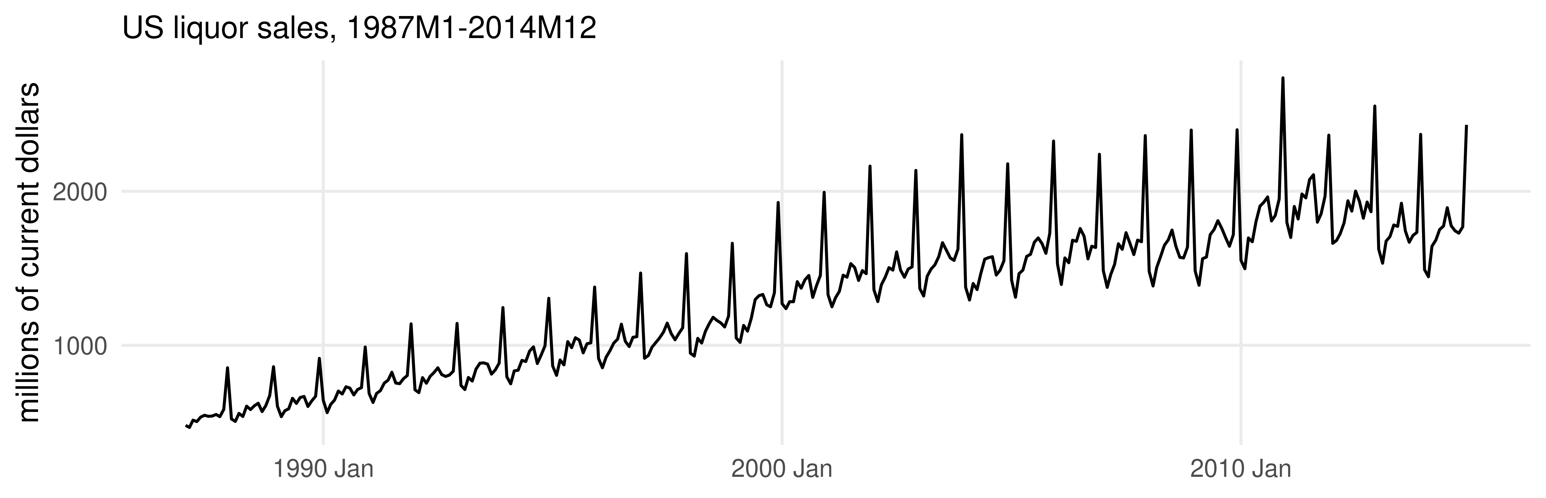
liquor |>autoplot(Sales) +labs(y ="millions of current dollars", x =NULL,title ="US liquor sales, 1987M1-2014M12")
Three features at once
Trend. Clearly upward, and possibly with a break in the slope.
Seasonality. A sharp spike every December. Perfectly regular, and by far the biggest month-to-month movement in the data.
Changing amplitude. The seasonal swings grow with the level of the series. That is a multiplicative pattern, not an additive one.
Point 3 has an immediate practical consequence.
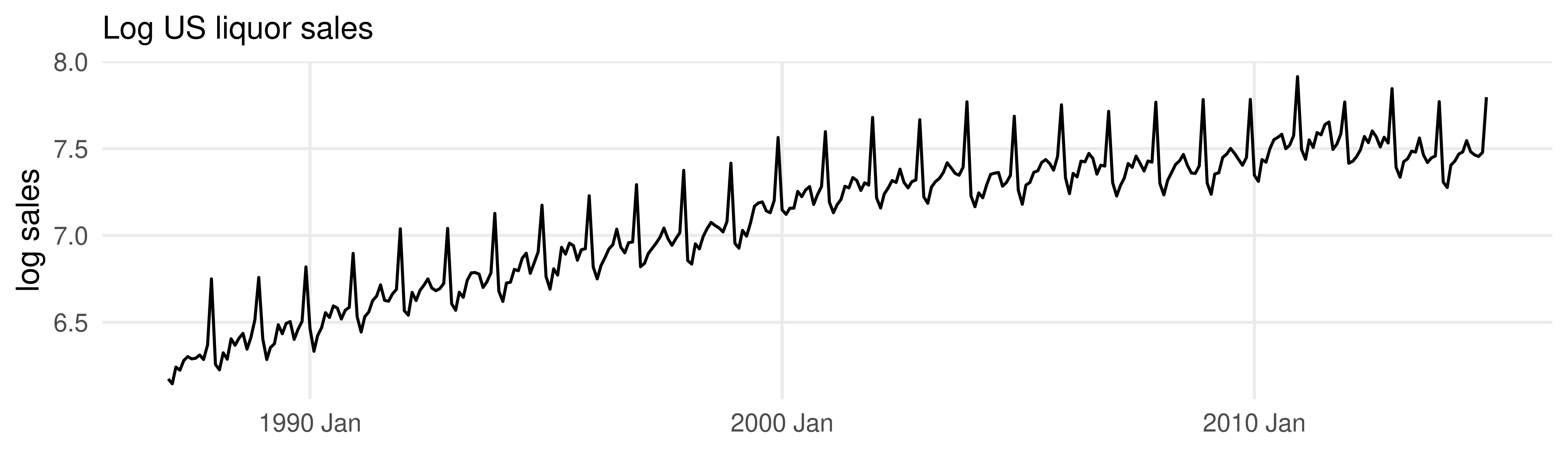
Why take logs
If seasonal swings are proportional to the level, take logarithms: proportional becomes additive, and an additive model can then be fitted.
The seasonal band is now roughly constant width. Compare the two plots carefully.
Time series patterns
Three patterns, defined
Trend. A long-term increase or decrease in the data. It need not be linear, and it may change direction.
Seasonality. A pattern driven by the calendar — time of year, day of week — with a fixed and known period.
Cycle. Rises and falls that are not of a fixed frequency. In economics these are usually business cycles, and they typically last at least two years.
Almost every economic time series is some combination of the three, plus noise.
Seasonal or cyclical?
The distinction is constantly muddled, including in the financial press. Three differences:
Seasonal
Cyclical
Frequency
fixed, known, tied to the calendar
not fixed, unknown in advance
Length
at most one year, by construction
usually longer, at least two years
Amplitude
fairly stable across repetitions
highly variable across episodes
The practical consequence: seasonality is easy to forecast and cycles are not. We know December is coming. We do not know when the next recession is.
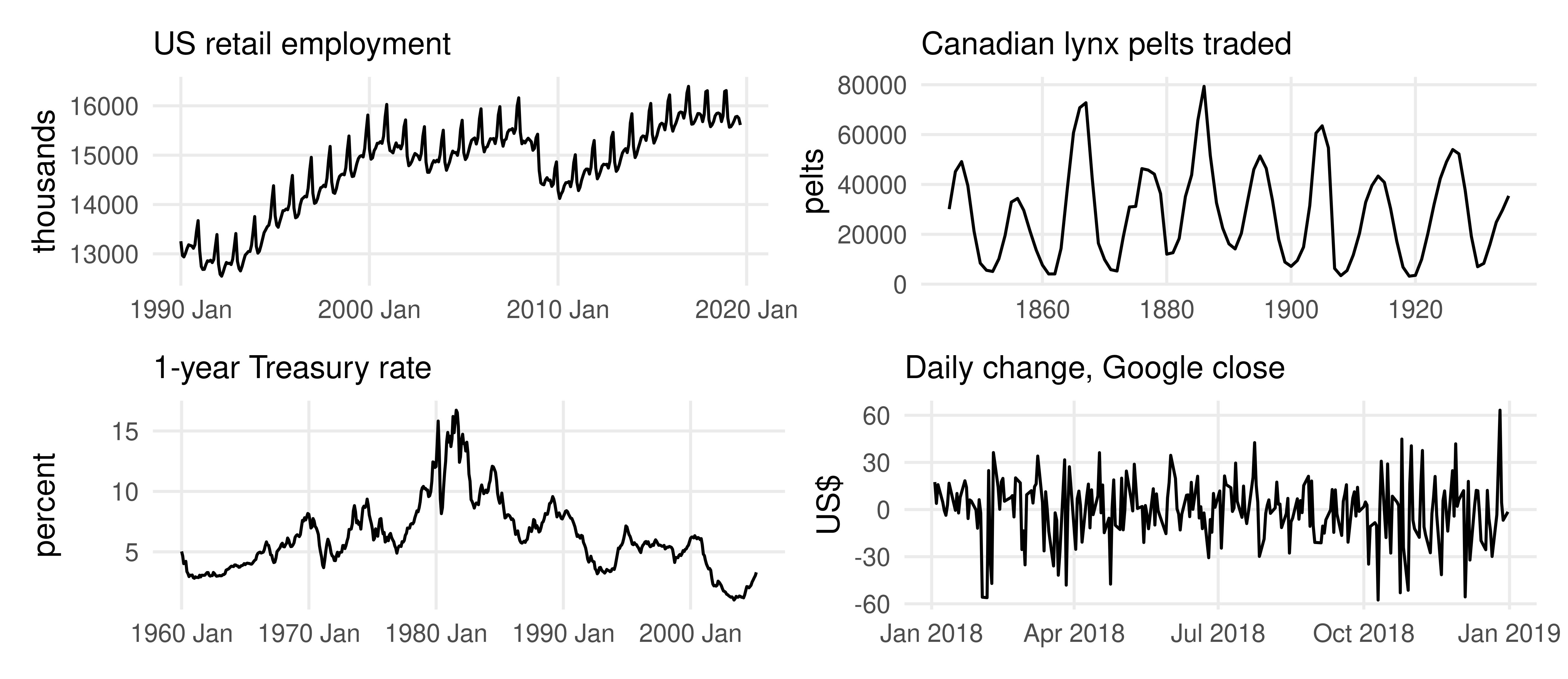
Four series, four combinations
Reading the four panels
Retail employment. Trend up, strong within-year seasonality (the December hiring spike), and cyclical dips at the 2001 and 2008–09 recessions. All three.
Lynx pelts. Striking cycles about nine to ten years long, with wildly varying amplitude, and no seasonality — the data are annual, so there is no within-year variation to have.
Treasury rate. Persistent wandering with a long trend up then down. No fixed period at all.
Google daily change. No trend, no seasonality, no cycle. Something close to pure noise — which is itself a finding.
The taxonomy is the model. What you see here determines what you fit later.
Seasonal and subseries plots
The seasonal plot
A time plot cut into years and overlaid, so each year is a line and the horizontal axis is the season.
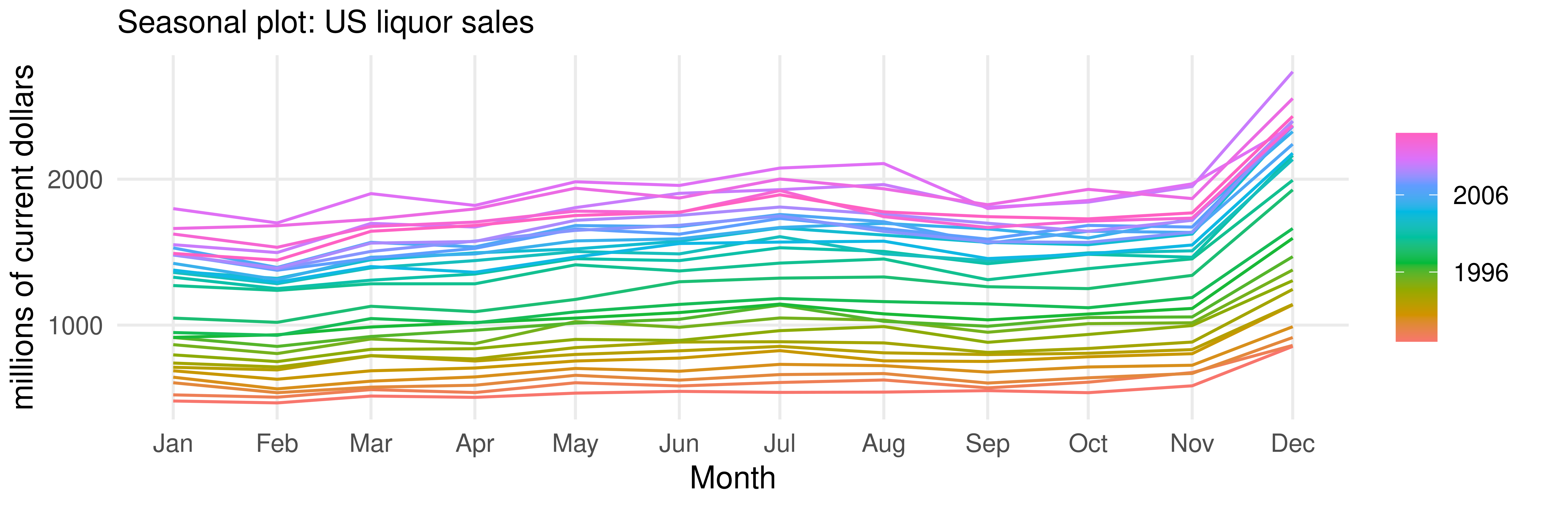
liquor |>gg_season(Sales) +labs(y ="millions of current dollars",title ="Seasonal plot: US liquor sales") +theme(plot.margin =margin(4, 18, 4, 4))
What the seasonal plot shows
The December spike is present in every single year, without exception. It is not an artefact of a few unusual years.
February is the lowest in 26 of the 28 years (January in the other two). The pattern is stable in shape.
The lines fan out over time: the seasonal amplitude grows with the level, which we already suspected from the time plot.
Any year that broke the pattern would be immediately visible as a line crossing the others. None does.
This is the plot that catches data errors. A month accidentally recorded twice, or a series that was reclassified in 2003, shows up here as a line that does not belong.
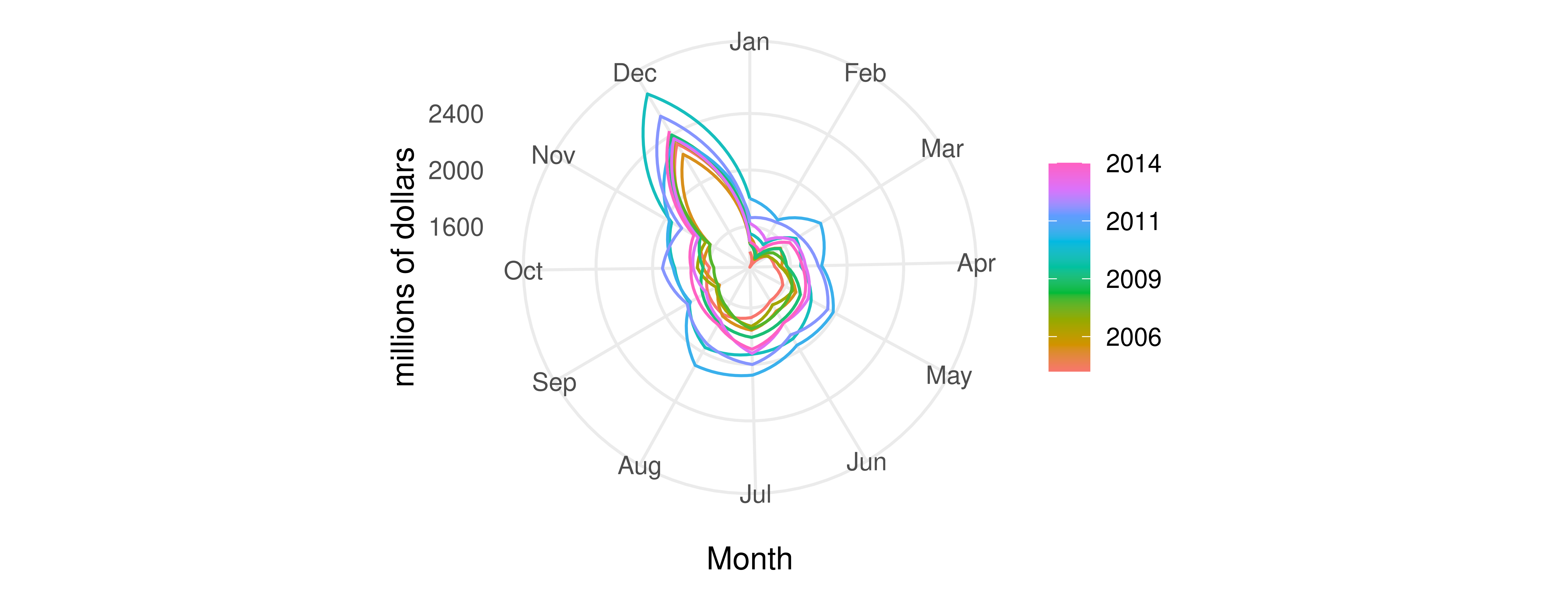
The same data in polar coordinates
liquor |>filter(year(Month) >=2005) |>gg_season(Sales, polar =TRUE) +labs(y ="millions of dollars")
Pretty, and occasionally useful for showing that the year closes on itself. Read values off it at your peril.
The subseries plot
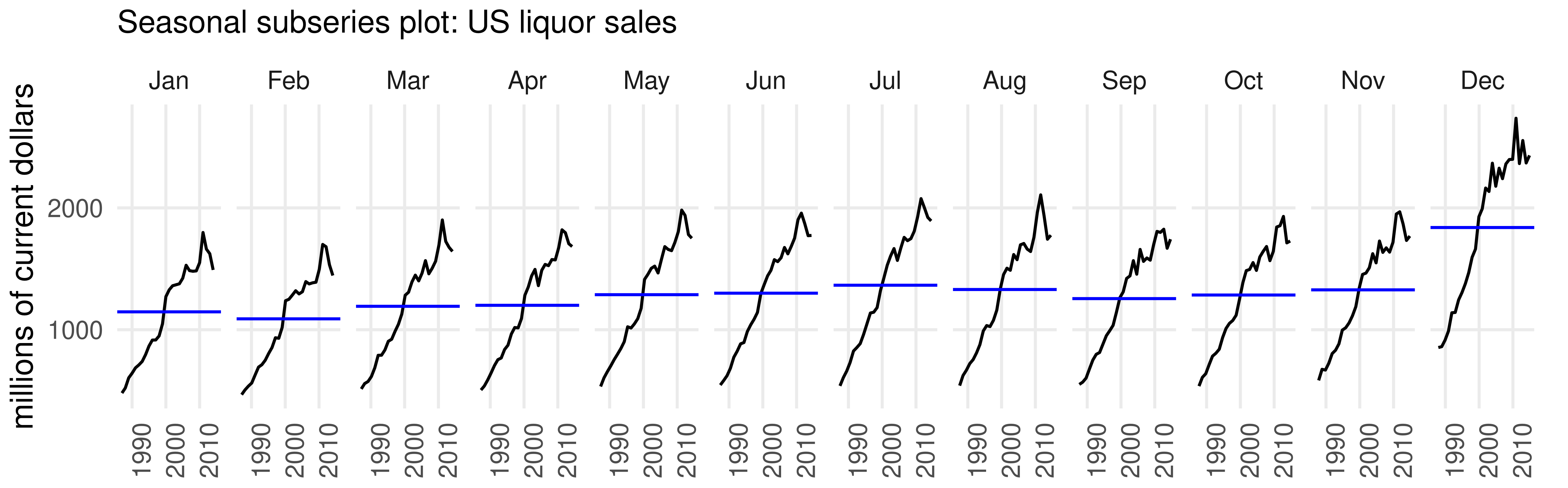
Now cut the other way: collect all the Januaries into one mini time plot, all the Februaries into the next, and so on. The blue line is each month’s mean.
liquor |>gg_subseries(Sales) +labs(y ="millions of current dollars", x =NULL,title ="Seasonal subseries plot: US liquor sales") +theme(plot.margin =margin(4, 14, 4, 4))
Seasonal plot versus subseries plot
gg_season() answers:
What does a typical year look like, and does any year break the pattern?
Good for the shape of the season.
gg_subseries() answers:
Is December growing faster than March? Has the seasonal pattern itself changed?
Good for changes in the season over time.
In the liquor data every month trends up, and December climbs the most in dollars — which is why the seasonal swings widen in the level plot. In proportional terms it is the opposite: December sales rose by a factor of 2.9 between 1987 and 2014 against about 3.2 for the average month, so the December premium has if anything shrunk slightly. That is what the log plot was telling us.
More than one season at a time
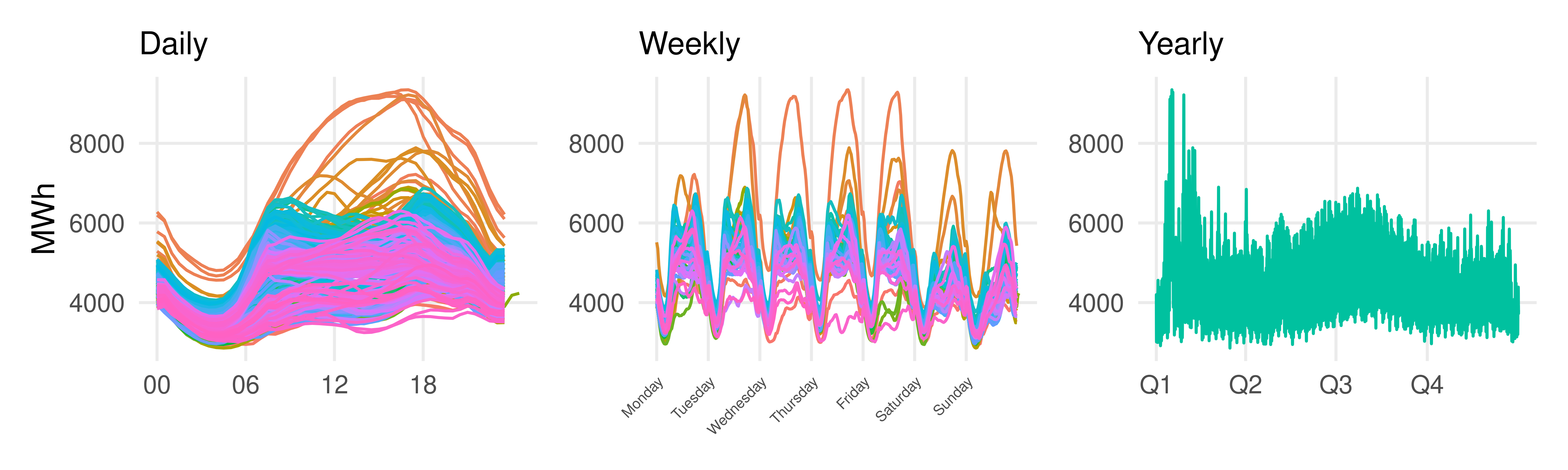
High-frequency data have nested seasonality. Half-hourly electricity demand has a daily cycle, a weekly cycle, and an annual cycle, all at once.
Victorian electricity demand, 2014. Daily: two peaks, morning and evening. Weekly: weekends sit below weekdays. Yearly: peaks in the southern-hemisphere summer, for air conditioning.
Elements of graphical style
Good graphics is like good writing
Bad graphics is like obscenity: hard to define, but you know it when you see it.
Producing good graphics is an iterative, trial-and-error procedure — an art rather than a science. But, as with writing, that is not a licence for anything to go. Three keys:
Know your audience, and know your goals.
Show the data, and appeal to the viewer.
Revise and edit, again and again.
This section follows Tufte, The Visual Display of Quantitative Information (1983), which every one of you should read at some point. It takes an afternoon.
Showing the data
Do not distort. Do not change scales in midstream; use common scales when making multiple comparisons; do not truncate an axis to exaggerate a movement.
Minimize non-data ink — ink used to depict anything other than the data. Erase redundant axes, drop the box, drop the background grid when it is not being read.
Avoid chartjunk: elaborate shading, decorative grids, three-dimensional perspective on two-dimensional data, and anything that moves.
“Within reason” belongs on the second bullet. Axis labels are non-data ink and you should keep them.
Appealing to the viewer
Clear, modest type. No mnemonics, no abbreviations only you understand, no SHOUTING IN CAPITALS.
Labels rather than legends where you can manage it. A legend forces the eye to travel back and forth; a label sits next to the thing it names.
Make the graphic self-contained. A knowledgeable reader should understand it without reading the surrounding text. That means a title, axis labels, and units.
Everything on this list costs you thirty seconds and buys a reader.
Aspect ratio
The aspect ratio is height over width, a = h/w. It is a real choice, and software will not make it for you.
One time-honoured convention: choose a so that height is to width as width is to height plus width,
\frac{h}{w} = \frac{w}{h+w}.
Dividing through by w and writing a = h/w gives a = 1/(1+a), or
a^2 + a - 1 = 0 \quad\Longrightarrow\quad a = \frac{\sqrt5 - 1}{2} \approx 0.618,
the golden ratio. Height a bit less than two thirds of width.
The golden ratio is not always right
Visual appeal and pattern revelation are different objectives, and for long time series they usually conflict.
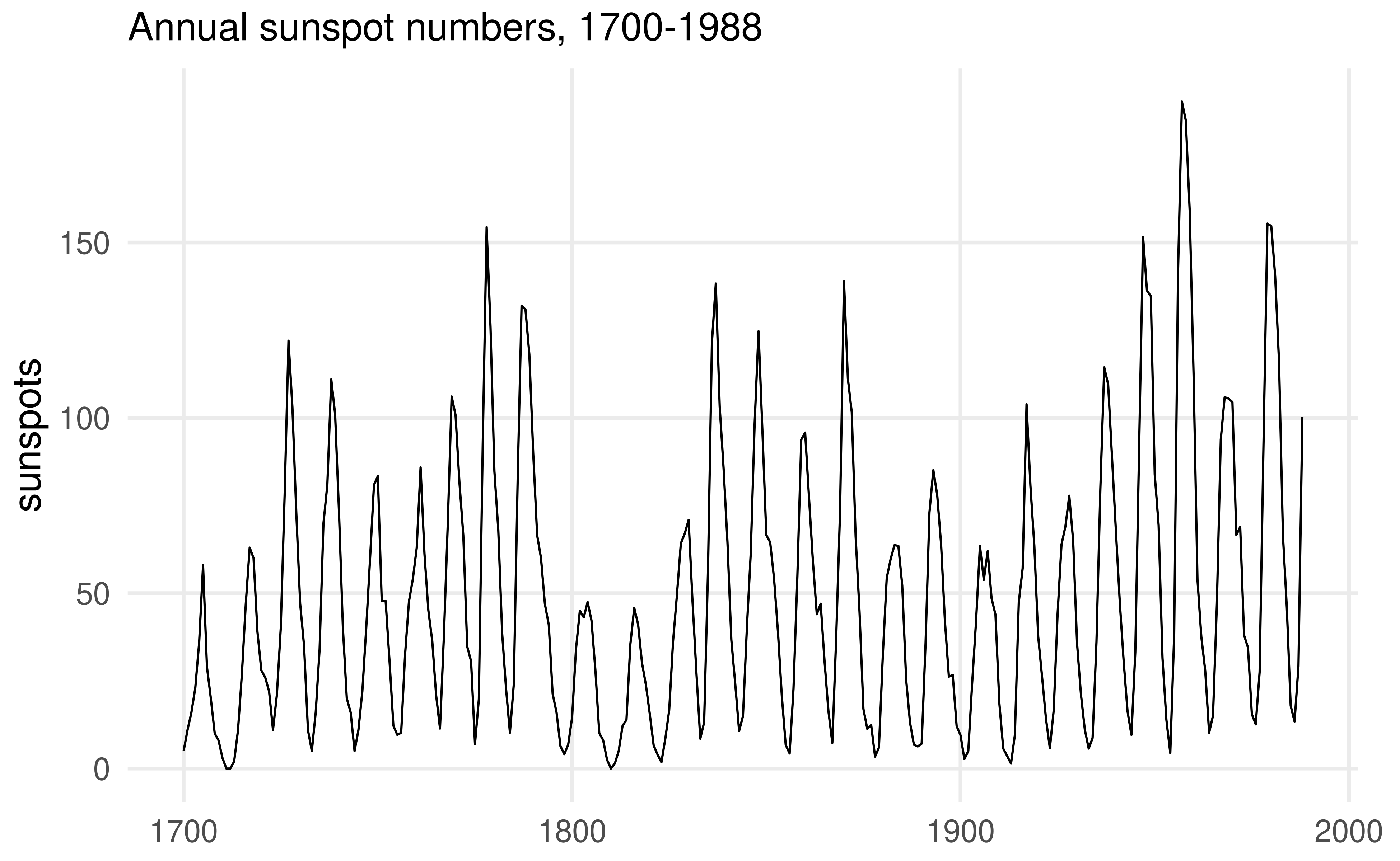
Aspect ratio about 0.62. Cycles, clearly. Anything else?
Banking to 45 degrees
Same data, same ink, aspect ratio about 0.12.
Now the asymmetry is unmistakable: sunspot cycles rise quickly and decay slowly. It was there the whole time.
The rule that produced it — choose the aspect ratio so that the average absolute slope of the connecting segments is about 45 degrees — is called banking to 45 degrees.
Cleveland (1993). For long time series the revealing aspect ratio is usually far below the golden ratio. Slopes near 0 or 90 degrees are the ones the eye cannot compare.
Where graphics stops
Graphics loses its power as the dimension of the data grows. Squash ten dimensions into two and something is lost.
But the same is true of the models. A linear regression on ten regressors also assumes the data lie in a thin slice of ten-dimensional space.
Graphical analysis and model fitting are complements, not substitutes.
In two or three dimensions, graphics loses nothing and models lose something. In twenty, both lose — and you need both.
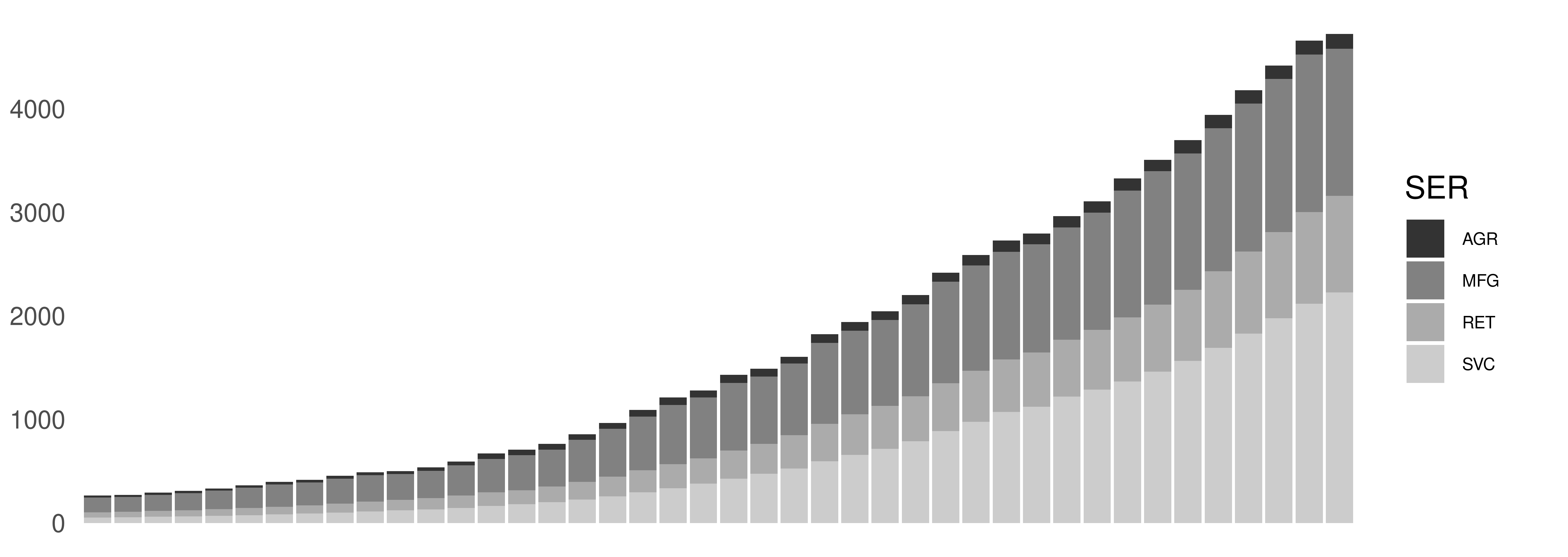
The book’s text calls the units millions of current dollars. US manufacturing value added was not $1.4 billion in 2001; these are billions. Check units before you plot, and label them after.
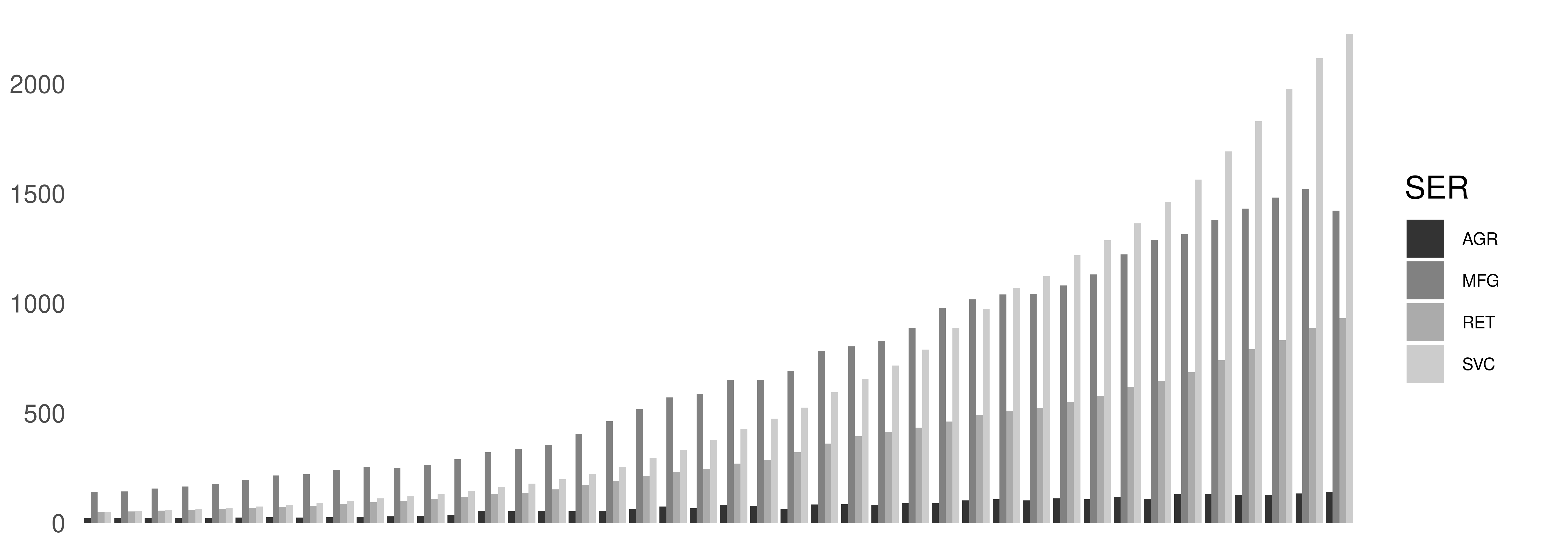
Attempt 1: bar graph
Unreadable. No title, no axis numbering, no labels, a meaningless legend key, and four bars fighting at every date. The good news is there is plenty of room for improvement.
Attempt 2: stacked bars
One bar per date instead of four, so slightly easier. Every other defect survives, and now only the bottom sector has a common baseline.
Bar graphs are for comparing a handful of categories. They are almost never the right tool for a time series.
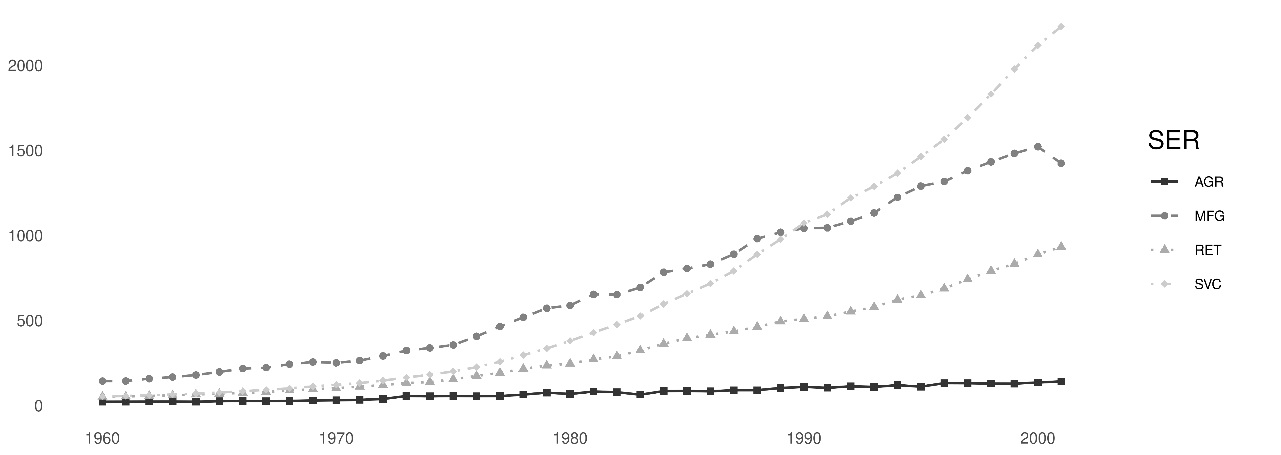
Attempt 3: a time series plot
A large improvement: the eye can now follow four paths through time. Still no title, no axis labels, no units, and a legend that must be decoded.
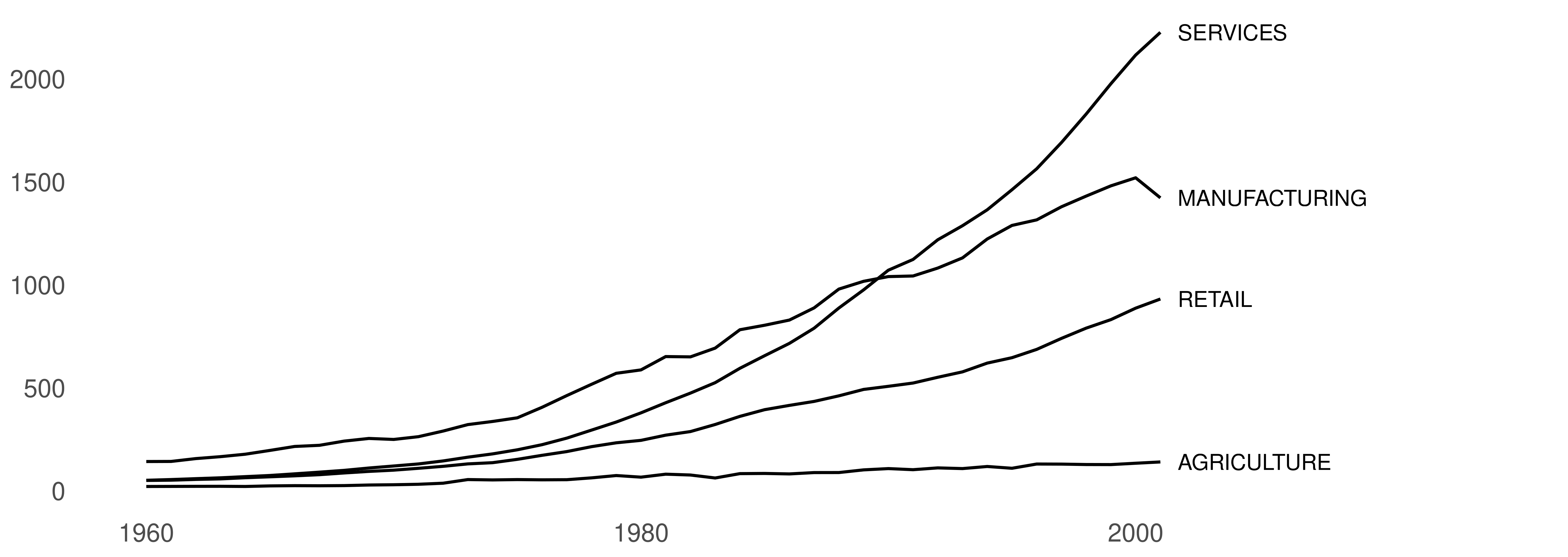
Attempt 4: label the series directly
The legend is gone, and with it the mnemonics: every line now says what it is, where the reader is already looking. But the CAPITALS shout, and the axes are still bare.
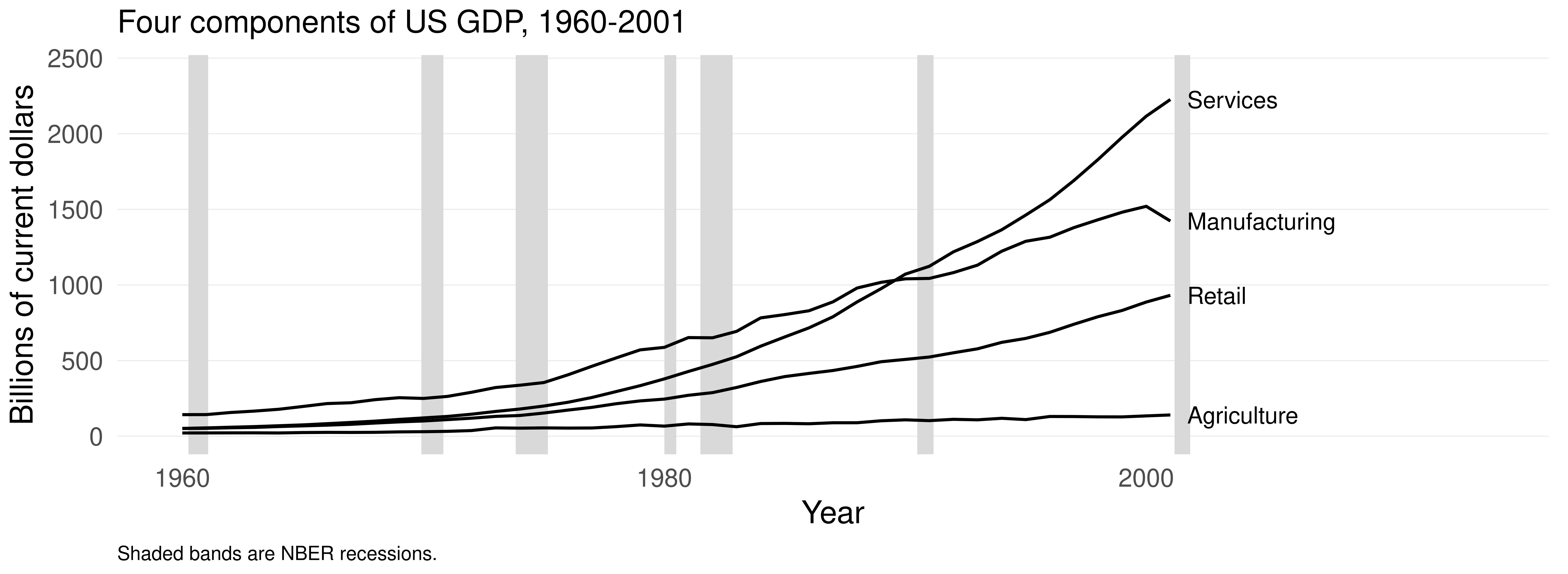
Attempt 5: finished
Axes labelled with units, a descriptive title, direct labels in mixed case, no box, and NBER recession dates shaded for reference.
What changed, and why
Step
Change
Principle
1 → 2
four bars per date → one
reduce clutter
2 → 3
bars → lines
match the tool to the data type
3 → 4
legend → direct labels
appeal to the viewer
4 → 5
CAPITALS → mixed case
clear and modest type
4 → 5
added title, axis labels, units
make it self-contained
4 → 5
added recession shading
give the reader context
throughout
dropped the box and the grid
minimize non-data ink
And the finished plot is not finished. Services grew from about a third of manufacturing in 1960 to more than 50% larger by 2001, and on a linear scale the early years are unreadable. Should we plot logs, or shares of the total, instead? Revise and edit, again and again.